Leaked Batman logo intrigues fans
But it looks rather familiar...
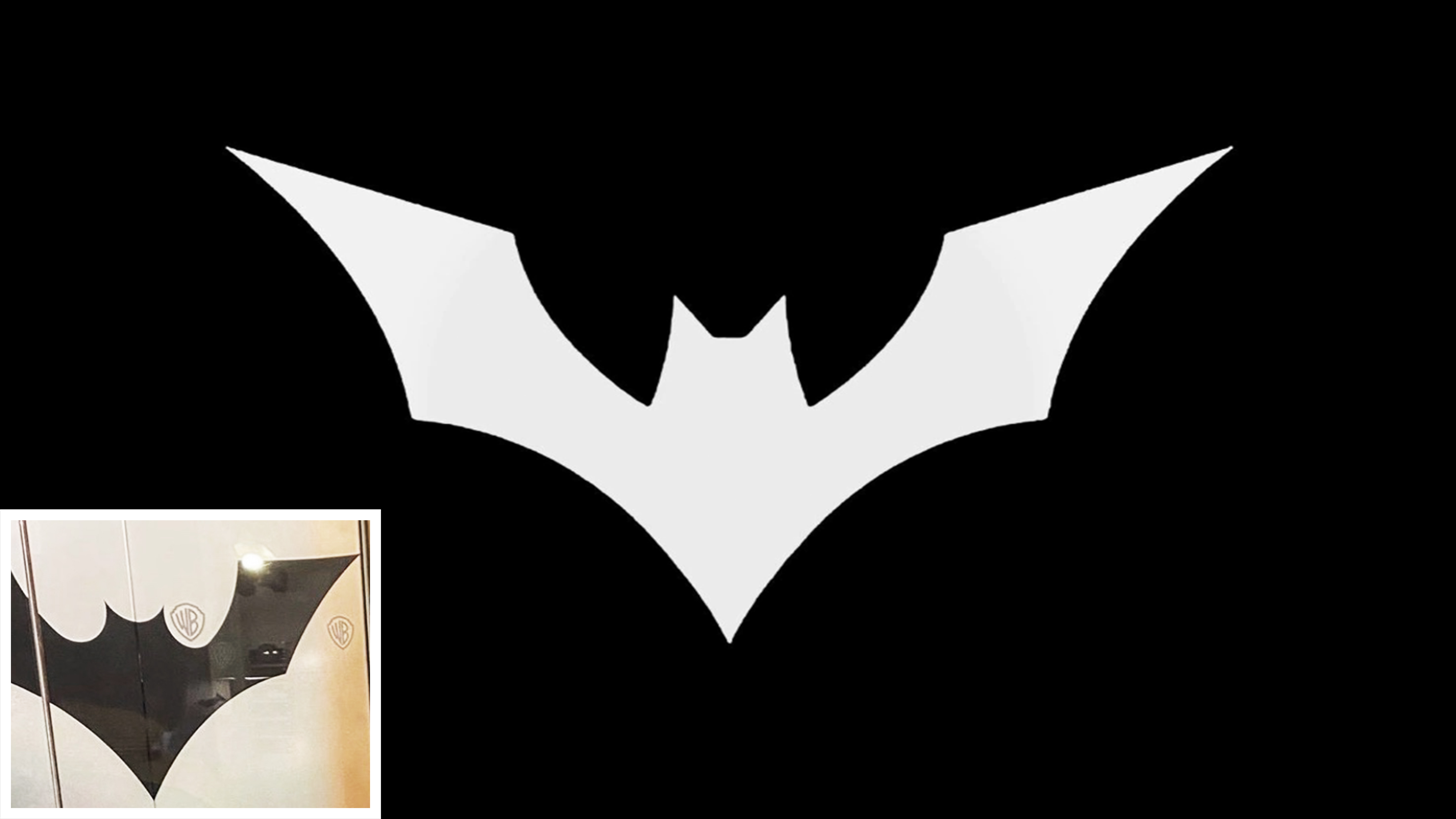
WB Montreal has been teasing a (currently unannounced) new Batman game for a few weeks, and now two new images have emerged on Twitter, appearing to show a brand new bat symbol inside the studio's HQ.
The bat symbol has undergone several transformations since the caped crusader first graced the cover of Detective Comics in 1939 – some more dramatic than others. Non-fans might not bat an eyelid at the new logo, shared by games reporter James Sigfield on Twitter (below). It's just a silhouette of a bat, same as ever, right? Not so fast – logo design is a complicated business (although our guide to logo design certainly simplifies things).
This could possibly be our first look at the logo from the new Batman game reboot.(From the elevator at WB Montreal) pic.twitter.com/hPACSCS0WhFebruary 19, 2020
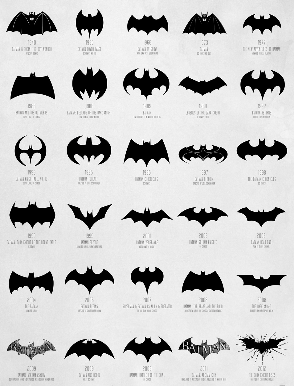
So is this possible new logo any different? To help you tell one bat from another, Reddit user rdgxxx recently shared a fascinating look at the evolution of the symbol from 1940-2012 (below).
Article continues below 
While the logo in Sigfield's tweet doesn't completely match any of these iterations, it perhaps most closely resembles the one for 1999's Batman Beyond (compare them below). The head and wings in this new version are rounder, though. One thing's for sure – it's a departure from the logo for the recent Arkham game series. We're pleased to see a return to an all-black design, without the rather obvious 'Batman' splashed across the wings (we get it, guys).

The Bat symbol is clearly close to fans' hearts – users were quick to comment on rdgxxx's post to declare their favourite – usually the one which evoked the strongest childhood memories. Djentleman5000 says, "I remember the ‘92/‘95 ones. I had The Batman cereal that came with Batman shaped piggy bank. I had a ninja turtles one too. Nostalgia...", while rdgxxx "used to watch the old TV Show every afternoon at home eating croissants with a home made latte! The '66 Logo!"
Although it remains unannounced, the studio has teased the new game with a series of mysterious images and videos of, each including the caption 'Capture the Knight'. Fans believe that the crests on display could be related to the Court of Owls, a secret crime group from the Batman comics:
Capture the Knight / Cape sur la nuit pic.twitter.com/yMFXMd4djUSeptember 23, 2019
Still, for all the teasing and mystery around the game, WB Montreal appears to be playing it safe with the new logo. It doesn't look likely to wind up on our list of controversial moments in logo design, which is just as well – when it comes to the fans, a dodgy bat symbol isn't going to fly.
Sign up to Creative Bloq's daily newsletter, which brings you the latest news and inspiration from the worlds of art, design and technology.
Related articles:

Daniel John is Design Editor at Creative Bloq. He reports on the worlds of design, branding and lifestyle tech, and has covered several industry events including Milan Design Week, OFFF Barcelona and Adobe Max in Los Angeles. He has interviewed leaders and designers at brands including Apple, Microsoft and Adobe. Daniel's debut book of short stories and poems was published in 2018, and his comedy newsletter is a Substack Bestseller.
