Britain's favourite crisps get patriotic redesign
Get ready to tuck into a new look for Walkers crisps.

Sign up to Creative Bloq's daily newsletter, which brings you the latest news and inspiration from the worlds of art, design and technology.
You are now subscribed
Your newsletter sign-up was successful
Want to add more newsletters?
When you think of good ol' Blighty, then perhaps images of Big Ben, red phone boxes and the Union Flag spring to mind. And when your everyday Brit thinks of crisps, chances are they think of Walkers. As part of a rebrand, Walkers has now brought the worlds of British icons and potato snacks together to strengthen its connection with shoppers.
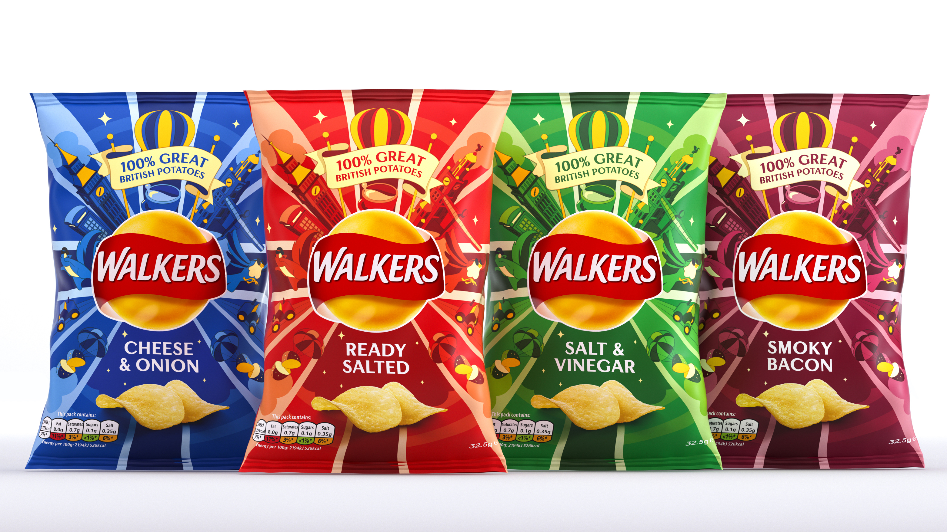
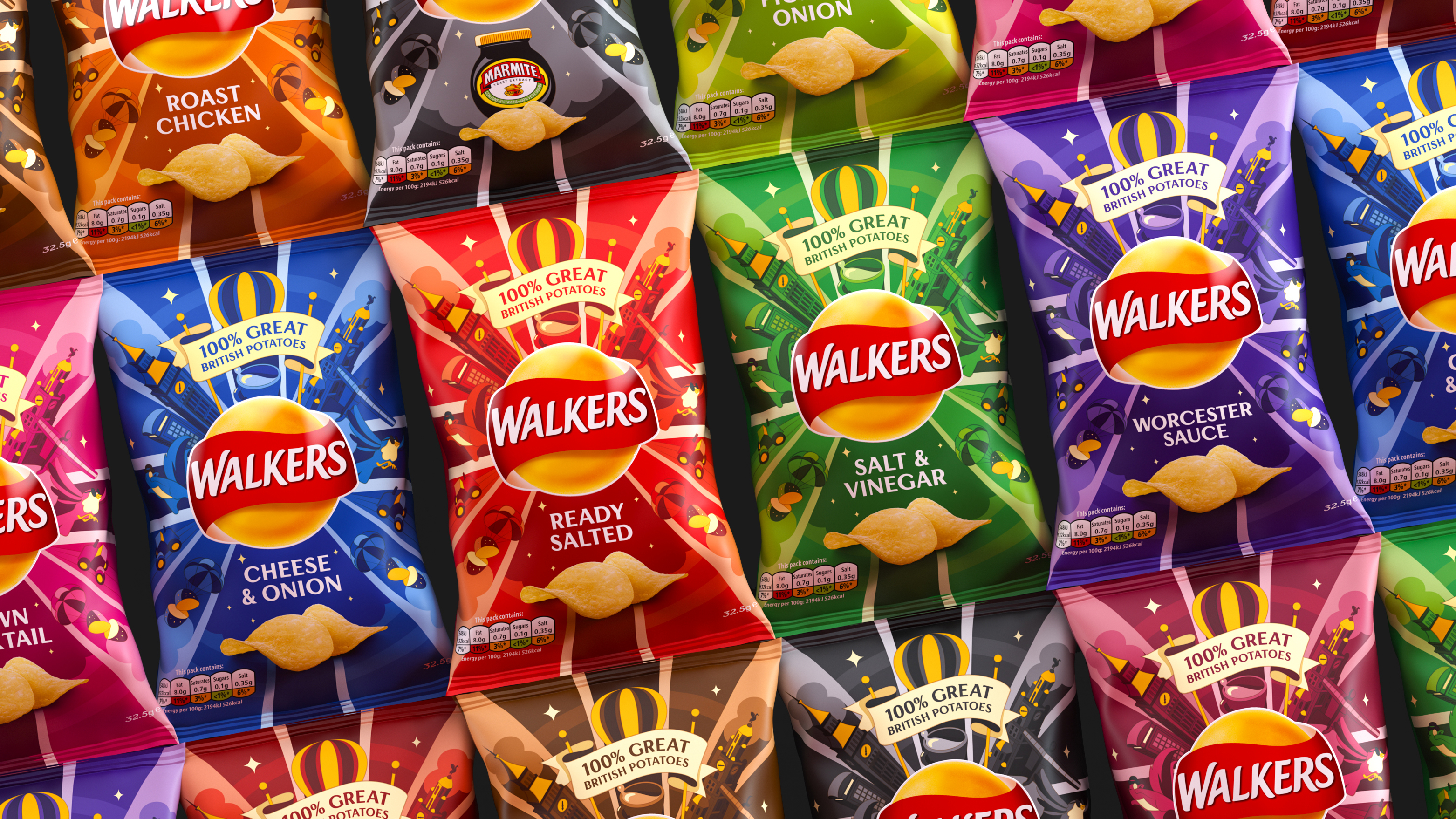
Designed in partnership with PepsiCo and Vault49, the Walkers redesign sees the packets of its core range of flavours get a patriotic new look that packs a modern, premium feel. Unveiled yesterday, the packaging design for the crisps sees the distinctive red and yellow Walkers logo drop from the top of its bags to sit squarely in the middle.
Surrounding the logo are playful hand-crafted illustrations that sum up modern Britain in a whimsical way. Look closely and you'll spot a pigeon wearing John Lennon-style sunglasses and a squirrel sporting a bowler hat and scampering around famous British landmarks such as the Angel of the North.
Cementing a connection with the British public makes sense when you consider that Walkers sells more than five times as many packs of crisps to people in the UK than its nearest rival. And for a company that makes seven million packs every day, that's a heck of a lot of crisps.
"It's one of those rare brands that taps into something deeper than the feelings people usually have for companies," says Jonathan Kenyon, co-founder and executive creative director at Vault49.
As if this wasn't a strong enough tie to the public, the new bags also proudly announce that Walkers crisps are made out of 100 per cent great British potatoes. It's a nice little reminder that will help bring the brand even closer to shoppers.
See the new design in action below.
Sign up to Creative Bloq's daily newsletter, which brings you the latest news and inspiration from the worlds of art, design and technology.
Featuring a mix of gloss and matte finishes, the new design is intended to stand out on the shelf and outshine pretenders to the throne – including any copycat brands. But with this rebrand, Walkers will stand head and shoulders above the competition.
“Walkers crisps are an irresistible delight, we’re excited to be unveiling a fresh and modern design that reflects the character of this uniquely British favourite," says David Marchant, Head of Design for PepsiCo Design and Innovation in Western Europe. "The eye-catching new pack will deepen the already-special relationship Walkers has with a nation of crisp connoisseurs.”
Related articles:

Dom Carter is a freelance writer who specialises in art and design. Formerly a staff writer for Creative Bloq, his work has also appeared on Creative Boom and in the pages of ImagineFX, Computer Arts, 3D World, and .net. He has been a D&AD New Blood judge, and has a particular interest in picture books.

