It's all but impossible to reveal a new logo without someone criticising it, but the US National Basketball Association (NBA) probably wasn't expecting such a harsh response from fans when it revealed its new commemorative logo for its 75th anniversary season.
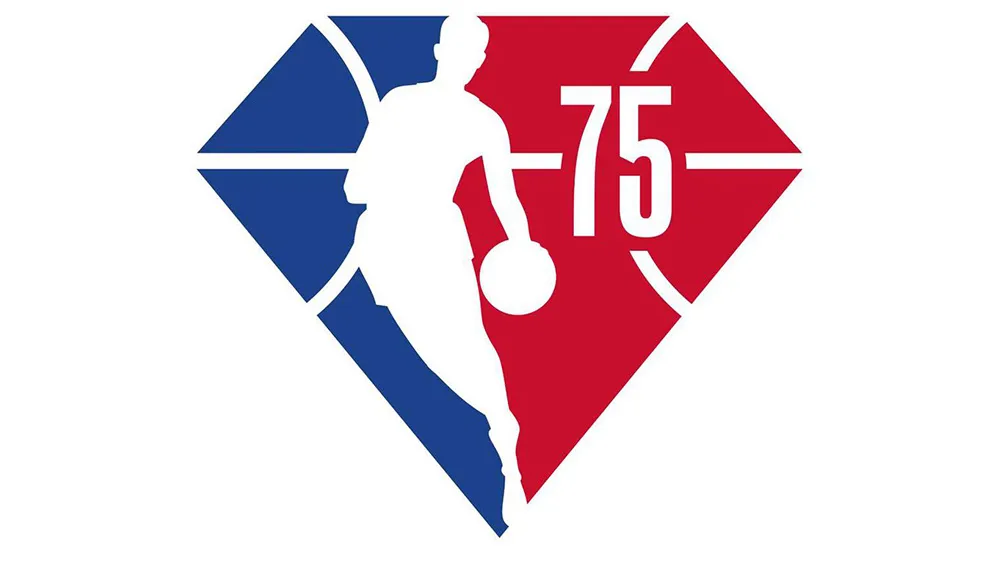
The temporary logo keeps the NBA's colours and the existing silhouette of player Jerry West, but changes the rectangular shape to a diamond – it's the league's diamond anniversary you see. It also adds a basketball pattern behind the silhouette and the number 75 in the NBA Action typeface. But fans are seriously unimpressed by the less than radical makeover of a logo that's barely changed since 1969 (to avoid such blunders yourself, see our guide to everything you need to know about logo design).


The NBA describes the temporary logo as a "fresh take on the league’s iconic Logoman identity, based in the classic 75th Anniversary symbol – the diamond." It will be used across all content and merchandise during the 2021-2022 season from October, and it seems many fans will be happy to see the back of it after that.
The NBA has temporarily tweaked or added elements to its logo for anniversaries in the past, but its standard logo has remained largely unchanged for five decades. The current logo with the silhouette of former player Jerry West was launched in 1969, and the only change since was a slight amendment of the colours and typeface in 2017.
Fans have been crying out for it to be updated with a more recognisable player from the modern game – Kobe Bryant, LeBron James and Michael Jordan are all names that have been suggested. "They changed the logo but didn't make it Kobe?" @peeta_x asked on Twitter. "Absolutely horrible. Where the hell is Kobe. The NBA completely out of touch," @BendjiNzau tweeted.
WACK. Kobe logo or dont change shitJuly 7, 2021
Fans have also taken issue with the shape of the commemorative logo, with some claiming that it looks like the Superman logo, and others saying it resembles a baseball home square, creating associations with the wrong sport completely. "Diamonds are in baseball only bud," @nicklasbray tweeted.
Of course, it hasn't taken long for fans to start offering their own improvements on the design, as you can see below.
After receiving initial backlash, the NBA has made a change to its 75th anniversary logo pic.twitter.com/E4elq8D6z6July 7, 2021
Should be the new NBA logo🐐🙏🏾 https://t.co/C8RnJ5RMFEJuly 8, 2021
If you're looking to design a logo yourself, see our guide to choosing the best free logo maker, or check out the prices available for an Adobe Creative Cloud subscription below.
Related articles:
- These are the hottest logo design trends of 2021
- The 10 best sports logos of all time
- These are the most popular sonic logos of 2021

