Is Holsten beer's rebrand enough to flip its fortunes?
Iconic brand returns to its roots.

Struggling beer brand Holsten has been given a new visual identity that aims to "refresh the brand for a contemporary market". As the popularity of craft beers has soared, Hamburg's stalwart beer has lost out, as many beer drinkers assume it is mass-produced.
Design Bridge's redesign centres around reasserting the brand's authenticity in the marketplace, reconnecting it to its roots in Hamburg. The design has been handcrafted to reflect the merchant work ethic that built the port city – resulting in a new identity that rivals those found in our roundup of top packaging designs.

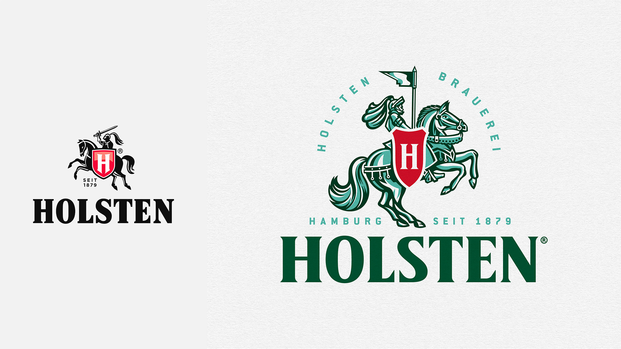
Design Bridge went to Hamburg to get a sense of the city's history (see the promo video here), diving into the Holsten brewery archives to collect key information about the brand's roots. They found that the knight icon had been sidelined and over-polished over time, so added details to the symbol to inject a sense of the beer's history.
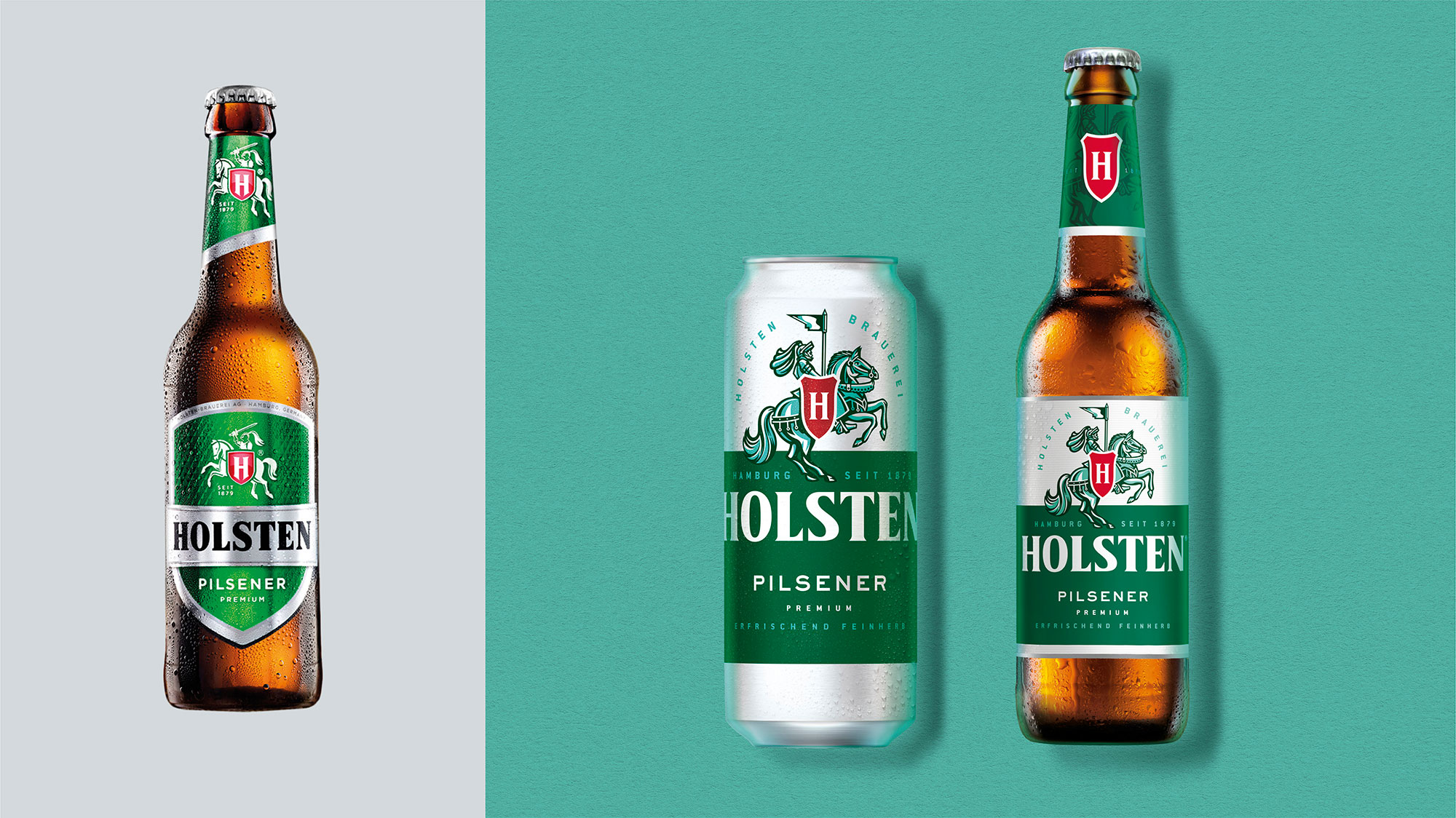
Article continues belowThe knight has been flipped to face the other way. "By turning the knight around he now proudly rides forwards – a significant shift from the previous outdated armed warrior to a progressive, flag-bearing beacon of leadership," says Design Bridge.

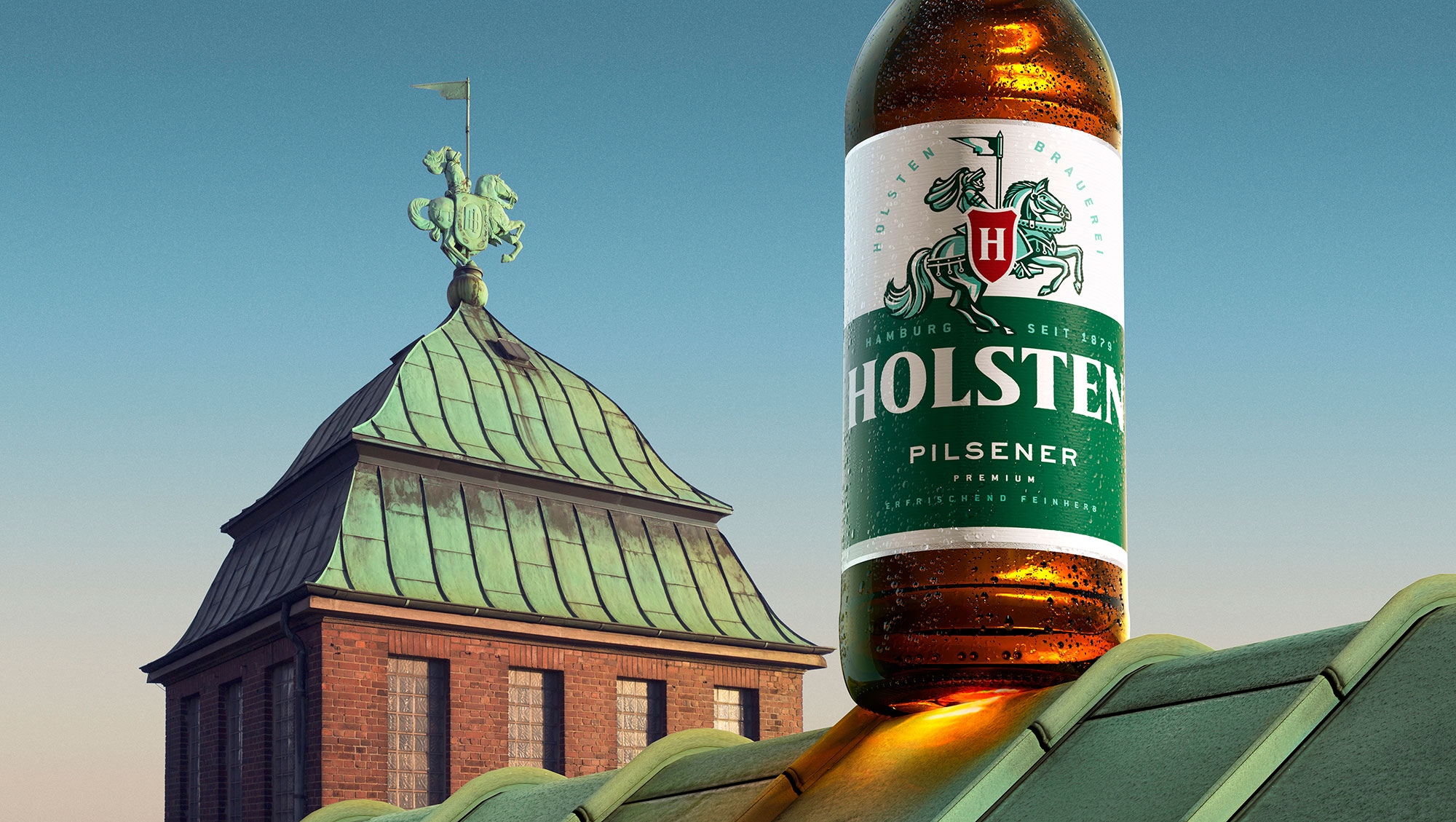
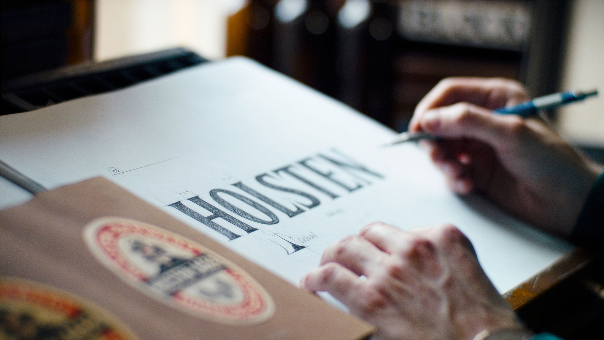
Beer aficionados will also notice that the shield-shaped label has been removed from the bottle, and a "light and refreshing" teal colour has been added to reflect the oxidisation of the knight statue that sits atop the Holsten brewery tower. Plus, there's a new handcrafted wordmark, which draws on typography and labels found in the Holsten archives (though we have to say, it is extremely similar to the previous incarnation).

Design Bridge's bespoke approach to the Holsten rebrand has resulted in a unique, authentic visual identity that doesn't appear to be aping anything already out there. We bet Coors Light is wishing it had taken a similar approach with its recent redesign, which many felt was a little too familiar.
Read more:
Sign up to Creative Bloq's daily newsletter, which brings you the latest news and inspiration from the worlds of art, design and technology.

Georgia has worked on Creative Bloq since 2018, and has been the site's Editor since 2023. With a specialism in branding and design, Georgia is also Programme Director of CB's award scheme – the Brand Impact Awards. As well as immersing herself with the industry through attending events like Adobe Max and the D&AD Awards and steering the site's content streams, Georgia has an eye on new commercial opportunities and ensuring they reflect the needs and interests of creatives.
