The iconic Kellogg's logo has been turned into a whole nostalgic typeface
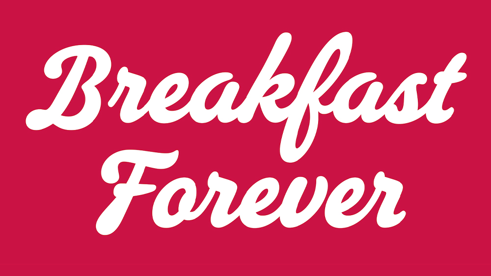
The Kellogg's logo is well-known across much of the Western world. Many kids grew up poring over its every stroke and curve during breakfast (OK, maybe that was just me). Now those lines have finally inspired an whole typeface devised from the famous script logo.
For anyone not involved in typography, this might not seem like a massive feat. I mean, 20% of the work was already done, right? But extracting an entire font design from just seven characters isn't an easy task. The Kellogg's logo is instantly recognisable when it says 'Kellogg's'. But designers had to create a typeface that would be just as unmistakable when it says anything at all.
The history of the Kellogg's logo is fairly simple. It was initially designed in 1907, based on founder William Kellogg Co’s signature. It was made more stylized in 1916 and cleaned up further in 1955. Other than the colour, it's barely changed since then.
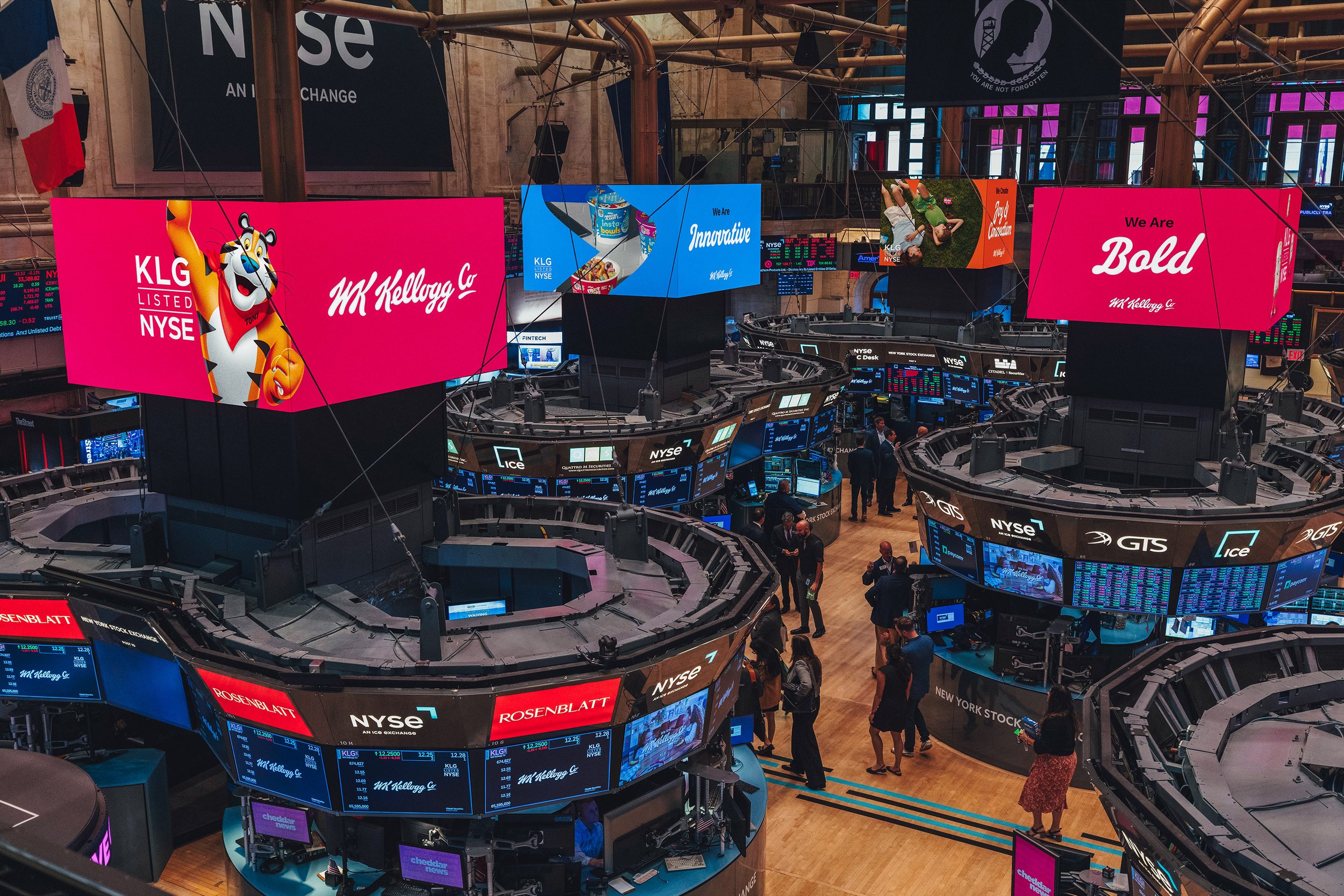
Article continues belowThe idea to now turn that enduring script logo into a typeface followed the separation of the Kellogg Company into two independent public companies: UK-based Kellanova, focusing on cereal, snacks and more for the international market, and North America-focused WK Kellogg Co. The new typeface is for the latter. But how do you expand the limited structures of a logo design into full collection of letters while still preserving its essence?
The idea came from Harlie Brindak, creative director at Brunswick, who envisioned a working font based on the company founder’s iconic signature as a tribute to his entrepreneurial spirit. She had been working with XYZ Type on refining the lettering for the WK Kellogg Co logo, so she asked the digital foundry if it could also turn the logo into an entire typeface.
A photo posted by xyz_type on
But that wasn’t as simple as drawing letterforms that looked like the Kellogg's logo. XYZ had to create "a brand-new typeface that’s always existed." It brought in Rodrigo Saiani from Plau , a Type Network partner foundry, and began to research the history of Kellogg’s packaging and advertising while also studying lettering and sign-painting manuals from the early 20th century.
“After hours searching through treasure troves of vintage lettering for clues to the project’s toughest challenges, we put pencil to paper," Rodrigo says. A lot of back and forth followed. The first challenge was to match the capitals to the dramatic Kellogg’s K. Ben Kiel and Jesse Ragan of XYZ chose hand-drawn sketches that matched the feeling of the logo but would be legible as stand-alone letterforms. Then, they had to define a lower case that would maintain that dynamism without being too distracting.
Sign up to Creative Bloq's daily newsletter, which brings you the latest news and inspiration from the worlds of art, design and technology.
“We wanted shapes that felt authentic to the era,” Jesse says. “But a contemporary audience would find many of those old-fashioned script structures less than legible. We needed iron-clad clarity.”
XYZ says that arriving at a steady, highly legible typeface required lots of small decisions. A key solution early on was to reduce the K’s steep incline for a better fit between capitals and lower case. Ensuring the legibility of the I and the J was also particularly challenging, and XYZ says the research into old sign-painting manuals paid off here, inspiring a variety of options that Brunswick Creative then tested in working files.
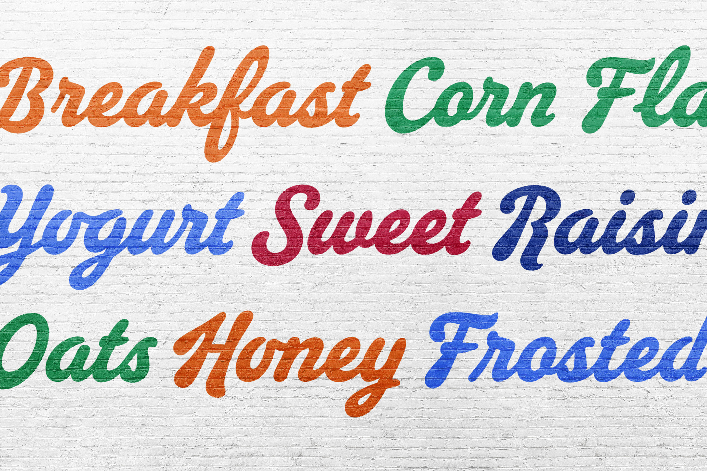
It was also decided not to use a cursive structure for the Q, F and T in order to make letters easier to recognise. Meanwhile, special glyphs like the "stair-step ll" and the 'e' with an entry stroke were created to match the spontaneity of the logo.
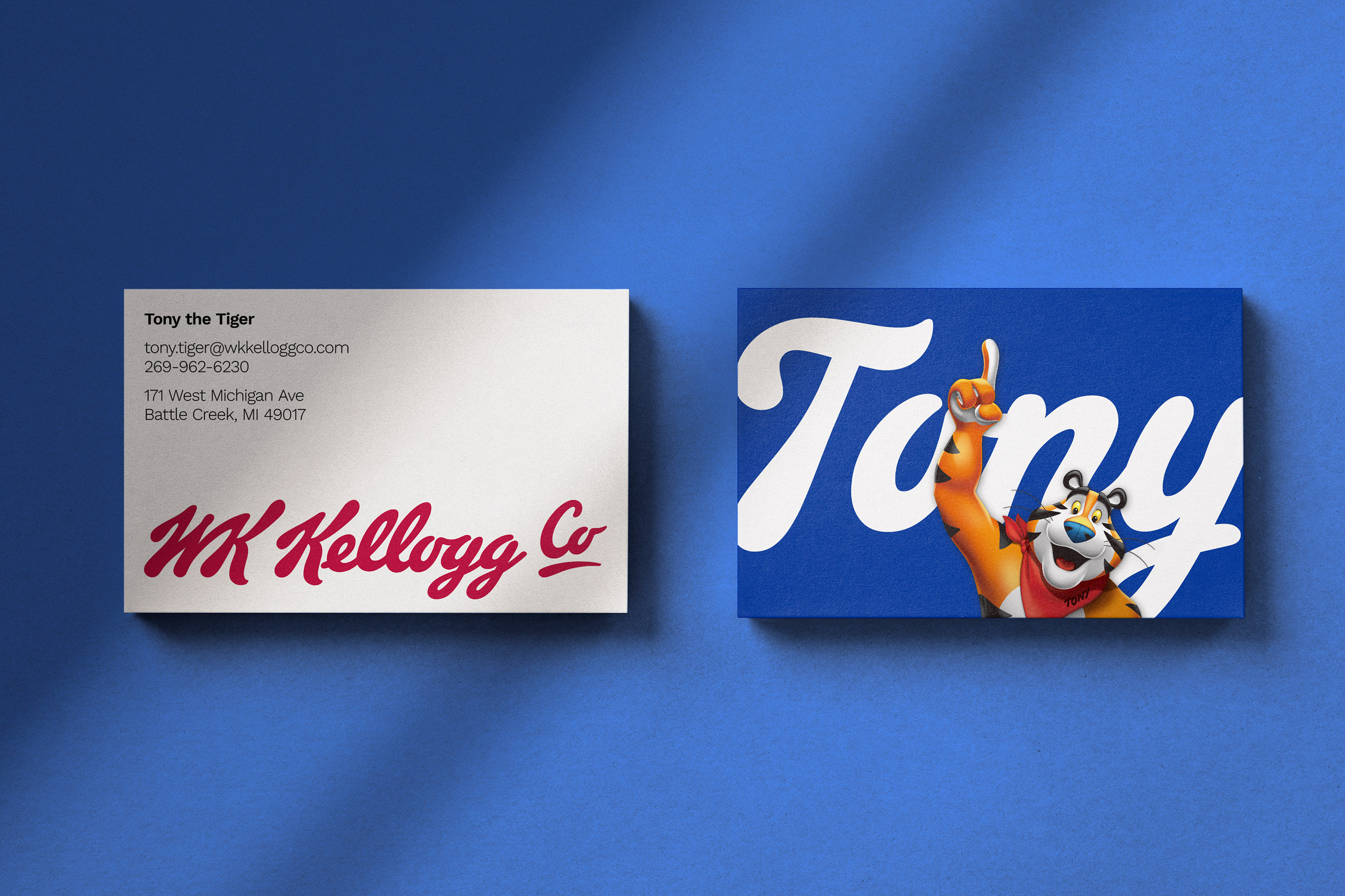
OpenType contextual alternates allow glyphs to be automatically substituted at the beginning, middle, or end of a word, producing a more natural effect, closer to hand-drawn lettering. However, the idea was to create a typeface for everyday business communication. Since programs such as PowerPoint don't support OpenType features, the default characters had to work well without them.
You can learn more in the case study at XYZ Type. For more logo inspiration, see our pick of the best logos and the history of the Deutsche Bank logo, which has just turned 50 years old.

Joe is a regular freelance journalist and editor at Creative Bloq. He writes news, features and buying guides and keeps track of the best equipment and software for creatives, from video editing programs to monitors and accessories. A veteran news writer and photographer, he now works as a project manager at the London and Buenos Aires-based design, production and branding agency Hermana Creatives. There he manages a team of designers, photographers and video editors who specialise in producing visual content and design assets for the hospitality sector. He also dances Argentine tango.
