Not everyone thinks the new Kia logo is a disaster
All press is good press, right?

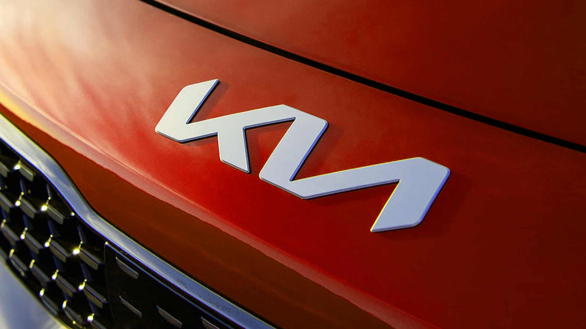
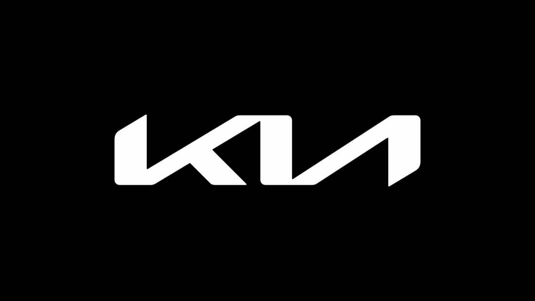
Ah, the new Kia logo. Despite being unveiled in 2021, the updated wordmark became the most contentious design topic of last year when Google data showed that around 30,000 Google searches for 'KN car' are being made a month. But is the supposedly illegible logo as disastrous as people think?
In a new interview, a sociologist specialising in logo design trends has claimed that things perhaps aren't as bad as they seem – and in actual fact, the slightly confusing design could even be – whisper it – a good thing. (Looking for inspiration? Check out the best logos of all time.)

In an interview with Marketplace, James I. Bowie claims that despite those erroneous Google searches, Kia doesn't seem to be suffering too much. "It’s been two years. Their stock appears okay," he claims. Bowie also shed some light on what he believes to be the rationale behind the design. "I think they’re maybe looking to project more of an upscale feel," he says. "They focused on this idea of mobility and movement, I think, looking to the future, and the logo was a handy way to signal that change that they were looking for."
And Bowie even suggests the confusion might not be all bad. "I think the fact that 30,000 people a month are Googling “KN Car” because they don’t seem to be able to read the logo might sound initially like a bad thing. But I think it shows that people are curious, like, ‘Hey, what’s that cool car I saw?’ In my opinion, that’s better than people ignoring your product altogether."

Still, there's no denying that the design has got designers talking – and even coming up with hilariously ingenious solutions to the problem. And Kia can take some solace from the fact that it isn't the only car manufacturer to have caused road rage recently. The subtly rebranded Audi logo recently upset traditionalists, and the less said about Volkswagen Italy's Instagram bio, the better. But when it's time for the next rebrand, Kia's designers might want to check out our guide on how to design a logo.
Read more:
- The latest Aston Martin logo makes perfect sense
- TikTok still can't get over that terrible Hershey's logo redesign
- New Apple logo revives iconic colours for major store launch
Sign up to Creative Bloq's daily newsletter, which brings you the latest news and inspiration from the worlds of art, design and technology.

Daniel John is Design Editor at Creative Bloq. He reports on the worlds of design, branding and lifestyle tech, and has covered several industry events including Milan Design Week, OFFF Barcelona and Adobe Max in Los Angeles. He has interviewed leaders and designers at brands including Apple, Microsoft and Adobe. Daniel's debut book of short stories and poems was published in 2018, and his comedy newsletter is a Substack Bestseller.
