The world's largest library, the Library of Congress based in Washington, DC, has been given a typographic rebrand and new logo design courtesy of legendary studio Pentagram. With the aim of making a dynamic brand identity that helps to make the world's largest library accessible to all, Pentagram's rebrand uses lettering as a metaphor for a bookshelf or bookcase.
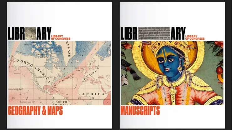
The Library of Congress itself is home to over 32 million catalogued books and other print materials spanning 470 languages. With such a diverse range of mediums to cover, Pentagram's solution of sandwiching images between the word 'Library' set in Druk Condensed Super is a clever way to accommodate everything. Meanwhile, the full name is brought to life in Sharp Grotesk 20.
Article continues below"Its central mission is to provide a rich, diverse and enduring source of knowledge that can be relied upon to inform, inspire and engage. The breadth and power of its collections should be easily understood, and be coupled with an invitation for all to visit physically or virtually to take advantage of all the treasures within."
Pentagram's rebrand replaces the previous logo and look designed by Chermayeff & Geismar & Haviv in 2010, which saw the American flag incorporated into the image of an open book. See how the two designs compare by clicking left to right in the gallery below with the arrows.


As the library serves Congress, the federal government and the American people, rebranding it was a tough brief. By abandoning some of the more patriotic imagery found in the previous iteration though, this new brand levels the playing field between the 'library' and 'Congress' parts of its name.
"All of us are living in a period of massive change in the creation, analysis, and use of information and libraries have an important role to play as collectors, curators, educators, and experts," David S. Mandel, director of the Center for Exhibits and Interpretation at the Library of Congress, told Pentagram.
"As the world’s largest library, we were drawn towards a bold direction that emphasises the library as a vital cultural institution."
Watch the rebrand in action via the video below.
Related articles:

