Lucozade flips its identity with refreshing new logo
It’s a small change with a big impact.
Sign up to Creative Bloq's daily newsletter, which brings you the latest news and inspiration from the worlds of art, design and technology.
You are now subscribed
Your newsletter sign-up was successful
Want to add more newsletters?
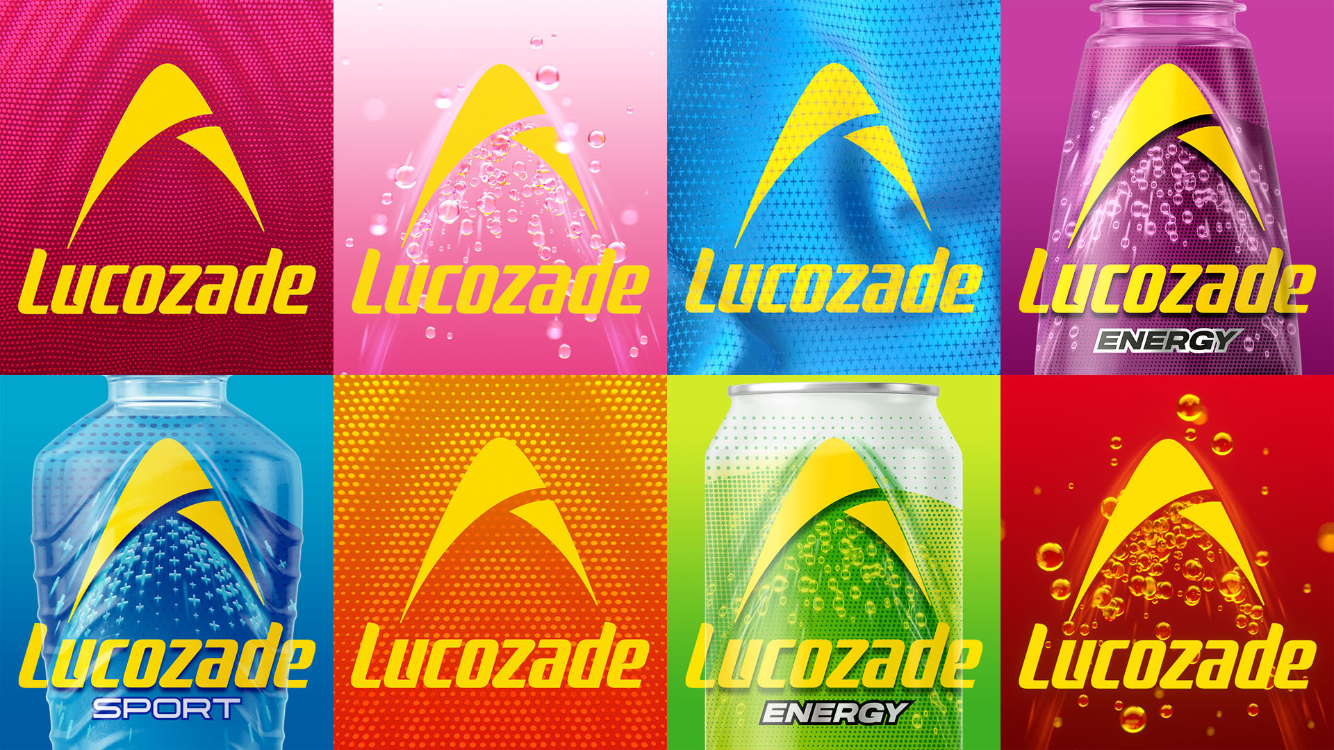
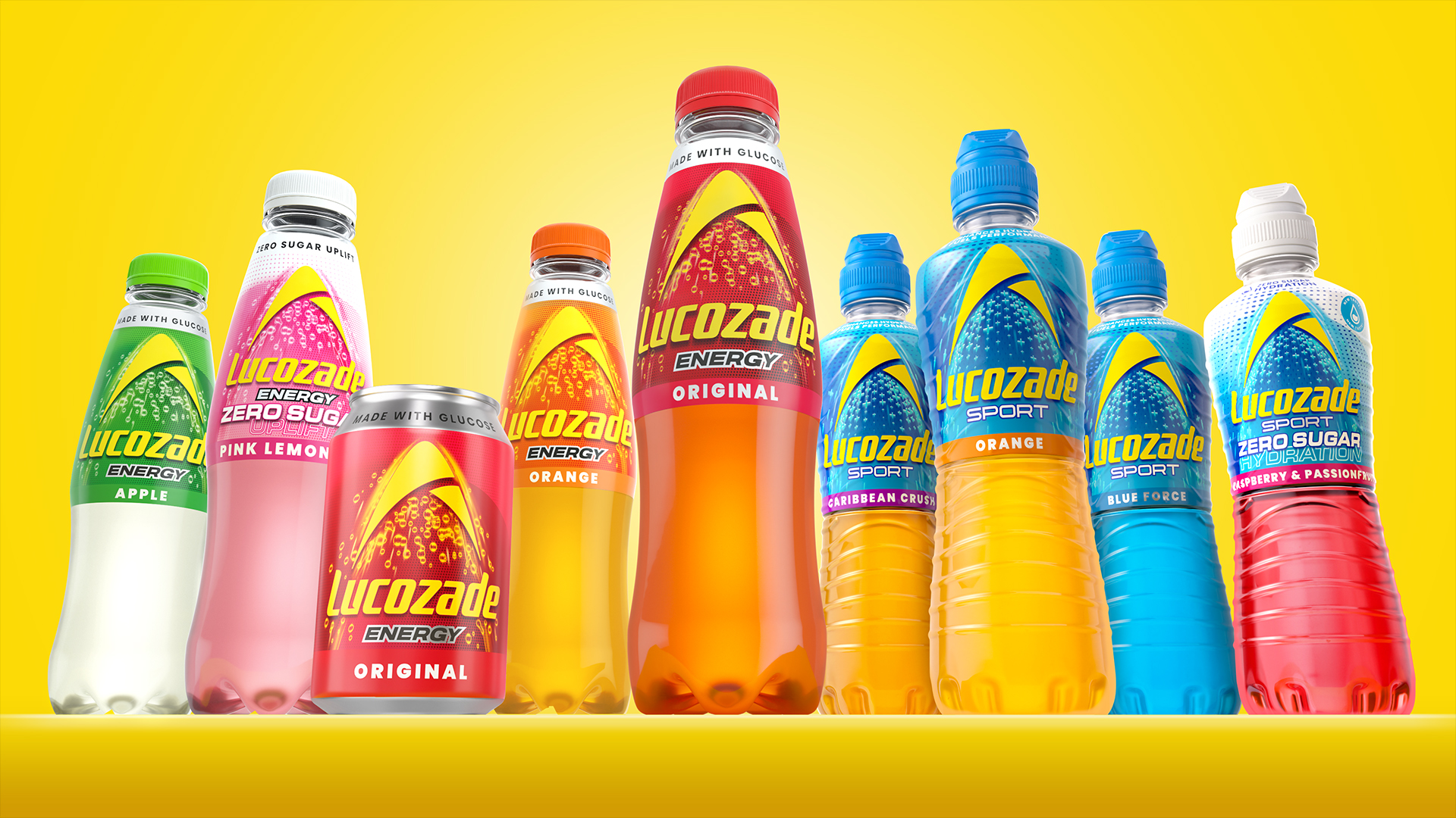
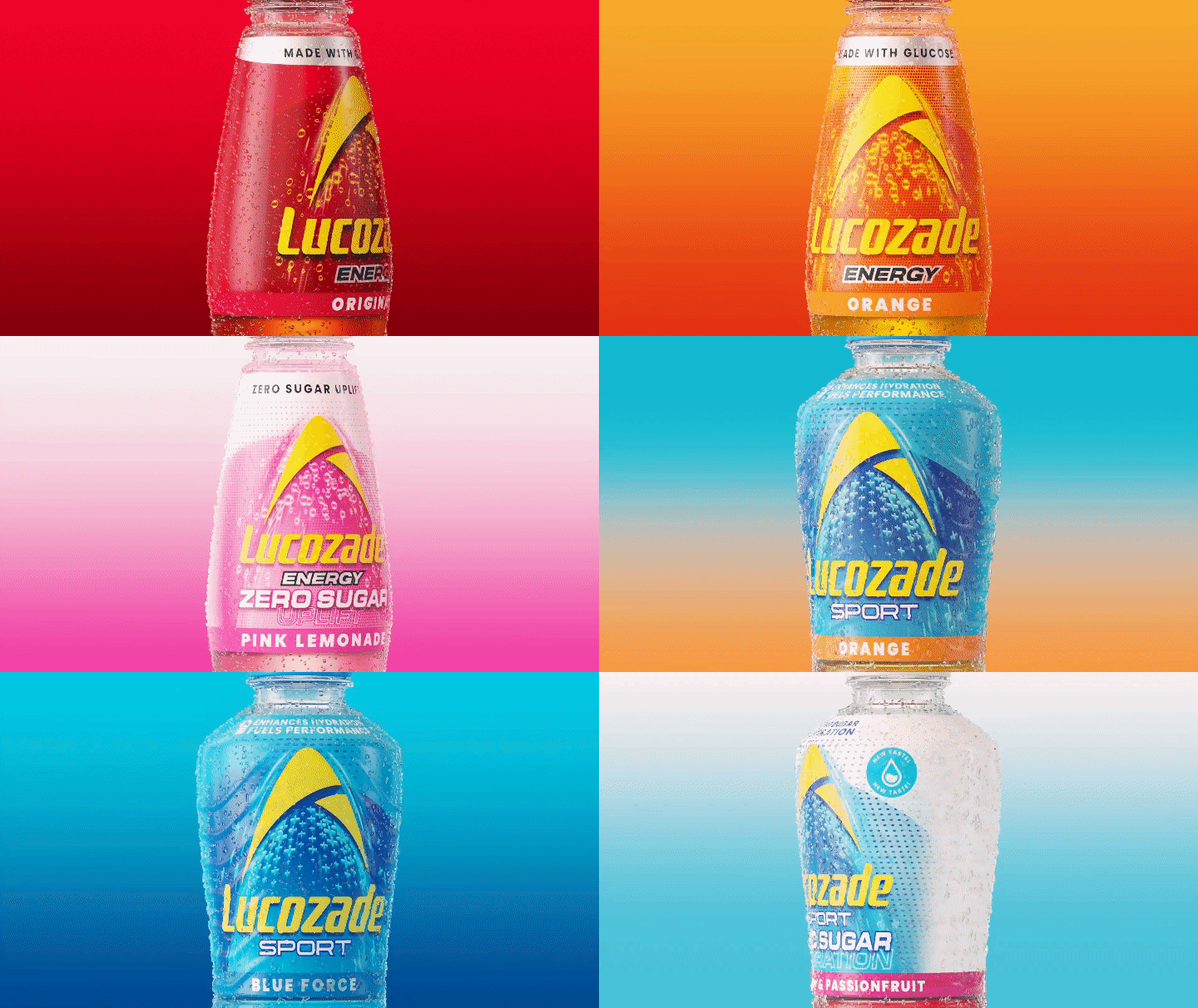
Drinks manufacturer Lucozade has unveiled a punchy new look, unifying the brand's growing selection of sports and energy beverages. In the crowded drinks market, Lucozade stands out as a fierce contender, unifying its products to create a visually striking master brand that maintains its signature look.
With a 97-year history, Lucozade is certainly one of the most iconic brands in the drinks sector. The small but impactful changes to the brand's identity catapult it into the contemporary drinks sphere, proving that legacy can be used to inspire a powerful brand refresh.
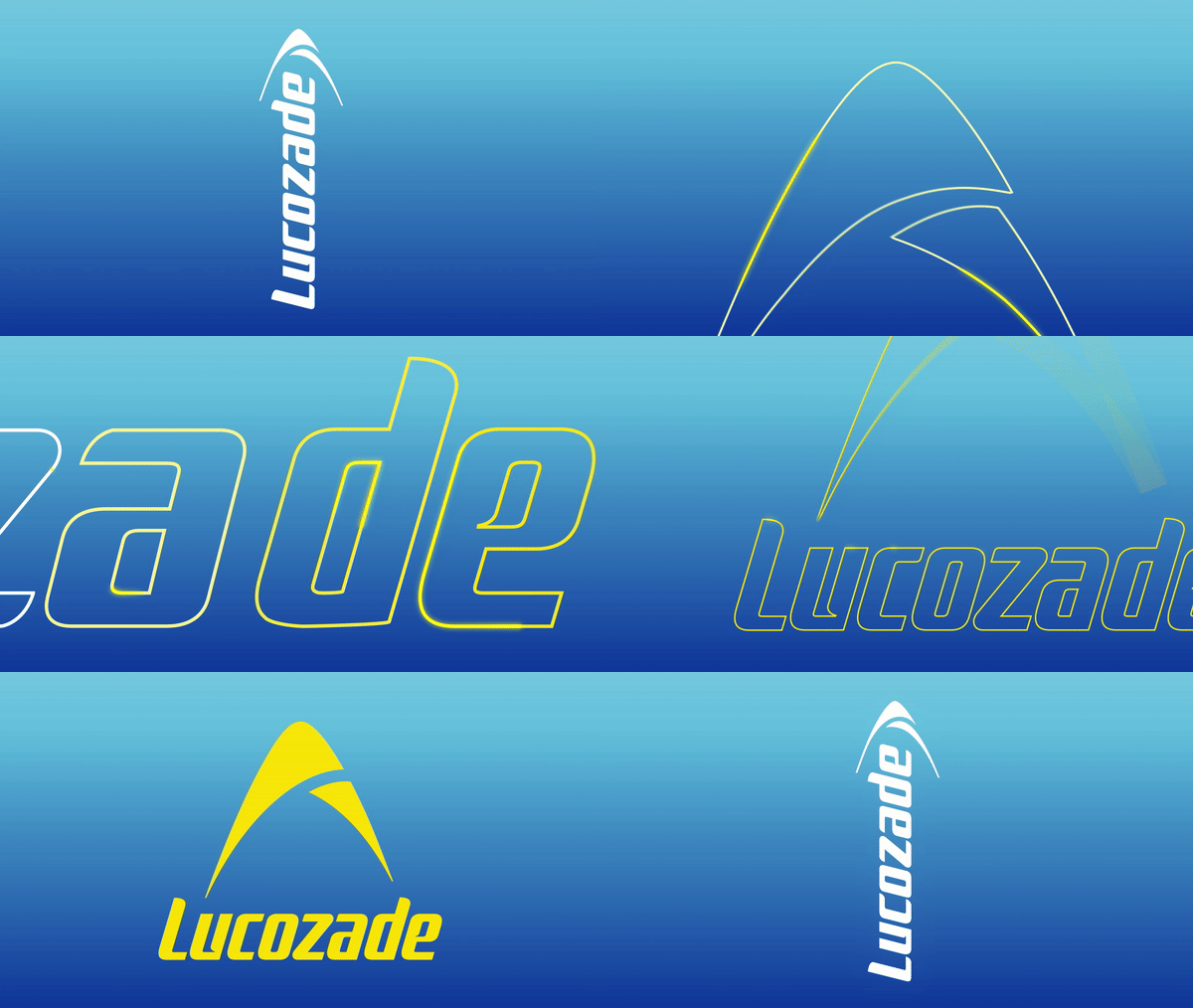
Created by design agency Pearlfisher London, Lucozade's new look centres around the reinvention of its iconic logo. The previous arc design has been redrawn to create a bold appeal, reimagined in an "optimistic, vibrant yellow" for a modern look. The Lucozade wordmark, which has typically been vertical across much of its packaging, has been flipped to create a more authoritative horizontal position, giving the logo a revitalised presence.
Article continues belowThe new look also comes with a host of custom assets, such as the "uplifting bubbles of Lucozade Energy propelling the arc, the bespoke, athletic mesh-inspired pattern for Sport and the introduction of the colour white as a consistent signifier for zero sugar". Together they work to visualise the "vibrant energy and dynamism of Lucozade," by adding a refreshing character to the branding.
"This rebrand was all about enhancing Lucozade's impact on shelf and reinforcing its credibility and iconicity as one of the UK’s most established energy and sports drink brands,” says David Jenkinson, partner, design & experience at Pearlfisher in a press release. "Our revitalised brand logo is the beacon of Lucozade’s positivity, surrounded by elements that cue the brand’s credibility as the original energy brand," adds Elise Seibold, marketing director at Suntory Beverage & Food GB&I.
For more design inspiration, take a look at the mesmerising new identity for British Land. If you're after more iconic branding, check out Lego's vibrant new brand identity that feels both nostalgic and timeless.
Sign up to Creative Bloq's daily newsletter, which brings you the latest news and inspiration from the worlds of art, design and technology.

Natalie Fear is Creative Bloq's staff writer. With an eye for trending topics and a passion for internet culture, she brings you the latest in art and design news. Natalie also runs Creative Bloq’s 5 Questions series, spotlighting diverse talent across the creative industries. Outside of work, she loves all things literature and music (although she’s partial to a spot of TikTok brain rot).
