New city of Paris logo is a design tour de force
The single stroke logo has deep historical roots.
Sign up to Creative Bloq's daily newsletter, which brings you the latest news and inspiration from the worlds of art, design and technology.
You are now subscribed
Your newsletter sign-up was successful
Want to add more newsletters?
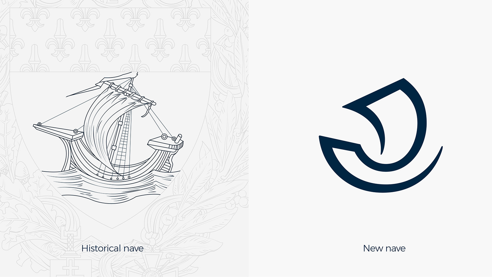
The city of Paris has revealed a new visual identity that celebrates the capital's welcoming spirit. Created by branding agency Carré Noir, the design overhaul includes a modern, single stroke logo that draws on the nautical nave historically associated with the city.
Described by Carré Noir as an identity that sees Paris having a rendezvous with itself, the logo and accompanying branding represents the strength and benevolence of the place and its people. "Paris is proud, Paris is beautiful, Paris is plural," the design firm explains.

For a city with so many famous cultural and historic associations, the decision to use the boat nave as the basis of the design might seem like a surprising one. However, when the City of Paris launched its call for potential identities, the nave was a mandatory part of the brief to designers. In its specifications, it outlined that the motif had to be preserved but evolved.
Article continues belowOriginally used by water merchants who brought considerable wealth into the city, the symbol has a long standing association with Paris. By reinterpreting it in this sleek logo design, Carré Noir has elegantly celebrated what made the city great, while also looking to the future.

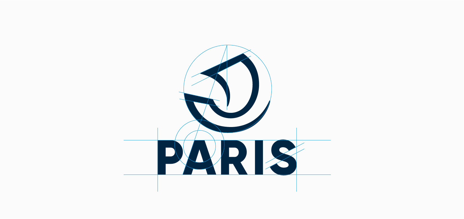
With its tapered line work and measured weighting, the single stroke logo gives an impression of movement and stability, while also remaining instantly recognisable as the historical emblem. Officially set in a monochrome navy blue to give it a modern finish, the logo is also adaptable enough to fit a range of different domains and colour schemes.
Accompanying the nave is a Paris logotype that seems to say 'bienvenue' thanks to the subtle curved crossbar in the letter 'A'. Carré Noir chose Montserrat as the identity's official font.

Related articles:
Sign up to Creative Bloq's daily newsletter, which brings you the latest news and inspiration from the worlds of art, design and technology.
- The story of the Tour de France logo
- New Banksy artworks discovered in Paris
- Then and now: The evolution of 3 iconic logos

Dom Carter is a freelance writer who specialises in art and design. Formerly a staff writer for Creative Bloq, his work has also appeared on Creative Boom and in the pages of ImagineFX, Computer Arts, 3D World, and .net. He has been a D&AD New Blood judge, and has a particular interest in picture books.
