NHS gets a strict new set of branding guidelines
A set of compulsory new branding rules have been introduced for the National Health Service.
Sign up to Creative Bloq's daily newsletter, which brings you the latest news and inspiration from the worlds of art, design and technology.
You are now subscribed
Your newsletter sign-up was successful
Want to add more newsletters?
From overworked staff to a lack of funding, the National Health Service (NHS) is beset with issues. One problem that doesn't immediately stand out though is the company's branding. Despite this, hospitals, GP surgeries and clinics across the UK have been advised to stick to a set of new branding guidelines after it was determined that the current layout was "creating confusion, and concern."
Published in January 2017, the new NHS Identity Policy is concerned with the positioning of the familiar NHS logo design, as well as how the service appears online, in print, and on signage.

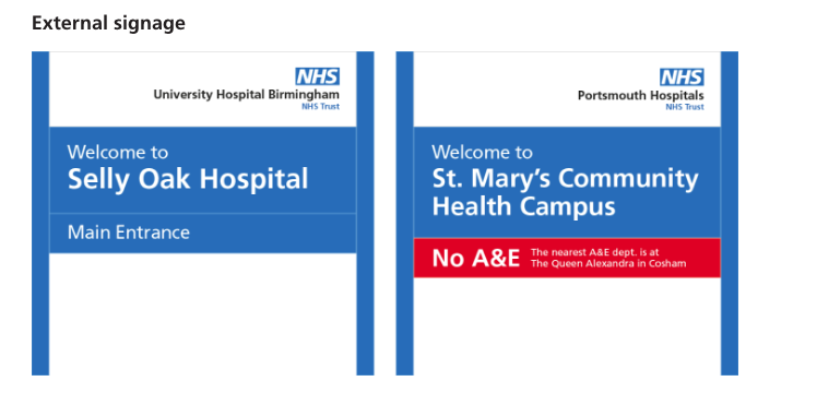
A consistent logo format is at the heart of the policy, after focus groups discovered that in some cases patients and visitors did not even notice the NHS identity at all. The new identity will see a consistent positioning of the NHS logo above the name of the hospital.
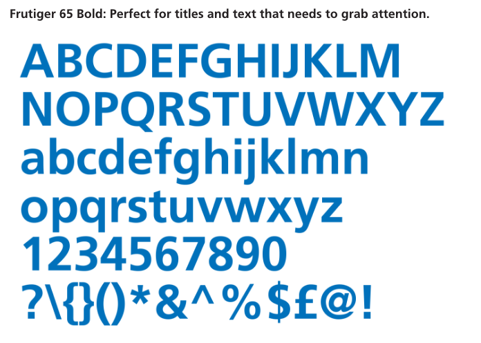
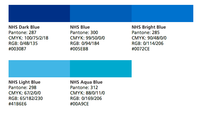
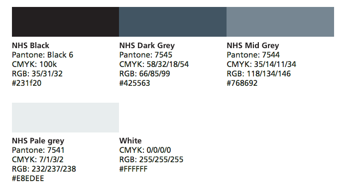
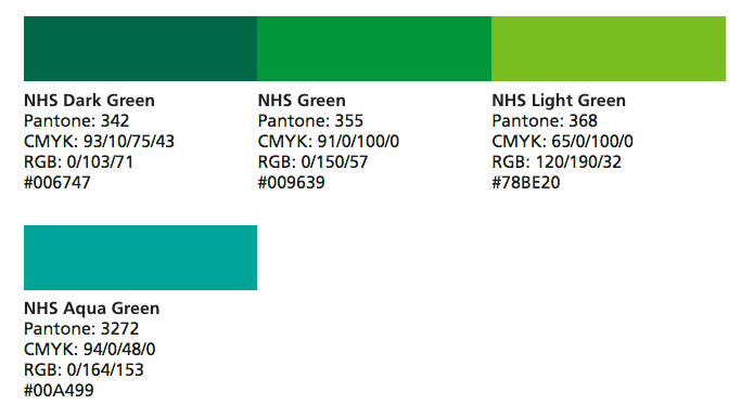
Article continues belowThe number of typefaces and fonts in use has been reduced to help soothe any confusion. However, the new guidelines also introduce a wider colour palette; alongside the familiar NHS blue (Pantone 300), visitors can expect to see neutral shades supported by greens, along with highlights in purple, pink, red, yellow and orange.
As with a lot of changes implemented by the NHS, the Identity Policy has come under fire from various sources, including other hospitals and charities. The organisation has defended the move, pointing out that by using existing print materials there will be minimal waste.
Related articles:
- 10 top tips for branding success
- The blurred lines of branding
- 21 outstanding uses of colour in branding
Sign up to Creative Bloq's daily newsletter, which brings you the latest news and inspiration from the worlds of art, design and technology.

Dom Carter is a freelance writer who specialises in art and design. Formerly a staff writer for Creative Bloq, his work has also appeared on Creative Boom and in the pages of ImagineFX, Computer Arts, 3D World, and .net. He has been a D&AD New Blood judge, and has a particular interest in picture books.
