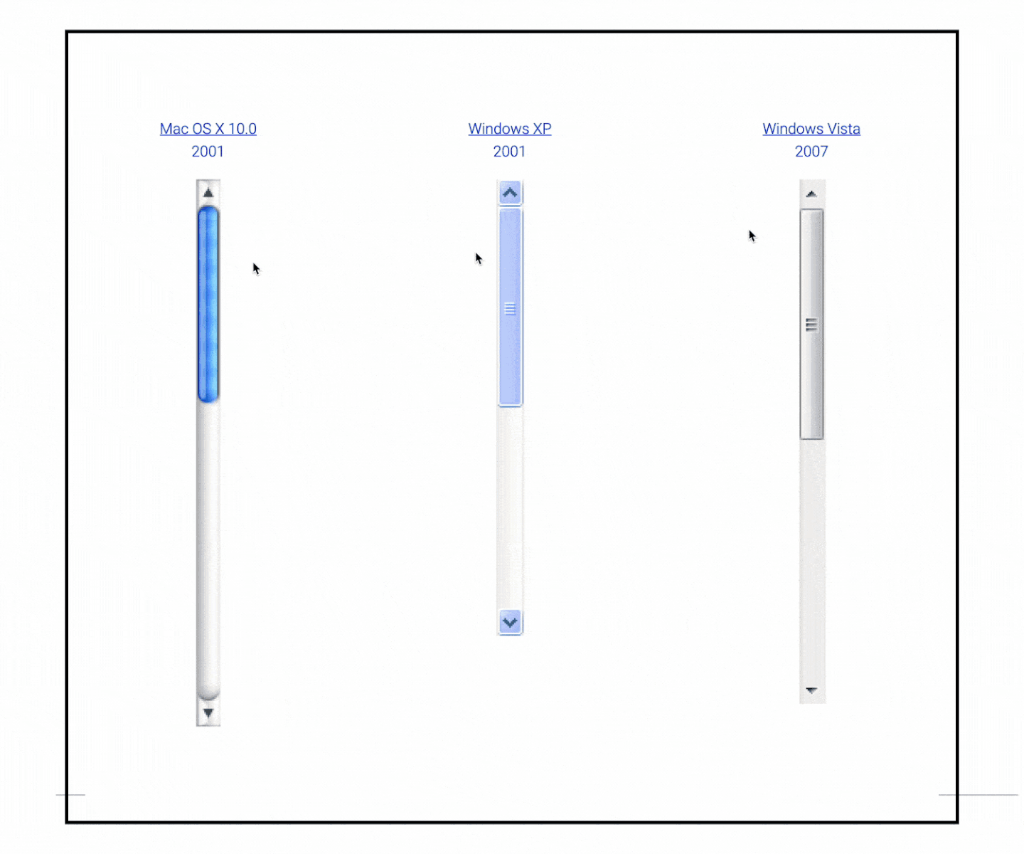
Have you ever considered what your favourite scrollbar design is? It's the kind of UI and UX design that often gets overlooked, because we use it so casually. Web curator and coder Sébastien Matos has created an interactive journey into scrollbar design, meaning you can visit his page and fiddle with over 30 years of UI design.
There's a lot that can be learned from experimenting with great UI design like the scrollbars of the old MacOS, and a site like Matos', while novel, is actually a reminder we need to curate old design concepts in practical ways. There's nothing like actually being able to interact with UI design. Check out our guide to the best UI prototyping tools for a hands-on approach to creating your own.
A visit to Sébastien Matos's site for a fully interactive experience of the best scrollbars of yesteryear is actually a great insight into designs of yesteryear, and it got fans talking, and naturally, debating, which is best. Twitter is known for many hot takes, but when UI fan @BoredElonMusk posted a link, everyone had to have a say.
Evolution of scroll bars. pic.twitter.com/a5N62J5z0bJanuary 21, 2023
Some of the best comments come from fans remembering their favourites. "Windows 95-2000 was a peak scrollbar," wrote @siebel_ess. "Agreed!" responded @bendodge, adding: "Simple, clean lines without being blinding white or so simplified you can't tell what it does."
Before we dig deeper into reactions to these iconic scrollbars, why not familiarise yourself with some of the current trends in web design in general. We have guides to the best website builders as well as the best web design software available today, for example.

Some fans of the classic scrollbar UI design took aim at the current crop of scrollbar design, notably from Apple. @terryogara wrote: "Not a fan of Apple's current dark mode scroll bar solution, where the light gray slider lacks contrast in rest mode, resulting in long pages displaying a Hermann grid illusion in the trough, forcing users to distinguish ghost images from the actual slider."
The debate generally then rages between whether Apple or Microsoft has the best scrollbar UI and UX design, many favouring Vista of everything. The last word is pretty much the view of everyone that loves a bit of nostalgia, as @MagdalaMystikos wrote: "It peaked at 1995 and everything's been worse since then".
If you're a UX and UI designer then read our feature on the ultimate UI design. If you're more of a retro tech lover, then take a look at our guide to the best retro consoles and the best retro controllers.
Read more: