Was this Spotify redesign totally necessary?
It looks nice, I guess.
Sign up to Creative Bloq's daily newsletter, which brings you the latest news and inspiration from the worlds of art, design and technology.
You are now subscribed
Your newsletter sign-up was successful
Want to add more newsletters?
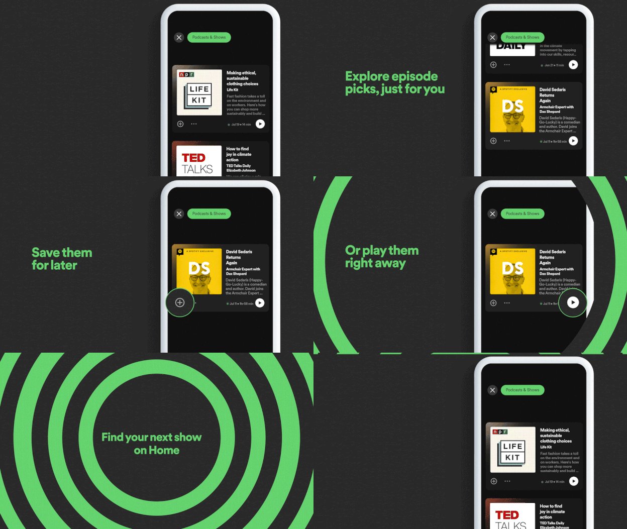
Whether you're team Apple Music or Spotify, we can all agree that the Spotify app is pretty damn nice to look at. However, the music streaming platform has just announced that it is giving its home screen a makeover – but did it need to fix something that wasn't broken?
Spotify's interface is a sleek-looking design based on shades of charcoal and lime green. The platform likes to update its home screen often and the most noticeable change to the app in the last update was on the stadium-shaped tabs in your library. But now a new redesign that has been rolling out across Android devices that focuses on dividing your music and podcasts into two separate feeds. If you're an avid Spotify user but are hoping to upgrade your experience, then make sure you check out our roundup of the best wireless headphones.

The new update features two separate feeds for all your music and podcasts now, so you can discover new tunes and shows easier than ever before. I don't listen to a lot of podcasts so I like the fact that the shows are now tucked away instead of taking over my music feed at the same time.
Article continues belowAccording to Spotify, "By creating these feeds, Spotify will help listeners to easily scroll through the type of content they’re looking for at that moment. The updated interface will make the experience more personalized while allowing users to dig even deeper into their recommendations".

It looks nice and all that, plus I won't have podcasts clogging up my music feed anymore (and vice versa) but I can't help but wish that Spotify focussed on a few other updates within the app. Perhaps it could have added folders within folders, more accurate live lyrics and notes to playlists.
We will have to wait to find out when the updates start rolling across the Apple devices, but for now, all you Android users can enjoy the update. If you want to have a taste of the new Spotify and can't wait until it gets to Apple devices then make sure you check out our roundup of the best Android tablets.
Read More:
Sign up to Creative Bloq's daily newsletter, which brings you the latest news and inspiration from the worlds of art, design and technology.

Amelia previously worked as Creative Bloq’s Staff Writer. After completing a degree in Popular Music and a Master’s in Song Writing, Amelia began designing posters, logos, album covers and websites for musicians. She covered a range of topics on Creative Bloq, including posters, optical illusions, logos (she's a particular fan of logo Easter eggs), gaming and illustration. In her free time, she relishes in the likes of art (especially the Pre-Raphaelites), photography and literature. Amelia prides herself on her unorthodox creative methods, her Animal Crossing island and her extensive music library.
