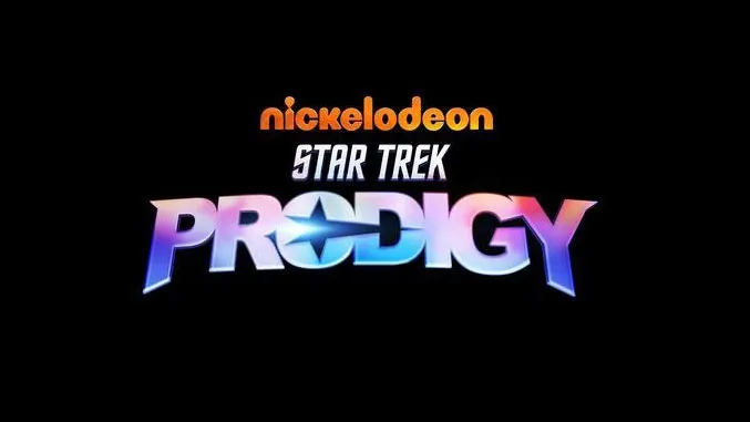
Star Trek has been repackaged for the next generation, in the form of an CGI animated series titled Star Trek: Prodigy. Set to launch next year on Nickelodeon, the show (aimed at kids, but no-one's judging) was announced at this year's Comic Con@Home, and comes with a brand new Star Trek logo, which serves as some serious logo design inspiration.
The new design (above) is an attention-grabbing design for a new generation of Star Trek fans. Though the logo retains the familiar italicised Star Trek font style, the 'Prodigy' lettering brings it hurtling into a new age with a colourful, futuristic design – perfect for attracting a younger audience. Traditional Starfleet insignia has been rotated and elongated, now in the form of a horizontal swoosh across the lettering.
New Star Trek logos never fail to cause excitement and some strong opinions. On Twitter, the font choice has been already questioned.
This is an absolutely horrible font choice they did. I mean, seriously? Arial Black?July 23, 2020
While some are analysing the logo compared to those that have come before. (Also, check out the gorgeous colour palette on the background on the below logo.)
is this that animated series that was supposed to have a cast of kids that finds an old abandon starship? or something else?also notice how the Star Trek logo has gone back to the one used in the 3 Kelvin films and not the one used for Discovery pic.twitter.com/18AfmUyIU9July 23, 2020
The new series is to be released in 2021 and, according to a statement by Nickelodeon and CBS Television Studios, "follows a group of lawless teens who discover a derelict Starfleet ship and use it to search for adventure, meaning and salvation".
We're looking forward to seeing how the design translates into the new CGI animation, and we wonder how long it'll be before Space Force rebrands again to keep up with a new Star Trek logo design (see Space Force's most recent redesign, and subsequent roasting here).
Read more:

