The new Wrigley's Extra logo is delightfully fresh
(But the rebrand isn't totally cool.)
Whether you know it as Extra, Orbit or Freedent, chances are you're familiar with Wrigley's products. One of the leading chewing gum brands, Wrigley's is synonymous with minty freshness – but is its latest rebrand as cool as the product itself?
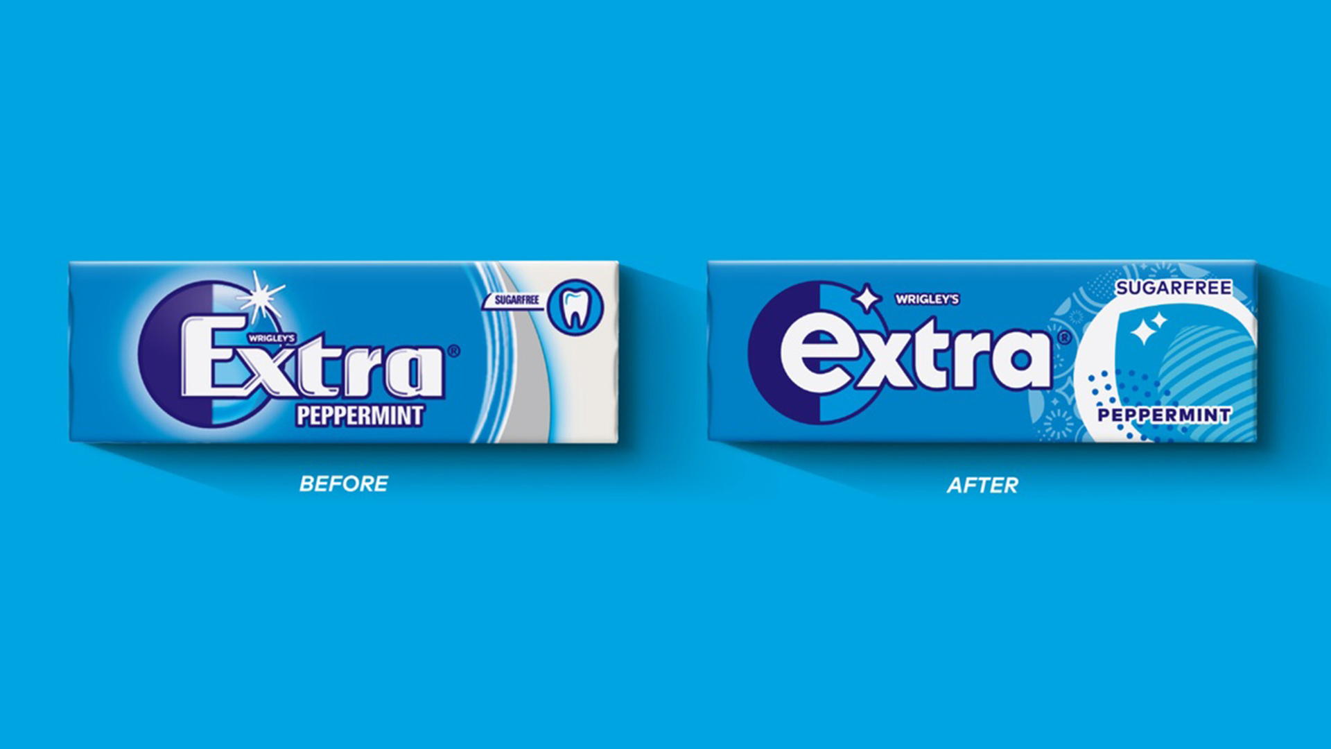
Yet another brand to join to flat design party, Wrigley's has unveiled a much cleaner brand identity, with a new lowercase logo. And it's all in the name of moving away from the cold "dental hygiene" aesthetic. (Looking for inspiration? Check out the best logos of all time.)

Designed by design agency Elmwood in an attempt to help Extra "get its 'ding' back" (the ding being the flash of light on the logo) by helping the brand "appeal to younger consumers and transform the brand into an iconic lifestyle brand."
Article continues belowShadowing has been entirely removed from the logotype, and the caps lock has been well and truly disabled, resulting in a much rounder and indeed friendlier look. According to Elmwood, chewing gum brands have previously opted for a more medical look to combat the notion that they're bad for teeth. But the new "softened curves and a clean eye-catching design" are intended to give off a much stronger 'lifestyle' aesthetic.

I'm a fan of the new look, which certainly feels fresher and, yes, cooler than the previous somewhat dated logo. Over on Reddit, the packaging design as a whole is dividing opinion. Many are fans of the logo itself, with one user describing it as "a complete improvement. Clean, consistent, and easy to read." (That 'e' does seem to be reminded more than a few users of Internet Explorer, though).
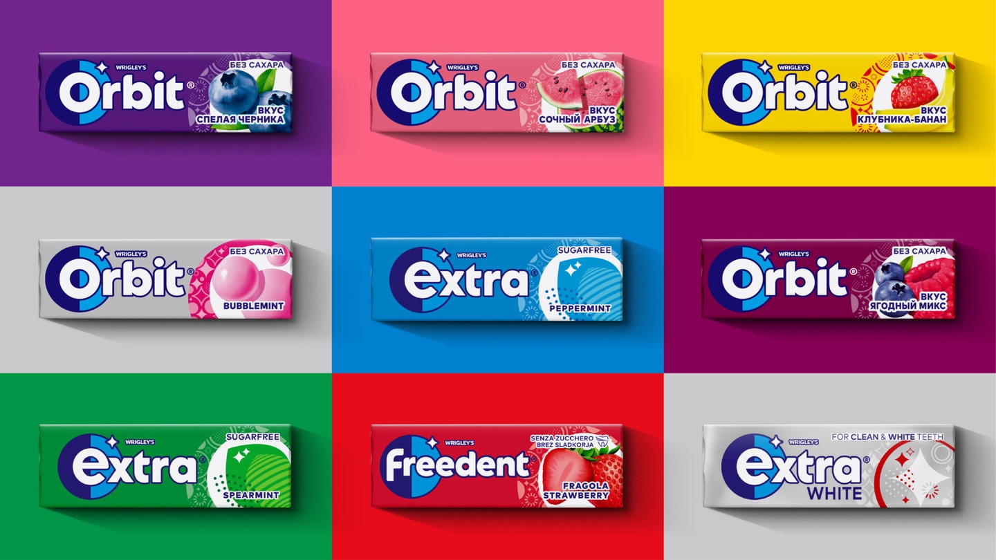
Less popular is the busy geometric pattern adorning the right side of the packaging, which seems at odds with the otherwise clean new look. "The right side has WAY too much going on. So many patterns and shapes, for what?" One user comments, while another adds, "Looks like the patterns I’d draw on my textbooks as a teenage girl."
Still, while the packaging design might not be a total triumph, itself, the identity as a whole, particularly that clean new logo, is a winner in my book. It's not quite Burger King rebrand levels of flat design success, but there's plenty to chew on here (sorry).
Sign up to Creative Bloq's daily newsletter, which brings you the latest news and inspiration from the worlds of art, design and technology.
Read more:

Daniel John is Design Editor at Creative Bloq. He reports on the worlds of design, branding and lifestyle tech, and has covered several industry events including Milan Design Week, OFFF Barcelona and Adobe Max in Los Angeles. He has interviewed leaders and designers at brands including Apple, Microsoft and Adobe. Daniel's debut book of short stories and poems was published in 2018, and his comedy newsletter is a Substack Bestseller.
