The Xbox One X logo nearly looked VERY different – here's why
Our heads are spinning.

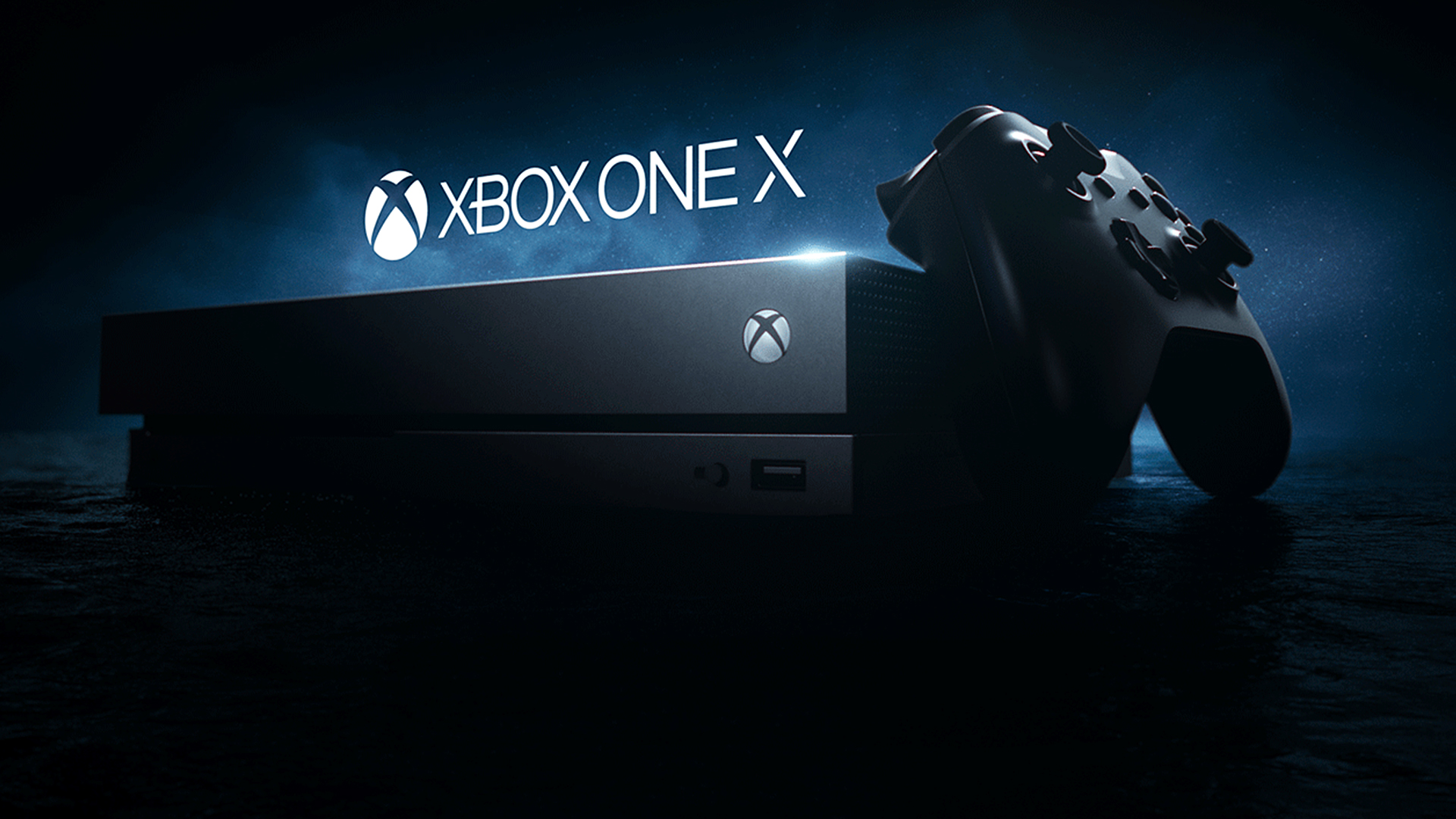
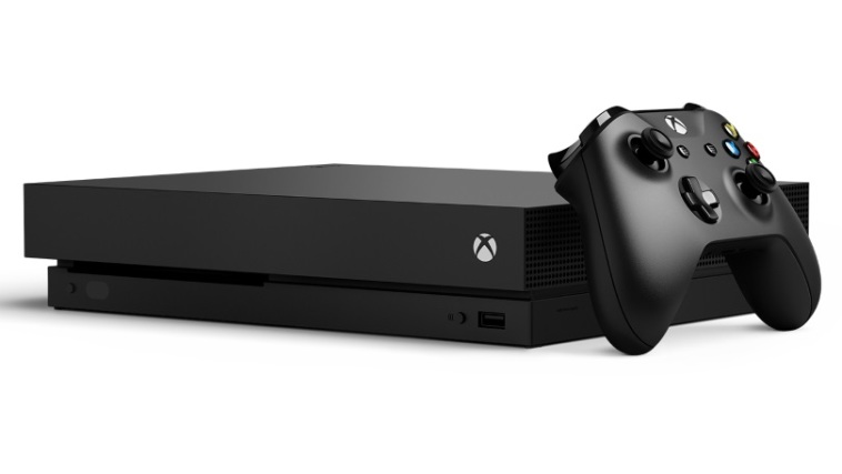
Along with the PlayStation and Nintendo logos, the Xbox symbol is one of the most recognisable gaming logos in the world. The design has been present and correct on every console since the Xbox 360 – but it was nearly very different on the Xbox One X.
In an interview with GQ magazine, head of Xbox Phil Spencer recently revealed that Microsoft toyed with implementing a motorised logo that could rotate 90 degrees, so it was always the right way up regardless of how the user had chosen to position the console. (Looking for logo inspiration? Check out the best logos of all time.)

Xbox designers "never like the logo sitting sideways," Spencer told GQ – so the solution (for a while) was a motorised logo. And it wasn't even expensive to implement – Spencer says it would cost the production "a single solitary buck". Even the non-motorised rotating logo on the original PS2 may have cost more than that.
Article continues belowBut as Spencer points out - one buck might not be a huge sum, but what if Microsoft sold a hundred million Xbox One X consoles? "Suddenly, that’s a hundred million dollar decision." In the end, the rotating button – described by Spencer as “just another thing that could fail” – wasn’t worth the potential cost.

It's always fascinating to learn about gaming design ideas that weren't to be. From those hundreds of unused Nintendo Wii logos to that horrendous McDonald's PS5 DualSense controller, there've certainly been a few near-misses over the years. And there could be more to come – we're still waiting to find out whether Sony's wacky new controller concept will become a reality.
Read more:
- Just one female Super Mario character has teeth – can you guess which?
- Microsoft's secret Xbox Easter egg finally discovered after 20 years
- Xbox's 20th anniversary museum exposes all your gaming secrets
Sign up to Creative Bloq's daily newsletter, which brings you the latest news and inspiration from the worlds of art, design and technology.

Daniel John is Design Editor at Creative Bloq. He reports on the worlds of design, branding and lifestyle tech, and has covered several industry events including Milan Design Week, OFFF Barcelona and Adobe Max in Los Angeles. He has interviewed leaders and designers at brands including Apple, Microsoft and Adobe. Daniel's debut book of short stories and poems was published in 2018, and his comedy newsletter is a Substack Bestseller.
