A clever take on corporate brochure design
London agency reinvents the art of company packaging to add potency to the Privacy International Prospectus.
Sign up to Creative Bloq's daily newsletter, which brings you the latest news and inspiration from the worlds of art, design and technology.
You are now subscribed
Your newsletter sign-up was successful
Want to add more newsletters?
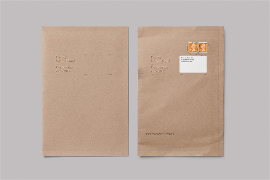
Company prospectuses aren’t always expected to contain the most exciting information. However, proving that good design can make the driest of subjects appear interesting is this prospectus for Privacy International, created by designers at London-based agency This is Real Art.
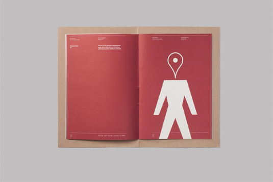
Privacy International’s mission is to defend the right to privacy across the world, and to fight unlawful surveillance and other intrusions by governments and corporations into the public’s private life.
With this in mind, the idea behind the design of the prospectus was to “dramatise the notion of privacy,” as creative director Paul Belford explains.
Article continues below 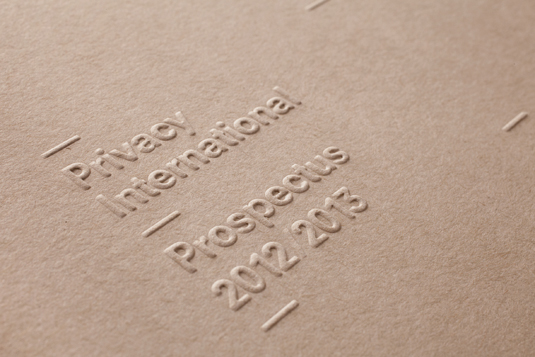
The way in which the cover has been designed means that the content of the prospectus remains hidden until the reader physically rips the perforations on the edge, and opens up the package. This sealed cover serves a double purpose, as it is also acts as the postal envelope.
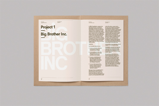
The company’s details have been subtly embossed on the cover, again referring to the notion of privacy, while Neuzeit and Akkurat Mono fonts were used throughout the publication and have been interspersed with relevant vector illustrations created by the team at This is Real Art. The paper stocks used were Flora Tobacco for the cover and Avebury Recycled Wove for the inside pages.
This showcase was originally published in Computer Arts issue 206.
Now read:
- 10 awesome examples of brochure design
- Mobile website design: 20 pro tips
- The 20 best iPhone and iPad apps for typefaces and fonts
Have you seen any inspiring packaging design? Let us know about it in the comments below!
Sign up to Creative Bloq's daily newsletter, which brings you the latest news and inspiration from the worlds of art, design and technology.

The Creative Bloq team is made up of a group of art and design enthusiasts, and has changed and evolved since Creative Bloq began back in 2012. The current website team consists of eight full-time members of staff: Editor Georgia Coggan, Deputy Editor Rosie Hilder, Ecommerce Editor Beren Neale, Senior News Editor Daniel Piper, Editor, Digital Art and 3D Ian Dean, Tech Reviews Editor Erlingur Einarsson, Ecommerce Writer Beth Nicholls and Staff Writer Natalie Fear, as well as a roster of freelancers from around the world. The ImagineFX magazine team also pitch in, ensuring that content from leading digital art publication ImagineFX is represented on Creative Bloq.
