How to artwork complex packaging designs
Pearlfisher's Brandi Parker reveals how to design a limited-edition twist-off bottle in seven steps.
Sign up to Creative Bloq's daily newsletter, which brings you the latest news and inspiration from the worlds of art, design and technology.
You are now subscribed
Your newsletter sign-up was successful
Want to add more newsletters?
In honour of Super Bowl XLIX and Bud Light's role as an official sponsor of the event, Pearlfisher helped Bud Light design a limited-edition aluminium twist-off bottle.
Printed directly onto the aluminium substrate, the project required Pearlfisher New York's Brandi Parker to use her problem-solving skills to bring the designer's vision to life. She walks us through the project...

My role at Pearlfisher is head of realisation, which is a fun role that's unique to Pearlfisher. What makes Realisation different than your traditional production team is that we're very tightly integrated with design and the design process, and we cover much more than just print production.
Article continues belowThe role actually encompasses structure, 3D, materials and finishes, and we contribute to the design process all the way through a project. This ensures that anything our designers create is actually producible for our clients.
We also help to incorporate new techniques and innovations into the design process, informing our clients and keeping ahead of the curve.
In honour of Super Bowl XLIX, and Bud Light's role as an official sponsor of the event, we helped Bud Light design a limited-edition aluminum twist-off bottle to celebrate the day.
To unite Super Bowl fans and Bud Light fans around the occasion, we created a copy-driven design that was like Bud Light's version of a coach's playbook, with copy like 'Catch the cameraman off guard', 'Run a different route' and 'Wow the crowd' splayed across the bottle.
Sign up to Creative Bloq's daily newsletter, which brings you the latest news and inspiration from the worlds of art, design and technology.
Here, I'm going to share a bit about the Realisation process for the limited edition bottle we created for Bud Light this winter. You can follow by watching the video, or the numbered steps below...
01. Aluminium dilemma
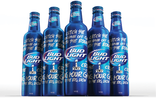
At first glance, the design seemed pretty straightforward. It's copy-driven, with large textured type printed on a can. But we realised that printing on aluminium would be challenging. It requires dry offset printing, where the wet inks can't touch each other – if they did they would bleed into each other.
02. Textured type
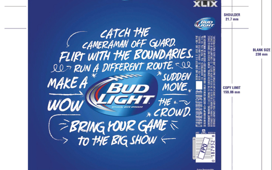
Normally we could create a stay-away to help separate the white text from the blue, but obviously with all the texture within the type, all the silver stay-aways would start to erode the design.
We had to decide: either get rid of the type texture or drop the text to substrate colour – silver. We chose the latter.
03. Pink dots
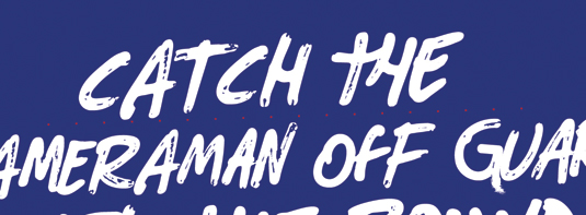
To aid this process, we identified areas in the textured type where we could open up negative space and also areas that we could remove. The pink dots specify the size requirement for texture.
Anything smaller was removed; anything larger we enlarged a bit more to make sure it held during printing.
04. Butt-fitting
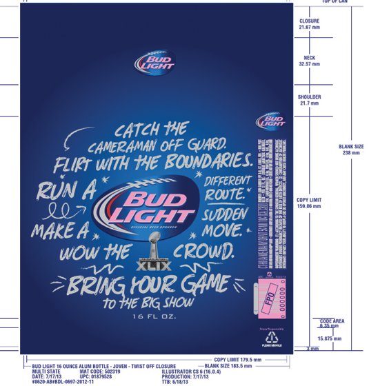
In the finished release file, pink specifies white areas and grey areas are substrate. The background is made up of two blues, which appear on-bottle to be over-printing, but in actuality they are butt-fitting – or placed tightly together in an interlocking dot pattern, allowing the blue-on-blue gradient.
05. Enter the shape-former
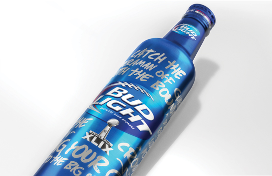
The bottle is formed as a tall cylinder first, then printed, and then heads into a shape-former, which forms the neck. The cap is printed flat and then shaped into the cap you eventually unscrew.
This results in a difference in colour and texture in the neck and cap areas, as the ink is more concentrated here.
06. Exceeding expectations
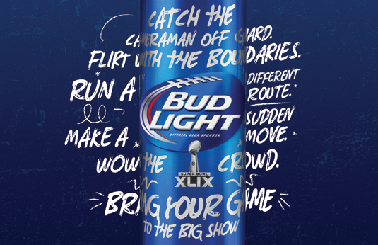
It's crucial to take a step back to make considerations for print, finish, and detail. This objectivity can mean the difference between a great idea that flops and one that exceeds expectations.
In this case, the client was really pleased with the result and we were thrilled to see the final product on the shelf.
Words: Brandi Parker
The full version of this article fist appeared inside Computer Arts issue 242, a typography special that explores the state of contemporary typography. You can grab your copy of Computer Arts 242 here.
Liked this? Try these...
- The evolution of 12 classic logos
- 6 incredible Twitter-powered inventions that will blow your mind
- The ultimate guide to logo design

The Creative Bloq team is made up of a group of art and design enthusiasts, and has changed and evolved since Creative Bloq began back in 2012. The current website team consists of eight full-time members of staff: Editor Georgia Coggan, Deputy Editor Rosie Hilder, Ecommerce Editor Beren Neale, Senior News Editor Daniel Piper, Editor, Digital Art and 3D Ian Dean, Tech Reviews Editor Erlingur Einarsson, Ecommerce Writer Beth Nicholls and Staff Writer Natalie Fear, as well as a roster of freelancers from around the world. The ImagineFX magazine team also pitch in, ensuring that content from leading digital art publication ImagineFX is represented on Creative Bloq.
