4 rules of visual hierarchy in poster design
Hierarchy is a vital skill in poster design. Niall O'Loughlin explains the basic concepts behind it.
Sign up to Creative Bloq's daily newsletter, which brings you the latest news and inspiration from the worlds of art, design and technology.
You are now subscribed
Your newsletter sign-up was successful
Want to add more newsletters?
In understanding how to design a poster, there is a hierarchy of importance which means the most crucial elements must be seen first. The application of hierarchy is a vital skill to learn if you wish to get your message across clearly since you will be working with shapes, icons, colours, images and font.
Failure to correctly establish hierarchy means your message will be jumbled at best and a complete mess at worst. (For examples of folk who got it right, see our pick of the best poster design around.)
When designing posters, it is worth noting that your work needs to get the message across quickly as there are only a few seconds for viewers to process the information. Here, we look at the rules of poster hierarchy which should help you understand where to place certain elements and why they are so important.
Article continues below01. Size of icons and shapes
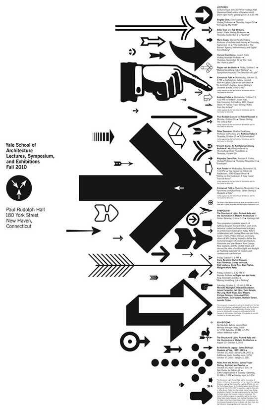
One of the biggest rules of poster hierarchy involves ensuring the size of icons and shapes is reflective of their importance. In other words, the most relevant symbols should stand out on the page. Remember, most people only ever see posters at a distance; if you have huge arrow on a poster for example, viewers will want to know why and this curiosity may cause them to take a closer look.
Another way to attract the eye is through the use of colour. Not only does colour evoke feelings, it also helps distinguish what is important and what is irrelevant. With poster design, it is best to use bright and bold colours on a significant feature as this will draw the eye towards it thus ensuring it is a focal component in the design.
02. Large to small type
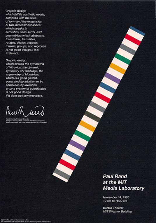
Although adding large symbols and bright colours will undoubtedly attract attention, the reasoning behind the poster is also critical. Some of the most memorable poster designs have involved black and white colours; they were successful because the designer managed to ensure the most important elements possessed a relative contrast to the rest of the poster.
One way to do this is by ordering the title, subtitle and body copy on the poster by size. The title will always be the first thing people see so it should look dominant on the page and be written in a noticeable font. Although the subtitle should be smaller, it needs to support the title. Finally, you need the body copy to be smaller and easy to read.
Sign up to Creative Bloq's daily newsletter, which brings you the latest news and inspiration from the worlds of art, design and technology.
03. Direct the eye
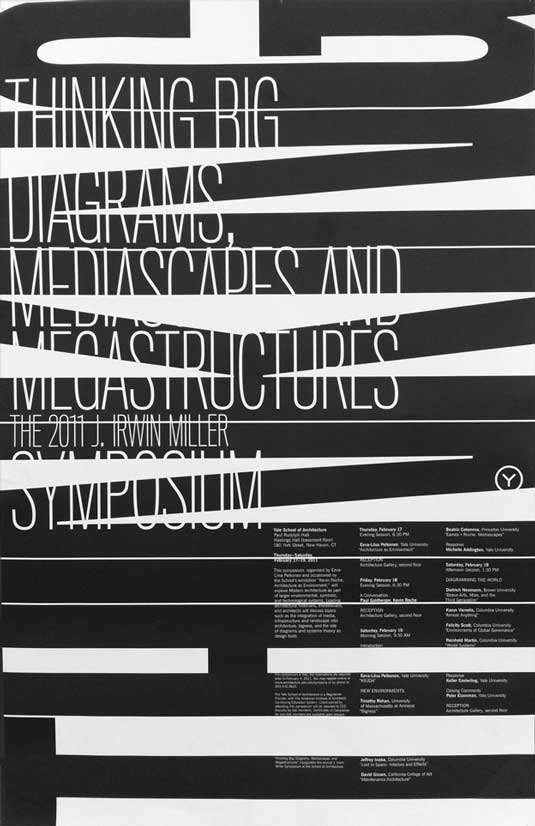
After going to the trouble of creating a killer highlight text or symbol, it would be a shame to waste your advantage by paying less attention to the rest of the poster. Once the eye has been attracted to the main symbol on the page, it will naturally turn its attention to the area beside the symbol. For example, if you have a giant arrow pointing to something on the poster, viewers will obviously look at that space next.
One way to approach this issue is by designing your poster to be read in a similar manner to a book. The human eye is almost 'conditioned' to start at the top left of a page, scroll to the right, then return to the left hand side before following this pattern to the bottom of the page. With this in mind, it is common to have the attention grabber on the top left of the page with information pertaining to a product or event placed in the bottom right hand block.
04. The laws of hierarchical flow
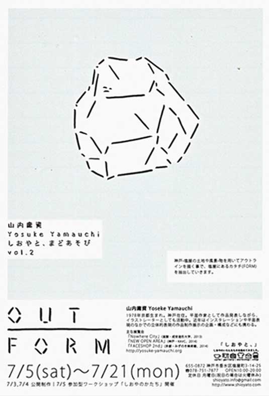
Although you may find success by following the 'book' approach as outlined above, many of the most memorable posters go about things in a completely different manner. Even though the goal is to get viewers from point A to B, there are virtually infinite ways to go about it. Perhaps you wish to get the message across nice and fast or else you want to take viewers on a journey through points C, G, X and Z first.
However, you can ask yourself the following questions to determine whether your attention grabbing symbols follow a logical progression which ultimately leads viewers to where you want them to go?
- Is there a directional tendency to your attention grabbing element?
- Does it make sense in the context of the poster?
- Is it located in the background or forefront?
- Is it clearly in focus?
- What kind of energy does it have?
Conclusion
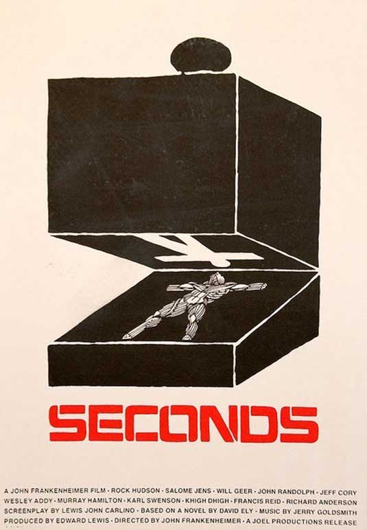
It is incorrect to assume that 'rules' and 'laws' of design hold you back. With a visual hierarchy in place, it is possible for you to create some semblance of order in your poster design by ensuring the most crucial elements are the first to be seen.
Once you attract the attention of the viewer's eye, then you can really let your creative side run wild. As long as there is a logical progression from point A (the attention grabbing element) to point B (the final message the point of the poster), you can design whatever you want on the path there.
Words: Niall O'Loughlin
Niall O'Loughlin is marketing manager for 99designs, an online graphic design marketplace that enables customers to quickly source graphic design work.
Like this? Read these!
- Brilliant Wordpress tutorial selection
- How to build an app: try these great tutorials
- Our favourite web fonts – and they don't cost a penny

The Creative Bloq team is made up of a group of art and design enthusiasts, and has changed and evolved since Creative Bloq began back in 2012. The current website team consists of eight full-time members of staff: Editor Georgia Coggan, Deputy Editor Rosie Hilder, Ecommerce Editor Beren Neale, Senior News Editor Daniel Piper, Editor, Digital Art and 3D Ian Dean, Tech Reviews Editor Erlingur Einarsson, Ecommerce Writer Beth Nicholls and Staff Writer Natalie Fear, as well as a roster of freelancers from around the world. The ImagineFX magazine team also pitch in, ensuring that content from leading digital art publication ImagineFX is represented on Creative Bloq.
