Environmental poster campaign is tree-mendous
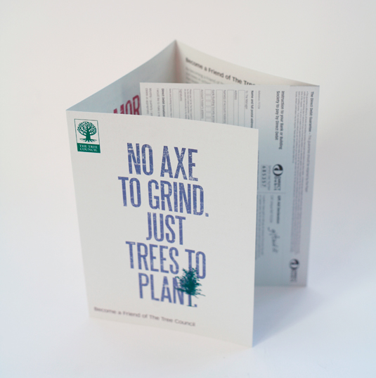
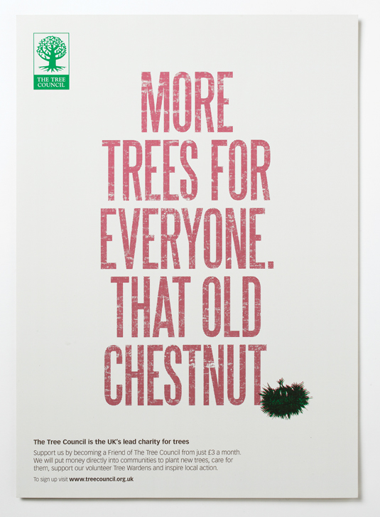
London studio MARC&ANNA has branched out with this poster design for The Tree Council.
Sign up to Creative Bloq's daily newsletter, which brings you the latest news and inspiration from the worlds of art, design and technology.
You are now subscribed
Your newsletter sign-up was successful
Want to add more newsletters?

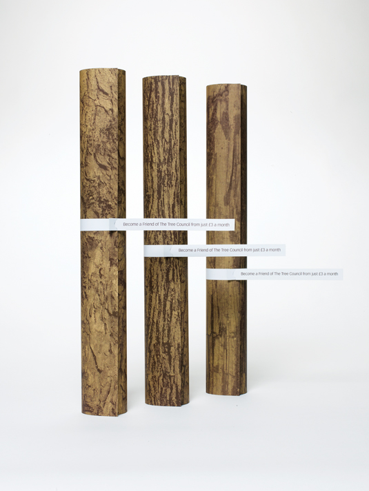
Most designers we talk to love print - books, magazines, posters; you name it. Trouble is, often they love trees too, and our planet seems to be running out of those. There's a conflict, but London studio MARC&ANNA has been working to put things right by designing a series of posters for The Tree Council, a charity whose aim is to plant and look after trees in communities around Britain. Hats off to the studio for doing it pro bono as well.
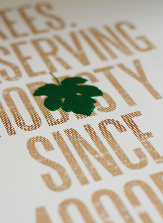
With halftone patterns, a limited colour palette and distressed type, they went for an un-fussy, lo-fi look. "We wanted a low-key feel to suit the recycled Cyclus Offset paper and we didn’t want the final materials to feel glossy or expensive," continues Atkinson. "We went for colours that felt natural, complementing the green of the logo.
"The copy itself has a bold, no-nonsense tone, so we chose a bold woodcut-like typeface to reinforce that." The charity is pleased with the work and has been emailing tree-based puns to MARC&ANNA ever since.
Article continues below 


This article was originally published in Computer Arts issue 211.
Like this? Read these!
- Free graffiti font selection
- Illustrator tutorials: amazing ideas to try today!
- Great examples of doodle art
Do you have any new projects that you'd like to share with us? Let us know in the comments box below!
Sign up to Creative Bloq's daily newsletter, which brings you the latest news and inspiration from the worlds of art, design and technology.

The Creative Bloq team is made up of a group of art and design enthusiasts, and has changed and evolved since Creative Bloq began back in 2012. The current website team consists of eight full-time members of staff: Editor Georgia Coggan, Deputy Editor Rosie Hilder, Ecommerce Editor Beren Neale, Senior News Editor Daniel Piper, Editor, Digital Art and 3D Ian Dean, Tech Reviews Editor Erlingur Einarsson, Ecommerce Writer Beth Nicholls and Staff Writer Natalie Fear, as well as a roster of freelancers from around the world. The ImagineFX magazine team also pitch in, ensuring that content from leading digital art publication ImagineFX is represented on Creative Bloq.
