The beginner's guide to brochure infographics
Infographics aren't just about the web. Here's how to make them work in print.
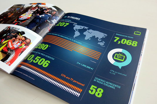
Everyone’s using infographics these days. Whether you’re a multinational advertising agency or a trendy high street wine bar, data is the new cool. Love them or loathe them, infographics are all around us and it’s rare to find a brochure that doesn’t contain at least a couple.
But how should infographics fit into the design of your brochure and what are the main things you need to consider when designing with data? Read on to find out more.
The basics
According to Wikipedia, an infographic is:
Article continues below‘…a graphic visual representations of information, data or knowledge intended to present complex information quickly and clearly. They can improve cognition by utilizing graphics to enhance the human visual system’s ability to see patterns and trends.’
All this is obvious really, but worth mentioning because despite your best-laid plans, it’s ridiculously easy to get carried away with the design, the colours, the layout and the typography of your design, and somewhere along the line lose track of what the infographic is actually all about. It’s not uncommon to find infographics that look beautiful but have lost all their essential value.
And infographics can be very valuable indeed. They can represent complex and multi-faceted information in a succinct and space-saving manner, improving readers’ cognition and making data more memorable. They allow readers to identify trends and gain insights quickly and efficiently, and of course they can look great too.
K.I.S.S.
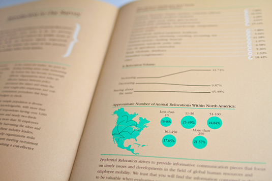
Perhaps the most important thing to bear in mind when incorporating infographics into your brochure printing and design is to keep it simple. An infographic is intended to simplify that which is complex, so make sure that your design does the same thing. Make sure you have enough space on the page and don’t overburden your reader with clutter.
Sign up to Creative Bloq's daily newsletter, which brings you the latest news and inspiration from the worlds of art, design and technology.
DO keep it simple.
Colour
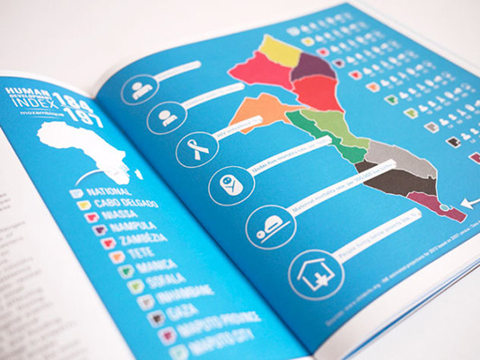
Obviously it’s important for your infographics to fit in with the overall style and design of the entire brochure. So you might want to choose colours that complement or accentuate the design. But don’t forget that colours can play an important role in the very meaning of the data too (in terms of categorization or suggesting similarities and differences), and that this by necessity overrides your colour scheme.
You will need to find a balance between the two and find something that works from a data analysis point of view as well as being aesthetically pleasing.
In the example above, K&i Design Studio used strong colours, together with crisp white, allowing for easy comprehension whilst keeping with UNICEF’s 'simple, optimistic, bold and contemporary' philosophy.
DO plan your colours carefully, in line with the meaning of the data as well as to fit the branding.
Brochure printing techniques
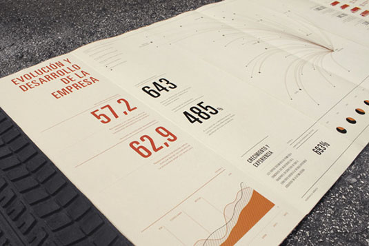
Today’s brochure printing techniques mean that size needn’t be an issue. If you need your infographic pages to fold out to double their size, include areas of spot colour or even feel different to the touch, these can all be catered for. As long as your design ideas are fit for purpose and take their lead from the data and the overall message, you can make creative and innovative use of a range of brochure printing technologies.
DON’T forget to think outside the box and if using a more unusual brochure printing technique will add value, go ahead and use it!
Proximity
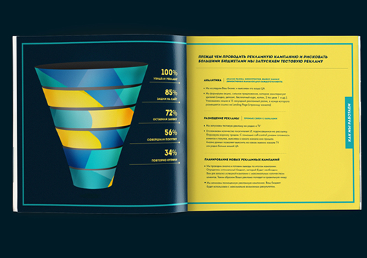
Depending on the type of data you wish to communicate, you might choose to place your infographic adjacent to a block of text or within a pull-out box. If so, be sure to allow enough space around the outside of the infographic, but still maintain enough proximity to show that the data and the surrounding text are linked. Another way to do this is to use lines, borders, colours or enclosing shapes to join blocks of text or images to the relevant infographic element.
If your infographic is especially complex or forms a central part of your content, you may decide to give it a page of its own or even allocate a double spread. Make sure you pay due consideration to how the brochure printing process will work, especially if you’re designing across the centre of a page. Allow enough space for margins and gutters and think carefully about how flat your brochure will lie and how it will be bound. If you want your readers to look carefully at the very middle of the spread, the last thing you want is to find crucial information disappearing into the spine of the booklet.
DO make sure that your infographics have enough room to breathe.
Hierarchy and placement
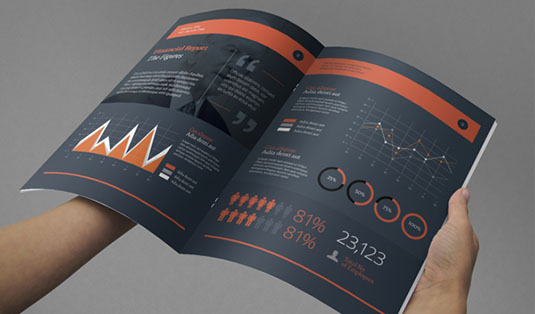
As with all interior layout design, the hierarchy within the infographic and the page hierarchy is crucial in ensuring that your reader looks at the important information first and understands how the various elements within the page relate to each other.
In terms of the overall structure of the brochure, where you place your infographic elements needs to be carefully considered as well. Too near the front and you risk turning off your audience with too many facts and figures; too far into the depth of the brochure and your readers may not notice it.
If you have several infographics, it therefore makes sense to space them out through the brochure, if the content allows for this, and make them stand out visually.
DO treat your infographics as features. Draw attention to them, but then let the facts do the talking.
How much is too much?
It can be tempting to fill a brochure with numerous, colourful and engaging infographics, but is there a limit to how many you should use? The answer depends on the type of brochure you’re creating, who the client is, the intended readership and the level of data that needs to be communicated.
The overall purpose of the brochure will help you to gauge the proportion of data, text and images within the brochure. An annual brochure for company shareholders, for example, may include a financial section about the year’s performance, highlighting growth and areas for improvement.
Since this will involve a lot of complex data, more infographics may be needed. A school prospectus, on the other hand, might only require a page or two related to results, league tables or subject areas.
DON’T bombard your readers with too much data, especially on consecutive pages.
Conclusion
Hopefully the above has given you some ideas of how you should – and shouldn’t – use data within your brochures. When used well, infographics can really lift a publication and ensure that your brochure is not only informative and fit for purpose, but is also engaging and beautiful.
For more helpful design and print tips, connect with us on Google+.
Words: Simon Tilbrook
Simon Tilbrook is the owner of Swallowtail Print, a premium brochure printing and design firm focused on delivering maximum value to their clients. Further bio on Simon can be found here.
Liked this? Read these!
- Free graffiti font selection
- Illustrator tutorials: amazing ideas to try today!
- Free Photoshop actions to create stunning effects
- The ultimate guide to designing the best logos
Have you seen a great example of brochure printing and design? Let us know in the comments below!

The Creative Bloq team is made up of a group of art and design enthusiasts, and has changed and evolved since Creative Bloq began back in 2012. The current website team consists of eight full-time members of staff: Editor Georgia Coggan, Deputy Editor Rosie Hilder, Ecommerce Editor Beren Neale, Senior News Editor Daniel Piper, Editor, Digital Art and 3D Ian Dean, Tech Reviews Editor Erlingur Einarsson, Ecommerce Writer Beth Nicholls and Staff Writer Natalie Fear, as well as a roster of freelancers from around the world. The ImagineFX magazine team also pitch in, ensuring that content from leading digital art publication ImagineFX is represented on Creative Bloq.
