How to design a set for an animated film
Mingjue Helen Chen designs and stages a distinctive ghostly animation environment - just in time for Halloween!
Sign up to Creative Bloq's daily newsletter, which brings you the latest news and inspiration from the worlds of art, design and technology.
You are now subscribed
Your newsletter sign-up was successful
Want to add more newsletters?
08. Painting the chimney
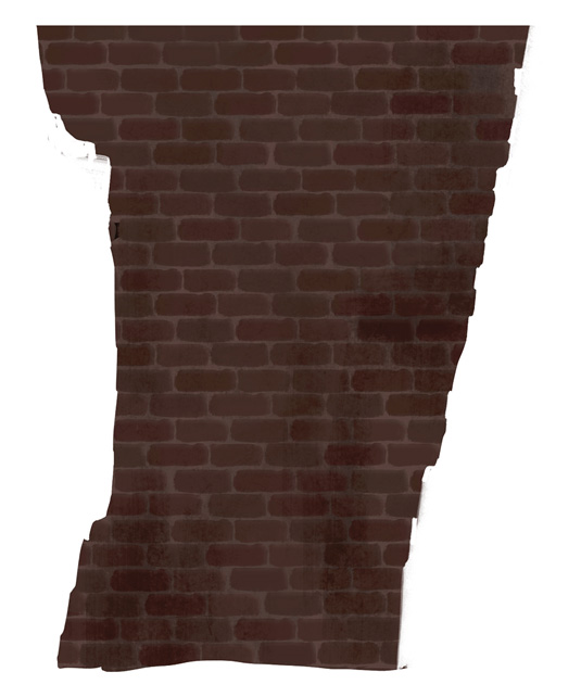
I repeat the process of creating my own texture for the chimney. I move it on to a new layer so I can focus just on the chimney.
Once I'm happy with the result, I move it back into my original file and adjust the lighting to match the rest of the image. Using a combination of Multiply and Darken layers gives me a pretty good result.
09. Adding architectural details
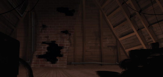
At this point I have my "stage" designated, so I start painting elements like the crossbeams with my lighting scheme in mind.
The human brain tends to want to equalise things, but to give this attic the feel of a little wear and tear I change up the spacing between the beams.
It also creates interest within the design, because not everything is perfectly spaced.
10. Time to redraw!
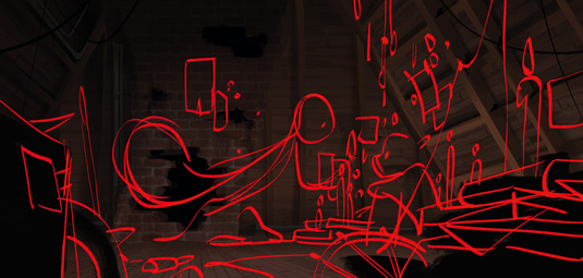
Now I take my image and recompose smaller details back on top of it, such as the characters and a few prop details.
It's always hard to know how much detail you need to put into a painting, and for the first step of a set design like this painting, I think something that conveys the feeling of the space rather then every little detail is more important.
Sign up to Creative Bloq's daily newsletter, which brings you the latest news and inspiration from the worlds of art, design and technology.
11. Illustrating some props
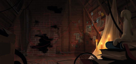
Keeping with the main value structure of the piece, I paint details such as the foreground elements and the small trinkets that the character might have put up in her space – newspaper clippings, feathers, glass, for example.
I want to show that she's taken this empty space and made it her own. If this set were to go to final, these props would warrant their own design pass.
12. First character
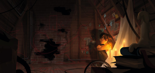
Now I lay in the first character. She should be clearly visible among the darkness and all the little trinkets that she's put up, so I make sure she's one of the brightest points in the painting.
I also create a cast shadow of the character to accentuate her lighter silhouette against the darkness that the shadow creates. This also helps to push the smaller details back.
13. Second character
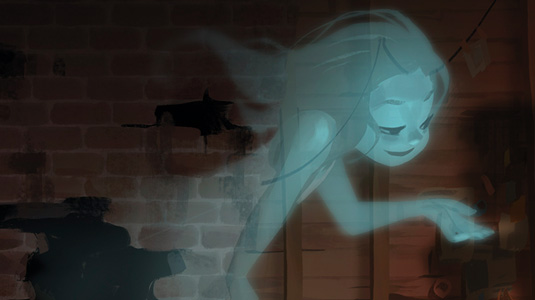
This second character is tricky, because of the idea that she isn't just a human.
I chose blue to offset the warm lighting on the human character, to pull them completely into different worlds and to keep the painting from feeling too monochromatic. I use a variety of blurs, Gaussian and motion to help give her a glow.
14. Lighting effects and finish
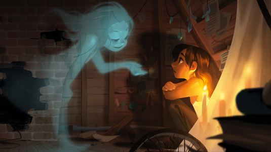
After the bulk of the painting has been completed, I can now focus on adjusting the lighting and values for the best read. The idea is to tweak the balance of the piece just in terms of value, to achieve the clearest read.
I also add a rim light to the sitting character's face because I feel she's become slightly lost in the painting, even though I've put a dark shadow behind her. Finally, I add a noise filter to tie the painting together.
Words: Mingjue Helen Chen
Helen works as a visual development artist and art director in the feature animated film industry. Films that she's been involved with include Frankenweenie and Big Hero 6. This article originally appeared in ImagineFX magazine issue 113.
Like This? Try These

The Creative Bloq team is made up of a group of art and design enthusiasts, and has changed and evolved since Creative Bloq began back in 2012. The current website team consists of eight full-time members of staff: Editor Georgia Coggan, Deputy Editor Rosie Hilder, Ecommerce Editor Beren Neale, Senior News Editor Daniel Piper, Editor, Digital Art and 3D Ian Dean, Tech Reviews Editor Erlingur Einarsson, Ecommerce Writer Beth Nicholls and Staff Writer Natalie Fear, as well as a roster of freelancers from around the world. The ImagineFX magazine team also pitch in, ensuring that content from leading digital art publication ImagineFX is represented on Creative Bloq.
