Greatest fonts countdown: 86 - Atlas Grotesk
We're counting down the 100 greatest typefaces in existence. Here is number 86...
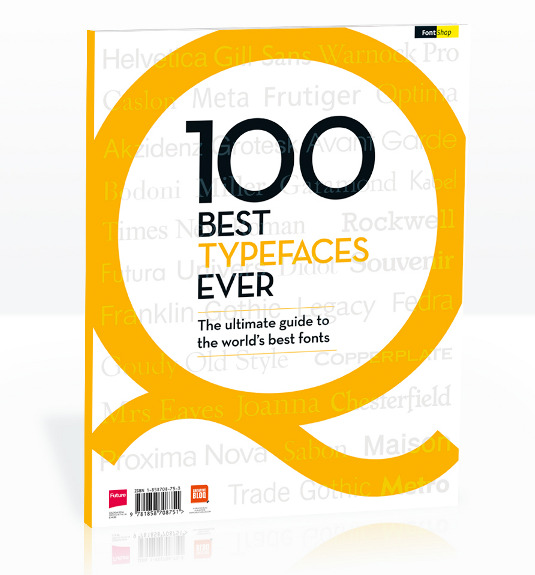
FontShop AG, the renowned type foundry, conducted a survey based on historical relevance, sales at FontShop.com, and aesthetic quality. With a few additions from the experts at Creative Bloq and Computer Arts magazine, the best fonts ever were selected for the new book, 100 Best Typefaces Ever.
Here we are counting down the 100 greatest fonts, but you can read interviews with some of the typefaces' creators, a brief history of type, the anatomy of a font, and much, much more in the book – find out how to get your copy in print or digital formats at the foot of this post.
But without further ado, here is the 86th best typeface…
Article continues below86. Atlas Grotesk

- Kai Bernau, Susana Carvalho and Christian Schwartz, 2012
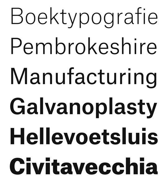
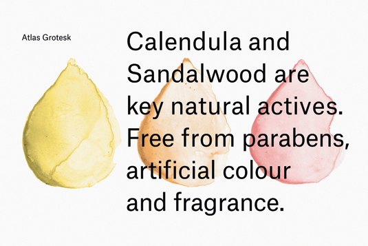
Published by Commercial Type in 2012, Atlas Grotesk is, according to the foundry, a "clean and fresh sans-serif with relatively long ascenders but short descenders". This adds up to a legible, comfortable typeface for body text – even when set with tight leading. The aesthetic, so says Commercial Type, was inspired in large part by the sans-serifs of the 1950s, specifically Dick Dooijes’s Mercator, released by the Amsterdam Type Foundry in 1957. With vertical proportions in common with American Gothic, the typeface sets more like Trade Gothic or Franklin Gothic than like Neue Haas Grotesk or Univers.


The 100 Best Typefaces Ever

This is an extract from The 100 Best Typefaces Ever, the definitive guide to the greatest fonts ever created, in association with FontShop AG. Over 180 premium pages, the book dissects the world's greatest typefaces, bringing you some insightful background on each and interviews with their creators.
You can pick up the book at all good newsagents today or order it online. Or you can download a digital edition directly to your iPad from the Computer Arts app on iTunes.
Sign up to Creative Bloq's daily newsletter, which brings you the latest news and inspiration from the worlds of art, design and technology.

Rob is editorial, graphic design and publishing lead at Transport for London. He previously worked at Future Publishing over the course of several years, where he launched digital art magazine, ImagineFX; and edited graphic design magazine Computer Arts, as well as the Computer Arts Projects series, and was also editor of technology magazine, T3.
