Greatest fonts countdown: 50 – Fugue
We're counting down the 100 greatest typefaces in existence. Here's number 50...
Sign up to Creative Bloq's daily newsletter, which brings you the latest news and inspiration from the worlds of art, design and technology.
You are now subscribed
Your newsletter sign-up was successful
Want to add more newsletters?
FontShop AG, the renowned type foundry, conducted a survey based on historical relevance, sales at FontShop.com, and aesthetic quality. With a few additions from the experts at Creative Bloq and Computer Arts magazine, the best fonts ever were selected for the new book, 100 Best Typefaces Ever.
Here we are counting down the 100 greatest fonts, but you can read interviews with some of the typefaces' creators, a brief history of type, the anatomy of a font, and much, much more in the book – find out how to get your copy in print or digital formats at the foot of this post.
But without further ado, here's the 50th best typeface…
Article continues below50. Fugue

- Radim Pesko, 2008
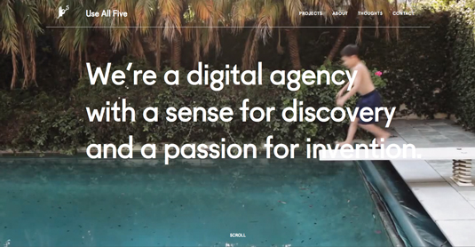
Radim Pesko's clean, light sans-serif typeface was originally designed solely for use in a book called The Wonder Years. The publication was a retrospective for Werkplaats Typografie in the Dutch city of Arnhem.
It was originally created for use in 12 point, as an homage to the work of Paul Renner, creator of Futura. As such, Fugue has a strong geometric foundation – note the strong presence of circles and extremely low contrast. The two-storey lowercase g looks like an inverted 8 with a tail that looks as unlike a serif as it can. It's now available in OpenType format as four fonts in over 30 languages.
This is an extract from The 100 Best Typefaces Ever, the definitive guide to the greatest fonts ever created, in association with FontShop AG.
Sign up to Creative Bloq's daily newsletter, which brings you the latest news and inspiration from the worlds of art, design and technology.

The Creative Bloq team is made up of a group of art and design enthusiasts, and has changed and evolved since Creative Bloq began back in 2012. The current website team consists of eight full-time members of staff: Editor Georgia Coggan, Deputy Editor Rosie Hilder, Ecommerce Editor Beren Neale, Senior News Editor Daniel Piper, Editor, Digital Art and 3D Ian Dean, Tech Reviews Editor Erlingur Einarsson, Ecommerce Writer Beth Nicholls and Staff Writer Natalie Fear, as well as a roster of freelancers from around the world. The ImagineFX magazine team also pitch in, ensuring that content from leading digital art publication ImagineFX is represented on Creative Bloq.
