Greatest fonts countdown: 60 - Bell Gothic
We're counting down the 100 greatest typefaces in existence. Here is number 60...
Sign up to Creative Bloq's daily newsletter, which brings you the latest news and inspiration from the worlds of art, design and technology.
You are now subscribed
Your newsletter sign-up was successful
Want to add more newsletters?
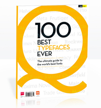
FontShop AG, the renowned type foundry, conducted a survey based on historical relevance, sales at FontShop.com, and aesthetic quality. With a few additions from the experts at Creative Bloq and Computer Arts magazine, the best fonts ever were selected for the new book, 100 Best Typefaces Ever.
Here we are counting down the 100 greatest fonts, but you can read interviews with some of the typefaces' creators, a brief history of type, the anatomy of a font, and much, much more in the book – find out how to get your copy in print or digital formats at the foot of this post.
But without further ado, here is the 6oth best typeface…
Article continues below60. Bell Gothic

- Chauncey H Griffith, 1938
Bell Gothic was designed for AT&T in 1938 for use in its telephone books and other listings. It was used for 40 years. It was a textbook career for newspaper boy Chauncey H Griffith, who was born in Ohio in 1879. After working as a typesetter and newspaper designer, he transferred in 1906 to the sales force of the Mergenthaler Linotype Company, which had been founded in 1890. Here, he successfully secured a position for the company in newspaper and book printing.
His close collaboration with the type designers William A Dwiggins and Rudolph Ruzicka became eventually paid off in 1931 with the release of the successful newspaper font Excelsior. Six years later, the American Telephone and Telegraph Company approached Griffith – who by then had been promoted to head of typographic development – to offer him a commission for a new telephone directory typeface. The result was Bell Gothic, so named because AT&T was founded by Alexander Graham Bell, the inventor of the telephone. It was released in 1938.
Bell Gothic was used by AT&T for four decades in telephone books and other applications, and remains a great choice for listings and catalogues thanks to its space-saving design. Unique features include angled terminuses on its ascenders and descenders, and the cross strokes on the capital I.
The font experienced a renaissance in the early 1990s, when it was used by a number of respected designers (Bruce Mau and Irma Boom) and institutions including Cranbrook Academy of Art, the Design Academy Eindhoven and Rhode Island School of Design.
Sign up to Creative Bloq's daily newsletter, which brings you the latest news and inspiration from the worlds of art, design and technology.
The 100 Best Typefaces Ever

This is an extract from The 100 Best Typefaces Ever, the definitive guide to the greatest fonts ever created, in association with FontShop AG. Over 180 premium pages, the book dissects the world's greatest typefaces, bringing you some insightful background on each and interviews with their creators.
You can pick up the book at all good newsagents today or order it online. Or you can download a digital edition directly to your iPad from the Computer Arts app on iTunes.

Rob is editorial, graphic design and publishing lead at Transport for London. He previously worked at Future Publishing over the course of several years, where he launched digital art magazine, ImagineFX; and edited graphic design magazine Computer Arts, as well as the Computer Arts Projects series, and was also editor of technology magazine, T3.
