Fiasco Design's Tom Morris runs the rule over a quirky new font that's gunning for Comic Sans (while hoping to attract much less vitriol).
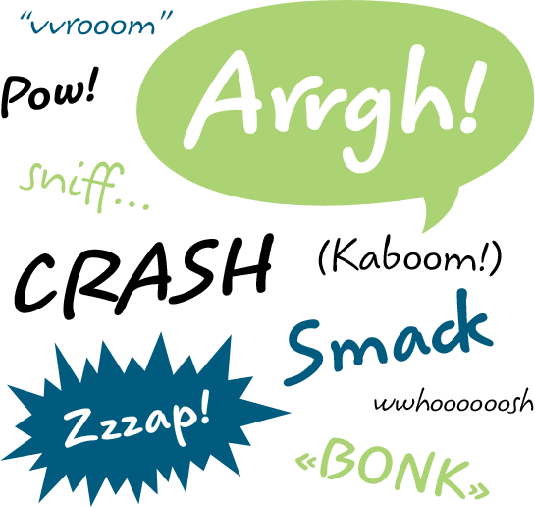
It's not Comic Sans, okay? Koorkin has a child-like feel
George Ryan's latest creation Koorkin finds its quirky name in homage to the designer's Armenian father-in-law and has a feeling of child-like simplicity. A senior designer at Monotype Imaging, Ryan has been designing typefaces since 1978 when he was hired by Mergenthaler Linotype as a 'letter drawer'.
"I've worked on hundreds of highly structured text faces," he explains. "For the most part, the roots of all of them can be found in the handwritten letterforms we learn as children. I enjoy going back to these shapes whenever the opportunity presents itself."
Child of the 1990s
Left in a drawer for over a decade, Koorkin found its origins in a product branding brief in the 1990s that never came to fruition as the request was withdrawn.
Latest Videos From Creative Bloq
When the drawings were rediscovered Ryan began to make the improvements he could never make with the clients restrictions and began building on his refinements with a suite of Open Type options.
Koorkin's handwritten style extends to slightly different instances of the same character
The ligature features and OpenType settings support its handwritten aesthetic, allowing for more dynamic word arrangements that are reflective of the uniqueness of handwriting. "For instance, a word such as 'breeze' set in Koorkin can have three slightly different 'e's."
Versatility
"A fun, casual, and versatile addition to every type library", Koorkin has a deceptive versatility that could push it head and shoulders above other less considered casual scripts.
Accentuating the pinched bowls in the lowercase 'o's, Koorkin is presented with unflattering outline strokes which don't do any service to its better use. The regular and bold weights stand out as being useful handwritten scripts, but certainly not as the bubble lettering some specimen images suggest.
Get the Creative Bloq Newsletter
Daily design news, reviews, how-tos and more, as picked by the editors.