Nike creates new typography for athletics body
Nike has introduced a whole new brand identity for the Georgia Athletics Association, including some inspiring typography.
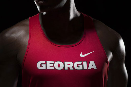
The Georgia Athletics Association have one of the most recognisable brands in the sports industry. From the Georgia bulldog to the black, red and white colour scheme, the brand is an identity classic. So, we were a little sceptical when we heard that Nike had been working on a new look for the teams. Turns out, we needn't be worried at all.
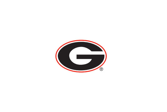
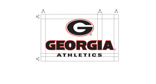
Working over a 15-month period, Nike decided to reaffirm the traditional Power 'G' logo as the primary brand identity. This will build equity throughout the teams within the Georgia Athletics Association, making for a well-rounded brand.
Custom display font
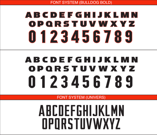
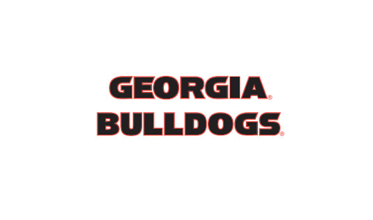
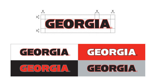
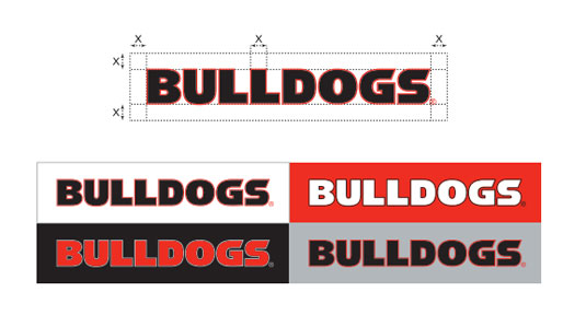
Although almost everything has had a make-over, it's the typography for the Georgia Bulldogs that really caught our creative eye. The team created a custom display font, which fuses modern foundational forms that will have universal functionality. The type will be used for a wide variety of athletic communications, so they went ahead and finished the look with a numerical set too.
The letterforms are sturdy and powerful drawing inspiration from the bulldog's anatomy as well as perhaps the most notable North Campus fixture - The Arch. The famous cast-iron Arch, has become the symbol of the University of Georgia, and was installed in the 1850s, when the front of the campus was enclosed with an iron fence.
You can view the entire new look for the Georgia Bulldogs on this PDF.
Like this? Read these!
- Free graffiti font selection
- Illustrator tutorials: amazing ideas to try today!
- Great examples of doodle art
What do you make of the new Nike look? Let us know in the comments box below!
Sign up to Creative Bloq's daily newsletter, which brings you the latest news and inspiration from the worlds of art, design and technology.

The Creative Bloq team is made up of a group of art and design enthusiasts, and has changed and evolved since Creative Bloq began back in 2012. The current website team consists of eight full-time members of staff: Editor Georgia Coggan, Deputy Editor Rosie Hilder, Ecommerce Editor Beren Neale, Senior News Editor Daniel Piper, Editor, Digital Art and 3D Ian Dean, Tech Reviews Editor Erlingur Einarsson, Ecommerce Writer Beth Nicholls and Staff Writer Natalie Fear, as well as a roster of freelancers from around the world. The ImagineFX magazine team also pitch in, ensuring that content from leading digital art publication ImagineFX is represented on Creative Bloq.

