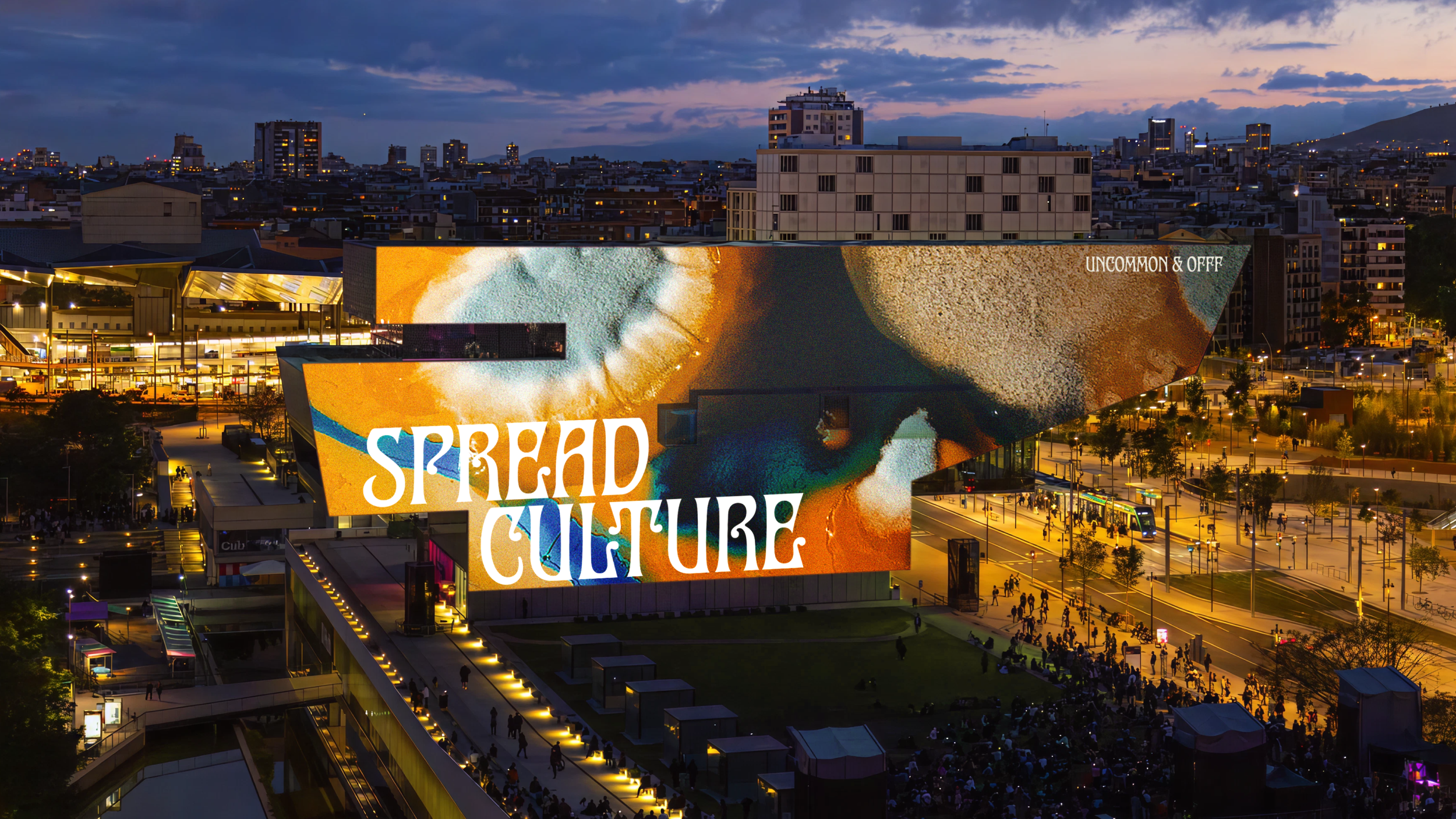
9 great uses of typography in TV commercials
More and more companies are using typography to bring their TV ads to life. We look at some of the best examples.
Sign up to Creative Bloq's daily newsletter, which brings you the latest news and inspiration from the worlds of art, design and technology.
You are now subscribed
Your newsletter sign-up was successful
Want to add more newsletters?
Kinetic typography has become increasingly popular in the last few years, with a variety of brands using the style to make their TV commercials stand out. From Old Spice to Ikea, we highlight some of the most creative uses of typography to sell us stuff on our screens...
- Read all our typography articles here
01. Ford F-150
The automotive industry seems to be a huge fan of kinetic typography and this ad from Ford to showcase their F-150 pick-up truck is a brilliant example. Using a bold font entirely in uppercase helped the brand reinforce its final 'Built Tough' strapline and clearly brought much success, with the car company going on to use typography again in its TV ad for the Ford Taurus SHO.
02. Starbucks
Coffee giant Starbucks used animated text for its 2008 Presidential election ad, tempting coffee lovers to exchange their vote for a free beverage. Entirely in capitals and in that all-so distinctive Starbucks green, the brand used different sized text to generate emotion and empathy with its customers.
Article continues below03. Pepsi
What better way to launch your new logo than to splash it all over a TV ad, right? That was clearly Pepsi's tactic in 2011 when they used an ad for its Refresh Project to showcase the new design, swapping all Os and 0s with the infamous blue, red and white circle.
04. Ikea
Ikea teamed up with London based animation company Bermuda Shorts to create an typographical TV ad that made the viewer question whether they're living in a "house or a home". The 60-second short uses a multitude of fonts whilst graphics were created using a combination of animation techniques; Flash, After Effects and CGI.
05. McDonalds
American burger giant McDonalds joined the typography trend in 2010 with the launch of its Little Tasters TV ad. A joint effort between Penny Royal Films, Blac Ionica and top creatives from Leo Burnett, the style emulated the great Saul Bass and used playful imagery and soft tones to celebrate the new menu.
06. Subaru
Subaru got on board with the car industry's TV typography trend when it partnered up with Salt Lake City's Lone Peak Productions to highlight Utah's number one Subaru dealer in 2011. The ads were created in After Effects and shot in Lone Peak's studio.
Sign up to Creative Bloq's daily newsletter, which brings you the latest news and inspiration from the worlds of art, design and technology.
07. Mothers Against Drunk Driving
This non-profit organisation in the US used a bold style of typography to advertise its partnership with personal injury lawyers Robert J DeBry and Associates. Created in After Effects, the very short 15-second spot uses an inspiring mixture of graphics and typography.
08. Bet365
Online gambling company Bet365 has used typography in a variety of ways throughout its TV ad campaign with Ray Winstone. Text swirls about the actor to portray that the viewer will, like Winstone, be knowingly in-control of information regarding the odds if they use the site to gamble.
09. Vodafone
Vodafone has used topography in a number of its TV spots, all incorporating the brand's identity colours of white and red. It's more well-known ad from 2007 sees the network provider use a mixture of animation and typography to create a playful tone.
Words: Natalie Brandweiner
Natalie Brandweiner is an online journalist for MyCustomer.com, covering social media and marketing, and has a keen interest in design.
Liked this? Read these!
- Free tattoo fonts for designers
- Create a perfect mood board with these pro tips
- The ultimate guide to logo design
Did we miss any of your favourites? Let us know in the comments!

The Creative Bloq team is made up of a group of art and design enthusiasts, and has changed and evolved since Creative Bloq began back in 2012. The current website team consists of eight full-time members of staff: Editor Georgia Coggan, Deputy Editor Rosie Hilder, Ecommerce Editor Beren Neale, Senior News Editor Daniel Piper, Editor, Digital Art and 3D Ian Dean, Tech Reviews Editor Erlingur Einarsson, Ecommerce Writer Beth Nicholls and Staff Writer Natalie Fear, as well as a roster of freelancers from around the world. The ImagineFX magazine team also pitch in, ensuring that content from leading digital art publication ImagineFX is represented on Creative Bloq.
