5 reasons not to start with beautiful mockups
Don't perfect your designs to early in the approval process, urges Zack Rutherford.
Sign up to Creative Bloq's daily newsletter, which brings you the latest news and inspiration from the worlds of art, design and technology.
You are now subscribed
Your newsletter sign-up was successful
Want to add more newsletters?
Presenting your first design concepts on a web project can be an intimidating prospect. Clients and/or development teams aren't always 100 per cent on board with your ideas, and sometimes they can't figure out what they want either. So you're not quite sure if you want to deliver something that's fully fleshed out or a bare bones mockup that's open to change and interpretation.
Here, we'll explain five good reasons why you should lean towards the latter.
01. You'll probably miss important details
High fidelity mockups are gorgeous, high quality, and more closely representative of what the finished product might look like. But is that really what you want?
As explained in the free guide Responsive Design Best Practices, rushing into high fidelity may cause you to overlook the structure of the design. It doesn't make sense to worry about the paint when you haven't even built a strong foundation.

You want your designs to start as a broad outline of form and essential function. You add detail as you implement. And in many cases you delete extra steps after you've implemented the details.
02. Lo-fi manages expectations
Clients are impressionable sorts by and large. When you sit down and show them a super impressive mockup, they're imaginations begin to run wild with possibilities. Things that you may not have thought of just yet. What's more, they might start to expect things beyond the standard you've already shown them.

Presenting your mockups in low fidelity form will give them the broad strokes of how the design will look. It will still create expectations but not the unmanageable sort.
Sign up to Creative Bloq's daily newsletter, which brings you the latest news and inspiration from the worlds of art, design and technology.
Instead, clients and stakeholders see the work you're doing as a canvas of as yet unfulfilled potential. Save the pixel perfect stuff for the final reveal and you're sure to receive a more enthusiastic reaction at the end of the project. Which is where you want the most enthusiasm anyway.
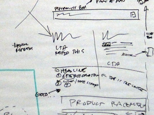
For example, in the below lo-fi mockup created in UXPin, notice how the lack of detail forces the viewer to focus on the shape and structure of the design.
Is the content readable and legible? Does the visual hierarchy help the user flow towards the CTA? All of these structural questions must be answered before exploring the visual design.
toaster-checkout-mockup.png
03. More feedback = better design
While it's nice to get something right the first time, it usually doesn't go off without a hitch.
High fidelity mockups may facilitate delivery speed, but low fidelity produces more insights when going back and forth with a client. By leaving room for interpretation in your mockup, you and the client can figure out what will work best for the user in a collaborative process.

If you produce a high quality mockup from the beginning, you almost preempt any opportunity for constructive feedback because you've produced work that they feel they can't complain about. That might work well for your self-esteem, but it doesn't result in the most positive UX design.
Sure they'll provide plenty of insights on the colors they like and the visual elements that speak to them on an emotional level—and that stuff is certainly important.
But what you need while you're building your product is to know about the navigation, information architecture, and the overall intuitive nature of the design. If you want real insights that you can use to improve your work at an early stage, then you have no choice but to test the waters with low fidelity mockups.
04. Mistakes cost less
Identifying areas of user friction is much easier to do with a lo-fi mockup.
You might have an idea that works well on a conceptual level, but when you implement it into a high fidelity prototype, an innate problem manifests. Unfortunately, you've already spent time rendering the entire design in all of its high quality glory, and a key element is causing you grief.

At that point it's back to the drawing board. This is a mistake that cost you plenty of time. As we all know, time is pretty much equivalent to the number of zeroes in your paychecks.
Wouldn't you rather make those mistakes before it costs you dozens of man hours perfecting the look of your design? Doesn't it make more sense to try and recognize the major issues in your design's structure before you've lost sleep putting together a visually impressive mockup?
If you finish a sketch of your design and figure out that something within the sketch is unusable, you simply sketch out another sample. You've wasted a few minutes. No big deal. If you've made a presentation or started a coded prototype…well, you might be pulling a little more hair out of your head.
Making a U-turn at 5 mph is a lot easier than at 55. Speaking of which…
05. Hi-fi doesn't guarantee client satisfaction
Is there anything more frustrating than spending a massive amount of time on a mockup only to have it summarily dismissed by the client?
It happens every day. It can be difficult to pry the essence of any project out of the client's lips at the best of times. High fidelity mockups can be a big gamble if you're not 100% clear on the concept your audience is looking for.
If the client isn't pleased with the results you've produced, you're back to square one and you'll be expected to deliver a second set of mockups which look just as good as the first.

Of course, now you're less confident in the work you'll produce because your first, best effort was met with politely disguised scoffs. Or, if you're working with jerks, outright disdain. This leads to greater anxiety, more sleepless nights, and a great deal of second guessing that you simply don't need in your life. To really rub it in, you'll probably also need to create the second version faster.
Relax, breathe, and just put together some low fidelity mockups that you can't get emotionally attached to. That invite criticism even. If you prepare yourself for the heat then the fire won't bother you.
Mockups are the first step in a long process of back and forth, give and take, iterate and reiterate. There's no reason to deliver a ¾ done product in the first step.

That's a recipe for frustration. Taking your time, testing the waters, and feeling out the needs of users and client alike will pay big dividends if you do it early.
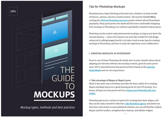
For more mockups strategies and best practices for Photoshop and Sketch, check out the free Guide to Mockups.
Words: Zack Rutherford
Liked this? Read these!

The Creative Bloq team is made up of a group of art and design enthusiasts, and has changed and evolved since Creative Bloq began back in 2012. The current website team consists of eight full-time members of staff: Editor Georgia Coggan, Deputy Editor Rosie Hilder, Ecommerce Editor Beren Neale, Senior News Editor Daniel Piper, Editor, Digital Art and 3D Ian Dean, Tech Reviews Editor Erlingur Einarsson, Ecommerce Writer Beth Nicholls and Staff Writer Natalie Fear, as well as a roster of freelancers from around the world. The ImagineFX magazine team also pitch in, ensuring that content from leading digital art publication ImagineFX is represented on Creative Bloq.
