Creating beautiful typography for the web
Christopher Murphy and Jake Giltsoff explain how we can draw on type’s rich tradition to create beautiful web typography.
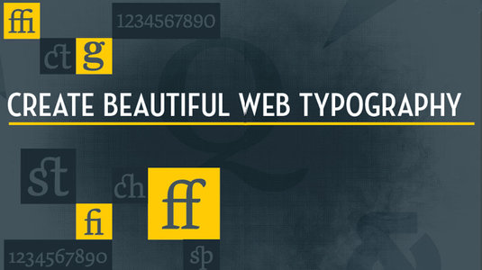
Over the past decade, online typography has evolved rapidly. Internet Explorer has supported web fonts, using EOT format, since IE4 in 1997 (yes, you read that correctly), but since those first tentative steps, typography on the web has attained a degree of maturity that enables us to focus on elevating the craft to ever-higher levels.
Adobe has blazed the trail here, introducing its Typekit web font service in September 2009, but others are equally deserving of a hat tip: Google introduced Google Fonts in May 2010, and Clearleft and OmniTI launched Fontdeck in June 2010. In short, we have had the tools to create rich web typography for quite some time now.
In this article, we will provide a broad overview of the importance of both macro- and microtypography on the web. The former focuses on the overall arrangement of text on a page; the latter on fine details like ligatures and figures.
In the online walkthrough that accompanies it (you can find it, complete with code, at macromicrotypo.com), we will explore the subject in more depth, taking a single page exploring the life and work of pioneering type designer John Baskerville, and considering it from a typographic perspective.
Macrotypography
Before we even start working on a project, there are a number of decisions we can make to shape the look and feel of our typography. We've explored these in more detail online, but for the purposes of this article, we will focus on three key elements: typeface selection (particularly typographic pairings); the importance of a clear hierarchy, and the role of a typographic scale in creating it; and the importance of a carefully considered relationship between page elements (type size, leading and measure).
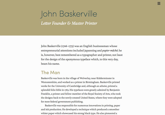
At the macro level, we need to consider how the building blocks of typography come together: the relationships between page, paragraph, word and letter. Consideration of these relationships leads to beautifully designed, typographically focused works – not to mention considerably happier readers.
Type talks
It goes without saying that the typefaces you choose will have a considerable impact on your project's look and feel. The type you choose communicates at a semantic level. As noted design critic Rick Poynor puts it: "Type is saying things to us all the time. Typefaces express a mood, an atmosphere. They give words a certain colouring."
Sign up to Creative Bloq's daily newsletter, which brings you the latest news and inspiration from the worlds of art, design and technology.
This is where a firm grasp of typographic history helps. A serif font suggests tradition; a sans serif something a little more contemporary. If you're new to the subject, there are a wealth of typography books to choose from, but we'd recommend Thinking with Type by Ellen Lupton, The Elements of Typographic Style by Robert Bringhurst and Detail in Typography by Jost Hochuli as starting points for your library.
Typographic pairings will shape your design at the macro level. For our online walkthrough, we've chosen Type Together's Athelas, a serif imbued with history, and Mostardesign's Sofia Pro, a clean, modern sans that we felt contrasted nicely.
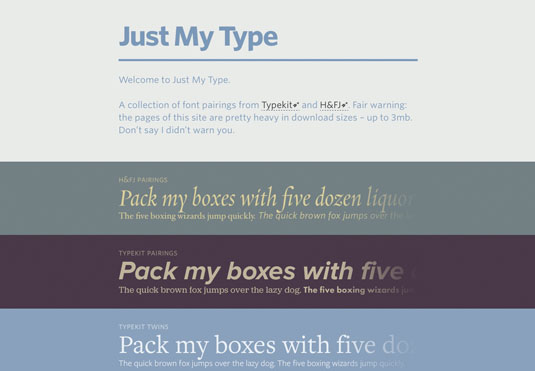
If you're looking for inspiration for your own pairings, give Aura Seltzer's Type Connection a whirl – it's a lovely 'typographic dating game'. Daniel Eden has also put together an extensive site – Just My Type – that showcases pairings from Typekit and Hoefler & Co., complete with links to each service's relevant pages.
A typographic scale
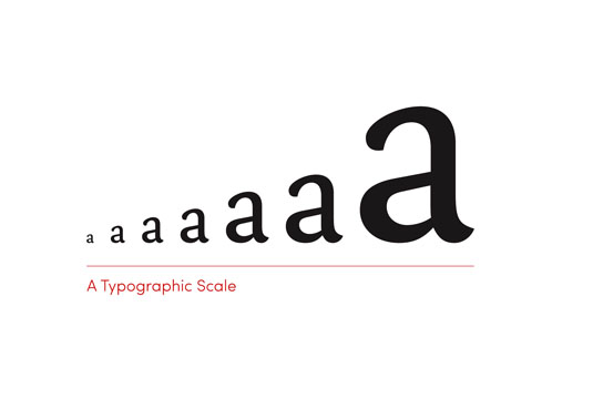
With our font choices locked in, the next step is to develop a typographic scale. This is a series of type sizes for our different elements that will clearly indicate our content's hierarchy and guide the reader through our content.
All being well, our content will be marked up semantically (HTML is, after all, a design element). Typically, content will have a clear hierarchy of meaning, with a number of headings – <h1>, <h2>, <h3> and so on – indicating our content's underlying semantic structure.
We can build on this as we consider our scale, mapping our content's hierarchy to a typographic scale. For our walkthrough, we've developed a modular scale – a sequence of font sizes based on harmonious proportions.
Setting font sizes from a modular scale helps to ensure that your typography is aesthetically pleasing. It also gives your content an underlying logic. Your scales will differ over your breakpoints, allowing you to set the font sizes appropriately according to the space available. There's a great deal written about typographic scales, but 'More Meaningful Typography' by Typekit's Tim Brown is a great place to start.
Universal typography
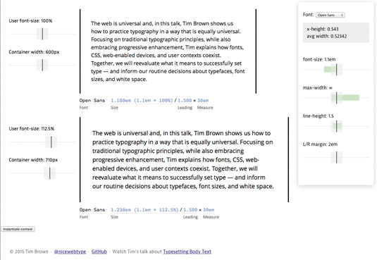
In our final pass at the macro level, we should consider the relationship between our page elements: type size, leading and measure. In our online walkthrough, we have considered the horizontal (measure) and vertical (line height) stresses of our composition.
Tim Brown calls this 'Universal Typography' and has developed an all-in-one tool to allow you to explore it. H+W's Jason Pamental also explores "the proportions and rhythm of your body, headers and measure" in an article for Typecast entitled 'A More Modern Scale for Web Typography'. Both are well worth reading.
Placing the reader at the centre of our design process, it's important to consider the line length, or 'measure', we choose. This will have a significant impact on legibility. Too long a measure and the reader will find it difficult to find their way back to the beginning of the next line. Too short a measure and they will be bouncing too quickly from line to line. Noted typographer Robert Bringhurst suggests a measure of between 45 and 75 characters (counting letters and spaces), with 66 characters sitting at the sweet spot. However, measure may be limited by factors such as screen size, so as usual, judging by eye is judicious.
Microtypography
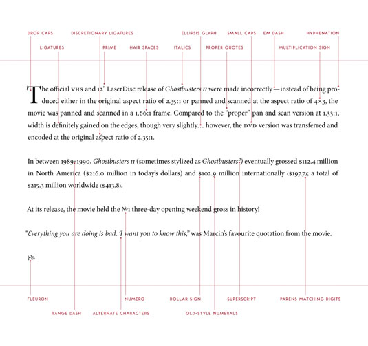
With our macrotypographic choices firmly established, it's time to move on to the all-important details. As Charles and Ray Eames put it: "The details are not the details. They make the product."
A seasoned typographer understands that details matter. In isolation they may easily be overlooked, but when they come together their effect is undeniable, lifting a piece of design considerably. Medium's Marcin Wichary highlights this in a wonderful post entitled 'Death to typewriters', which is well worth reading.
As with our macrotypography, we've explored microtypography extensively in our walkthrough, so for the purposes of this article we'll focus on three key elements: ligatures (both common and discretionary), figures (old style and lining, proportional and tabular) and other typographic niceties – not least exploring the difference between primes and quotation marks.
A marriage made in heaven
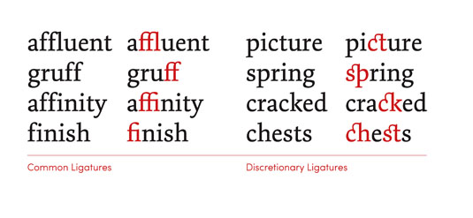
Ligatures are glyphs formed of a combination of two or more adjacent letters and are typically designed to alleviate aesthetic problems when adjoining letters overlap uncomfortably. In the past – when letters were cast in metal – certain characters had a propensity to collide with other characters. To address this, troublesome letters were combined into a single piece of type: a ligature. The 'common' ligatures address these issues. In addition, many typefaces also offer 'discretionary' ligatures, intended for decorative purposes. Common ligatures satisfy a functional and aesthetic need. Discretionary ligatures, on the other hand, are intended for – you guessed it – discretionary use.
Ligatures are easily triggered in CSS, assuming the typeface you are using includes them. Typekit's helpful guide to 'Syntax for OpenType features in CSS' explains everything you need to know to implement this.
Ligatures add colour to typography. They also clearly signpost that you – unlike so many others – care about the all-important details. But use them with care. Sprinkled over a text too liberally, they can impede the reader's progress.
Go figure!
The terms 'number' and 'numeral' are often confused: 'One' is a number, but '1' is a numeral. Added to this, numerals in typography are referred to as 'figures' (no one said this would be easy!).
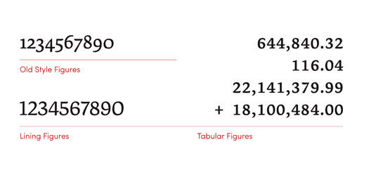
We frequently encounter figures when wrestling with typography: telephone numbers, dates of birth, financial data, fractions … the list goes on. Well-designed typefaces include both 'old style' figures and 'lining' figures. Lining figures were originally designed to be used in conjunction with capitals; old style (or 'lower case') figures blend in better with text settings given their ascenders (6, 8) and descenders (3, 4, 5, 7, 9).
In addition to old style and lining figures, a thoughtfully designed typeface will include both 'proportional' and 'tabular' figures. Proportional figures, as the name implies, have differing widths (a '1' is narrower than a '9'), and are designed to fit together like letters. Tabular figures, on the other hand, are intended for tabular data and designed to be monospaced.
When setting figures within a paragraph of text – a date of birth, for example – old style proportional figures are the ideal choice. When setting numerical data, however – such as for an annual report – lining tabular figures would be a better choice.
Punctuation matters …
In our final pass at the micro level, we'll consider the importance of using the correct punctuation for the task at hand. Punctuation could easily be an entire article itself. Suffice to say there's a very deep rabbit hole you could fall into here.
Hyphens and dashes might look similar, but they have different functions. A hyphen is used at the end of a line to divide broken words or to link two words (or possibly, to create linked-up words) – whereas a dash introduces a pause between parts of a sentence. Dashes also come in different flavours – including en dashes (–) and em dashes (—). Different publications have different house styles, but an en dash is typically used with a space on either side, an em dash without.
It would be remiss of us to finish this article without stressing the difference between primes and quotation marks. Primes ('straight quotes') are used to indicate units of measure: 6' 10", for example. Quotation marks ('curly quotes') are used, unsurprisingly, for quotations: "Typography's a wonderful thing!"
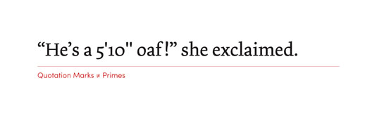
If there's one thing guaranteed to annoy a seasoned typographer, it's the incorrect use of primes and quotation marks.
Get this right and you'll stand out from the crowd.
Learning from the past
It's an exciting time to be working on the web. The typographic tools that we have at our disposal are evolving at a dizzying rate. But the tradition of typography stretches back hundreds of years. As we look forward, let's also be mindful of the past. There are lessons aplenty we can draw from it, and in so doing, strive to create beautiful web typography.
Words: Christopher Murphy and Jake Giltsoff
Christopher Murphy is a best-selling author, speaker, designer and educator based in Belfast, exploring the intersection of design and business. Jake Giltsoff is a designer at Typekit, making things mostly for the web, with a passion for type and typography. This article originally appeared in issue 268 of net magazine.
Liked this? Read these!
- The 100 best free fonts
- The best photo apps for iPhone, iPad and Android
- Download these free iPhone apps for designers

The Creative Bloq team is made up of a group of art and design enthusiasts, and has changed and evolved since Creative Bloq began back in 2012. The current website team consists of eight full-time members of staff: Editor Georgia Coggan, Deputy Editor Rosie Hilder, Ecommerce Editor Beren Neale, Senior News Editor Daniel Piper, Editor, Digital Art and 3D Ian Dean, Tech Reviews Editor Erlingur Einarsson, Ecommerce Writer Beth Nicholls and Staff Writer Natalie Fear, as well as a roster of freelancers from around the world. The ImagineFX magazine team also pitch in, ensuring that content from leading digital art publication ImagineFX is represented on Creative Bloq.
