Free ebook on responsive web design
This guide to multi-device design is free to download today.
Sign up to Creative Bloq's daily newsletter, which brings you the latest news and inspiration from the worlds of art, design and technology.
You are now subscribed
Your newsletter sign-up was successful
Want to add more newsletters?

With M-dot sites statistically dying out, and new devices (with new screen sizes) constantly emerging, the only reliable, future-proof strategies are responsive and adaptive design.
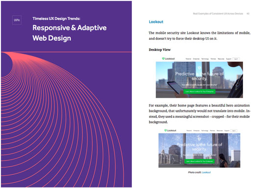
Responsive & Adaptive Web Design is a comprehensive handbook on the solutions to multi-device design, covering the best practices, when to use each, and even walkthroughs of the processes.
Written by the prototyping app UXPin as part of their free design library, this free ebook draws from expert advice and examples from successful companies like Hulu Plus, the Guardian, Change.org, Lookout, and more.
Article continues belowInside this e-book, you’ll find:
- The advantages and disadvantages of both RWD and AWD, so you know when to use which
- Guidelines for RWD and AWD, helpful regardless of experience level
- A step-by-step tutorial of the mobile-first design workflow, one of the best processes for consistent UX
- Thorough analysis and comparison of the mobile, tablet and desktop views from 7 companies that do it well.
See for yourself, and share it if you find it helpful. You can download this e-book now.
Liked this? Read these!
- How to make web forms work better on mobile
- Discover the best blogging platform
- The best free script fonts
Sign up to Creative Bloq's daily newsletter, which brings you the latest news and inspiration from the worlds of art, design and technology.

The Creative Bloq team is made up of a group of art and design enthusiasts, and has changed and evolved since Creative Bloq began back in 2012. The current website team consists of eight full-time members of staff: Editor Georgia Coggan, Deputy Editor Rosie Hilder, Ecommerce Editor Beren Neale, Senior News Editor Daniel Piper, Editor, Digital Art and 3D Ian Dean, Tech Reviews Editor Erlingur Einarsson, Ecommerce Writer Beth Nicholls and Staff Writer Natalie Fear, as well as a roster of freelancers from around the world. The ImagineFX magazine team also pitch in, ensuring that content from leading digital art publication ImagineFX is represented on Creative Bloq.
