How to make web forms work better on mobile
Making forms responsive may be simple, but taking time to consider the device can make a big difference to usability, says Gene Crawford.

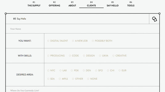
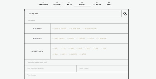
Making your web forms responsive is not a topic that's discussed too often. Mostly because it's not a huge deal to get HTML form elements to behave in a responsive manner – that is, to be both liquid and to utilise targeted screen widths with media queries to serve up specific form layout changes.
The main thing is to consider the context in which a person will be using the form. This a question of thinking through the device you are targeting, not just its screen size. Let's look at a couple of examples that help illustrate my point.
Field sizing
First, field sizing is important on smaller screens when people are using their fingers to target a form field. When using our phone, we do not have the same level of precision as we do with a mouse. Apple's Human Computer Interaction Design documentation has some great in-depth information on how to design for people who are using their fingers to interact with a device.
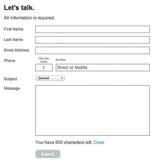
Another consideration when designing a responsive layout is the placement of form elements in relation to their respective fields. On desktops and iPads, having the labels left-aligned makes the form appear simple to complete.
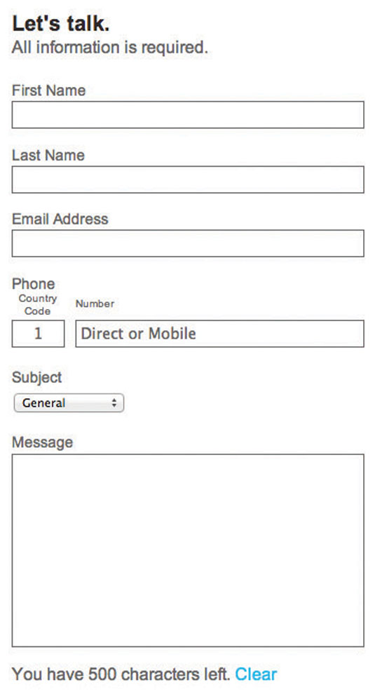
If we change the same form on an iPhone's screen so the labels are on top of the fields, this makes the user slow down a little. As mobile users often have their attention split between different tasks, this should help focus their efforts. Accuracy is more important than speed.
Here are some examples:


Words: Gene Crawford
Sign up to Creative Bloq's daily newsletter, which brings you the latest news and inspiration from the worlds of art, design and technology.
Gene Crawford's mission is to work tirelessly to provide inspiration and insight for developers, mostly via unmatchedstyle.com. This article originally appeared in issue 271 of net magazine.
Like this? Read these!
- 5 lessons in UX design
- Brilliant Wordpress tutorial selection
- Free tattoo fonts for designers

The Creative Bloq team is made up of a group of art and design enthusiasts, and has changed and evolved since Creative Bloq began back in 2012. The current website team consists of eight full-time members of staff: Editor Georgia Coggan, Deputy Editor Rosie Hilder, Ecommerce Editor Beren Neale, Senior News Editor Daniel Piper, Editor, Digital Art and 3D Ian Dean, Tech Reviews Editor Erlingur Einarsson, Ecommerce Writer Beth Nicholls and Staff Writer Natalie Fear, as well as a roster of freelancers from around the world. The ImagineFX magazine team also pitch in, ensuring that content from leading digital art publication ImagineFX is represented on Creative Bloq.
