How to balance visual consistency with beauty on the web
Achieve visual consistency without creating cookie cutter sites.
Sign up to Creative Bloq's daily newsletter, which brings you the latest news and inspiration from the worlds of art, design and technology.
You are now subscribed
Your newsletter sign-up was successful
Want to add more newsletters?

Visual consistency in web design may have started as an idea or abstract concept – something along the lines of, 'wouldn't it be nice if the site looked consistent, too' – but it's now a baseline expectation for every site.
For your users, visual consistency is more than just an aesthetic preference. It serves several practical purposes, including:
- Intuitive feel – Whether consciously or not, a user picks up on the rules a site sets for itself. By adhering to these rules, a site creates a recognizable interface that the user feels confident using.
- Learnability – Every occurrence of inconsistency makes the user relearn a functionality, whereas consistency signals to the user how to work familiar functions.
- Professionalism – Inconsistencies give the impression of disorganization and even laziness – not traits people want to do business with.
- Visual flow – Consistency allows people to know where to look, or send subtle visual cues to influence where they look.
In this article, we'll deconstruct the areas most affected by visual consistency – typography, UI elements, and colours – and illustrate their effective use in a real-life example.
01. Typography
Feel free to experiment with different fonts and styles – but don't go overboard.
You'll want enough diversity to keep your text interesting, while also differentiating the categories of text (heading, content, links, etc.). While you're free to select whatever typefaces, styles, and weights you want for the different categories, the most important aspect is that your treatment, whatever it is, must remain consistent.
If you use choose a bold serif font for one H1 headers, make sure you use a bold serif font for all H1 headers.

To ensure consistency, you can actually set font properties globally through CSS. Font family, size, colour, line height, and weight can all be set as in the following example for body text:
Sign up to Creative Bloq's daily newsletter, which brings you the latest news and inspiration from the worlds of art, design and technology.
body { font: 1em/1.5em Cambria, Arial, serif; color: #151; }
Beyond consistent typefaces, make sure the alignment is consistent and that you've set proper line spacing (roughly 1.4-1.6x your font size). Creating this vertical rhythm instills harmony between all your content, improving readability and familiarity.

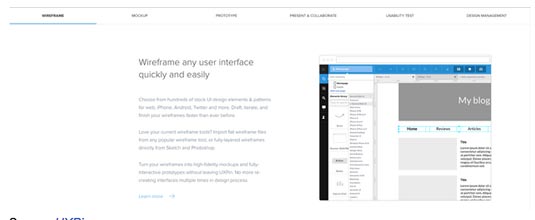
For one potential redesign of the UXPin website, we decided on a minimalist sans-serif typeface. We choose the following sitewide typographic consistencies (as you can see in the image above):
- Headers – Large font size, with select words bolded
- Subhead – Mixed-case, regular weight
- Primary Navigation – Mixed-case, bolded weight
- Secondary Navigation – All caps, regular weight

For the main content (shown above), we've created vertical rhythm through a left-justified, right-ragged alignment and a 1.6x line spacing. To transition the eye smoothly, we also added plenty of white space between the H2 header ('Wireframe any user interface quickly and easily') and body copy.
The result is not only a well-structured visual hierarchy, but one that simplifies user interaction. People can instantaneously separate the visual elements with one glance to find what they're looking for, whether the navigation bar or the next section of text when scanning.
02. UI Elements
A site's use of graphics, icons, textures, layout spacing, and images all work together to set the visual atmosphere of the interface.
Aside from thematic consistency, pay attention to the mechanics of graphics:
- Spatial relationships – Make sure that the padding around elements is consistent, otherwise you'll break the visual flow. This spacing also affects the grouping of elements (chunking), which helps reduce the user's cognitive load if there are too many elements on the page.
- Images – Visually, your images should reflect the same look, feel, and texture. In terms of implementation, make sure that you don't make some images open in new tabs while others appear in lightboxes. Pick a style and stick with it.
- Size – Related elements should be the same size and look similar, ie, all circular or all square. Size can signal differences or similarities in function, in accordance to the Gestalt principles we describe in Web Design for the Human Eye 1.
Let's take a look at Redhat, which reflects all the best practices for visual consistency of UI elements.
Technology page:

Services & Support Page:

As we described in Web UI Patterns, the cards pattern is great for maintaining consistency across different pages. Once you hit a secondary page like Technologies or Services & Support, the close spacing and identical size of the features pages all suggest that they relate to each other.
Meanwhile, site search and account settings are shuffled away to the top-right corner, but they are clustered together. This tells the user that these are all a group of secondary actions. Also, notice how the background image has the same industrial feel, but differences in shading and colour keep the site from feeling like a template.
The circular icons are also consistently designed with their white outlines against a red background. Every new page of the site has familiar visual cues, allowing the user to 'instinctively' know what to do.
Next page: colour and reconstructing visual consistency...

The Creative Bloq team is made up of a group of art and design enthusiasts, and has changed and evolved since Creative Bloq began back in 2012. The current website team consists of eight full-time members of staff: Editor Georgia Coggan, Deputy Editor Rosie Hilder, Ecommerce Editor Beren Neale, Senior News Editor Daniel Piper, Editor, Digital Art and 3D Ian Dean, Tech Reviews Editor Erlingur Einarsson, Ecommerce Writer Beth Nicholls and Staff Writer Natalie Fear, as well as a roster of freelancers from around the world. The ImagineFX magazine team also pitch in, ensuring that content from leading digital art publication ImagineFX is represented on Creative Bloq.
