Mastering your perfect design process
Jane Portman gives out some tips on how to improve your UI design process.
Sign up to Creative Bloq's daily newsletter, which brings you the latest news and inspiration from the worlds of art, design and technology.
You are now subscribed
Your newsletter sign-up was successful
Want to add more newsletters?
UI design is a production process. But beneath everything, it's a service. And you're getting paid for serving the client.
Developing your own process is almost as important as developing your own design style. These workflow peculiarities will get you through hard times, and they'll make your service more memorable to clients.
With time, you polish the process and it becomes part of your personality.
Let's briefly walk through the most common stages of the UI design process to see how you can improve them to fit your style.
Wireframes
Are you still working without wireframes? I totally know what you're thinking, because I spent years in your camp before I realized the true value of wireframing.
You're thinking: "Sure, they're useful. But I know what I'm doing, and I can design perfectly well right in Photoshop."
But the benefits of wireframing aren't limited to just prep work:
Sign up to Creative Bloq's daily newsletter, which brings you the latest news and inspiration from the worlds of art, design and technology.
- You entirely separate the thinking process and UX considerations from the visual design: it makes thinking much easier
- It makes the following design process totally worry-free, with the focus on aesthetics
- Wireframes serve as a communication bridge between you and the client, who's more likely to sign off on the ultimate layout without asking unpleasant questions if it's based on their own input from the wireframing round
- Thoroughly documented wireframes yield additional respect towards your UX expertise, which may go unnoticed if the client is blinded by the beauty of the final layouts
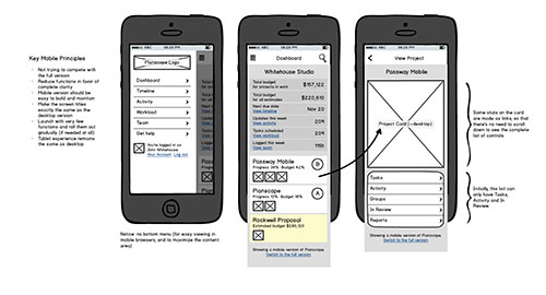
Make sure to include plenty of comments right into the wireframes. Comments make wireframes look more interesting, and they'll guide the client through your thinking process. You can even ask questions or give a few options to choose from right inside the wireframes.
Have a look at this fragment of wireframes for the mobile version of Planscope for Brennan Dunn. Not only do you set the grounds for further high-fidelity layouts, but you also explain your way of thinking to the client.

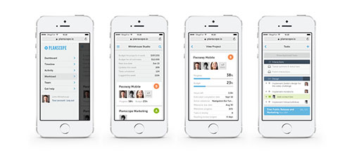
Here's what these wireframes finally evolved into. The ultimate high-fidelity layouts were much easier to design (and sign off).

Prototypes and testing
These amazing methods allow you to explore and highlight problems in your wireframes on the early stage, without drawing up high-fidelity layouts and deploying them.
You can make your wireframes clickable using tools like InVision. Or you can work with the developer to build an early version that lacks the graphics but represents the core functionality.
Then this early prototype is tested live, either by you and the team, or by a group of users from the target audience. It would be fantastic if all the projects could afford this stage, but the reality's different.
The majority of large agencies still employ the waterfall approach, which means the testing happens after product deployment. Then the amount of testing to be made is very limited due to the lack of resources and the natural resistance of the team to change anything after the hardest part of the work is done.
Not to mention that plenty of entrepreneurs don't budget for user testing at all. It doesn't seem smart, but it's easily justified by the lack of resources, both time and budget.
High-fidelity layouts
No matter what the usability experts say, the visual part of the process is very important. It brings true joy and fun to the UI design process. Nothing can be more rewarding than getting your hands on actual fonts and colors.
If you do your due diligence with the wireframes and get preliminary approval from the client, then the visual part will be easy as pie. Well, almost.
So open up Photoshop and get your hands dirty.
I don't recommend you present any more than two "style options." One isn't enough because the client just needs to have a choice, and three makes the choice too hard. Remember that Buridan's ass paradox? The poor mythical animal starved to death because it couldn't make a choice between two identical piles of hay.
Managing feedback
It takes additional wisdom to manage the feedback process. One of the key principles here is empathy. Plus, be attentive and remember the details from your discussion with the client. Later on, you can present your UI ideas as the development of their initial ideas.
It also helps to emphasize the business goals of the app, the target audience, and other marketing aspects. These are the bread and butter of any entrepreneur, and they'll be very glad that their UI designer takes all these things into consideration.
Words: Jane Portman
Want to learn more? Get Jane Portman's entire ecourse, Fundamental UI Design, in your inbox by signing up here.
Liked this? Read these!

The Creative Bloq team is made up of a group of art and design enthusiasts, and has changed and evolved since Creative Bloq began back in 2012. The current website team consists of eight full-time members of staff: Editor Georgia Coggan, Deputy Editor Rosie Hilder, Ecommerce Editor Beren Neale, Senior News Editor Daniel Piper, Editor, Digital Art and 3D Ian Dean, Tech Reviews Editor Erlingur Einarsson, Ecommerce Writer Beth Nicholls and Staff Writer Natalie Fear, as well as a roster of freelancers from around the world. The ImagineFX magazine team also pitch in, ensuring that content from leading digital art publication ImagineFX is represented on Creative Bloq.
