The best web design tools: work faster and smarter
From code editors and frameworks to UX and prototyping, these web design tools will help streamline your workflow
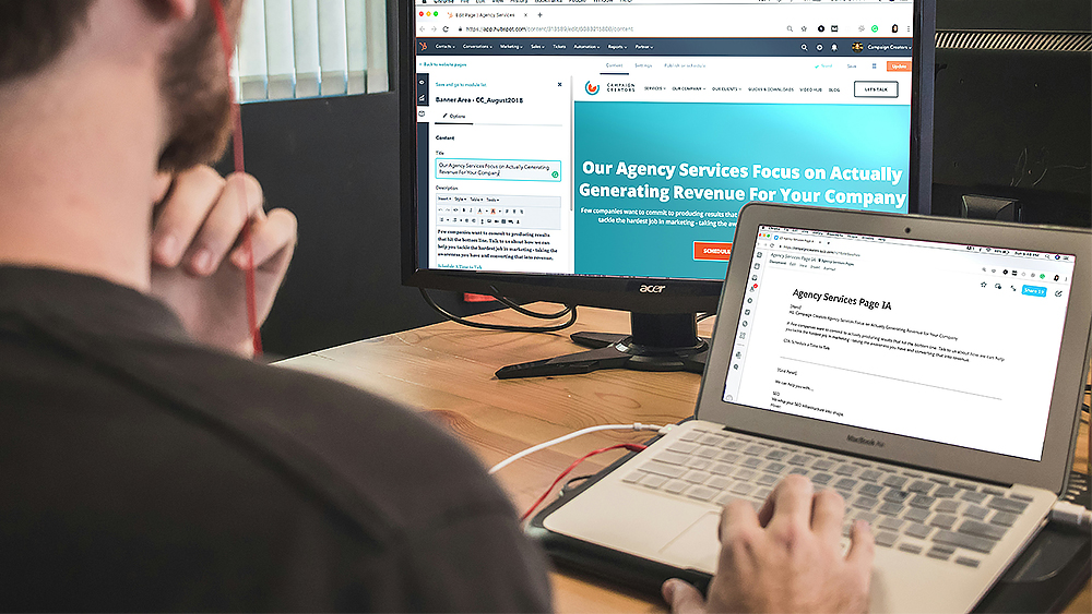
The best web design tools can help you design a site faster, easier and more smoothly. It's always worth thinking about which tools might speed up your workflow, and we've tested dozens over the years, from prototyping tools to code editors.
In this article, we've brought together a list of the best web design tools we've tested, including options for creating mockups and prototypes, the best code editors and frameworks, the best testing tools and tools for VR, animation and typography.
While you're here, you might also want to check out our roundup of the best web builders for small businesses or the more aesthetically minded best website builders for artists.
Code editors
01. Sublime Text 4
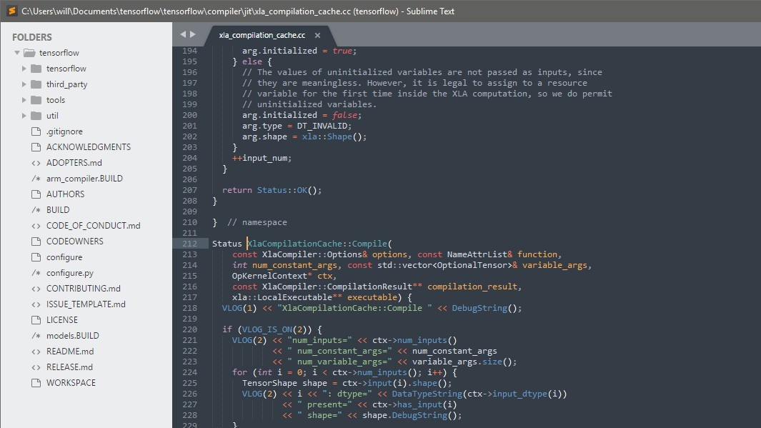
A decent code editor can really save you a lot of time, and make the process of writing code easier on the eyes and brain. Sublime Text has been around for years and isn't the most contemporary option, but we think it's still one of the best code editors around. It's simple but powerful and flexible thanks to a load of community-written plugins, and it's very lightweight, allowing you to open large files without the battery strain generated by Electron-based IDEs.
Microsoft Visual Studio Code (see below) is great but heavy since it's an IDE. Notepad++ does the job, but it's not exactly attractive. Sublime text is streamlined, easy to use and responsive, helping you to get into the flow of programming. It's not free, but given the amount of time this code editor can save, we think it's still worth the cash.
02. Visual Studio Code
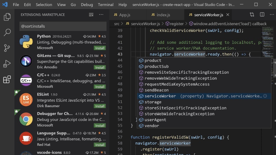
We already mentioned that it's heavy, but Visual Studio Code remains our favourite free code editor. It's developed by Microsoft but open-source, and it has a built-in terminal and Git commands are built-in. You can debug your code right from the editor. There are extensions to add new languages, themes, debuggers, and more. And as well as syntax highlighting and autocomplete, you also get Microsoft's clever IntelliSense feature, which provides autocompletion of code and data on the parameters of functions and known variable names.
03. Codespaces
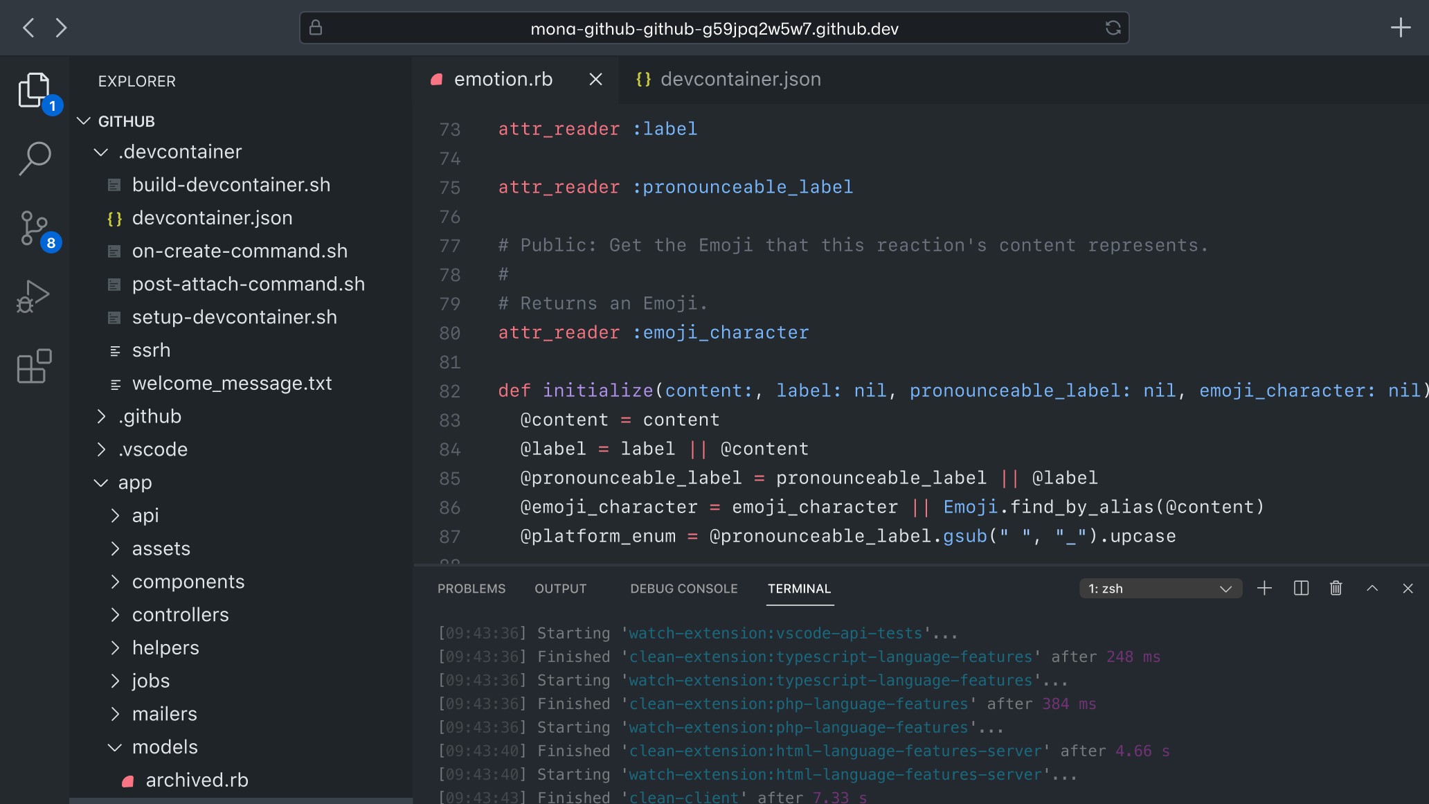
Codespaces is a browser-based code editor based on Visual Studio Code (above). It has support for Git repos, extensions and a built-in command line interface so you can edit, run, and debug your applications from any device. Obviously, this enables you to work from anywhere, and makes collaboration with other devs easier. You can launch Codespaces straight from Github. And it's very fast: spin up new dev environment for any sized project in seconds with prebuilt images. GitHub’s own 35GB dev image starts in under 10 seconds.
Sign up to Creative Bloq's daily newsletter, which brings you the latest news and inspiration from the worlds of art, design and technology.
Mockups and prototypes
04. Figma
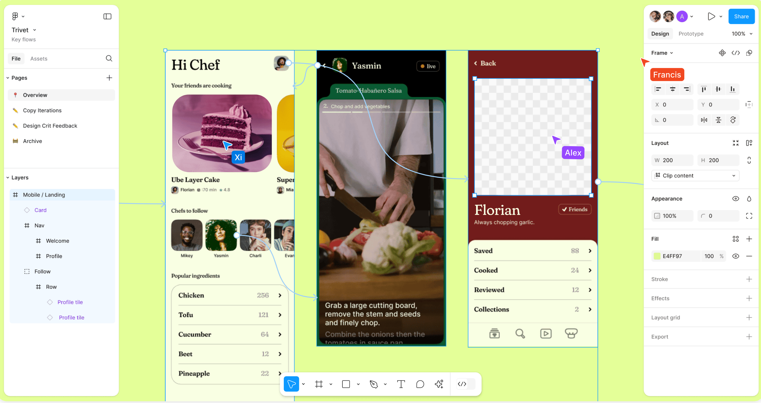
Figma is a popular interface design tool that enables multiple designers to collaborate in real-time, and it tops our list of the best UI design tools. The collaborative approach is very useful when you have multiple stakeholders in the project that are involved in shaping the outcome – so useful that its popularity spread like wildfire throughout the web design community. Figma is available in the browser, or on Windows, Mac or Linux, and there are both free and paid versions depending on what you use it for. For more details, see our Figma review.
05. Sketch
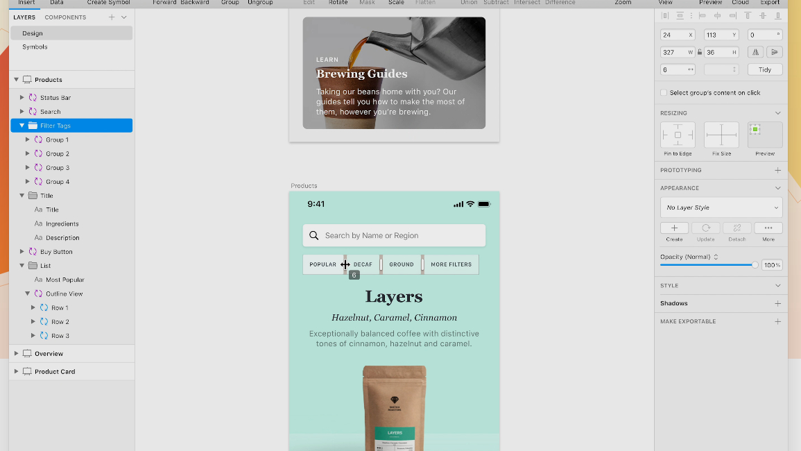
Sketch has declined in popularity amid the surge of users turning to Figma, but it remains a viable and highly powerful vector-based tool for building interfaces and prototypes in a collaborative way. Sketch was built especially for making websites and apps so there are no unnecessary features cluttering the place, and it's faster and more efficient than some software that has a broader scope.
The community offers hundreds of Sketch plugins to make your design workflow easier and smoother. A downside of Sketch is that the desktop app is only available on Mac, although there is a web app. For more details, see our Sketch review.
06. Marvel
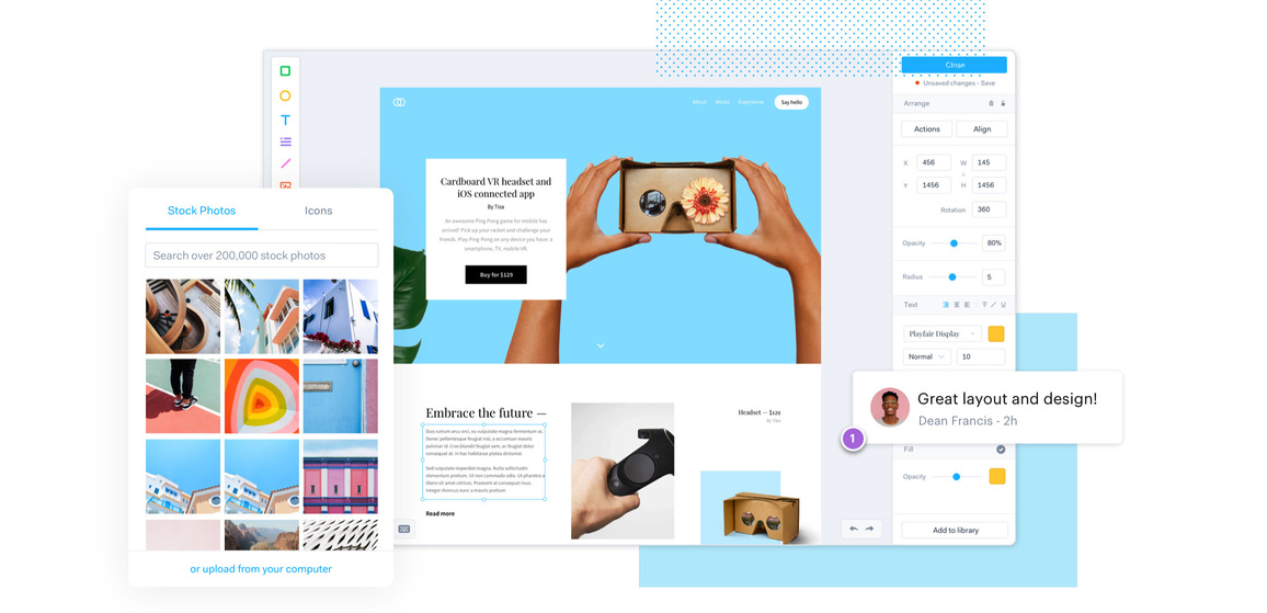
Marvel is another web design tool that’s great for producing quick ideas, refining an interface to how you want it to look, and building prototypes. Marvel offers a really neat way of building pages, allowing you to simulate your design through a prototype. There are some wonderful integrations for inserting your designs into your project workflow. Interestingly, there's an integrated user testing feature, which is still fairly unusual in the web design toolscape. It’s all online too, so no need to download anything, and we found it to be more stable and to syncs faster than the late Invision. It also has a lightweight plug-in.
07. Affinity Designer
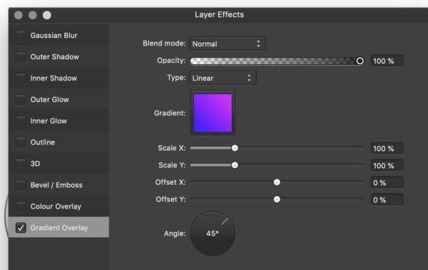
This isn't specifically a web design or UI tool but rather a subscription-free alternative to Adobe Illustrator. But Affinity Designer has still become popular among web designers seeking to create prototypes. Benefits include adjustable, non-destructive layers, which means you can adjust images or vectors without damaging them. The million per cent zoom helps you really get in close with vector art, and the undo and history features allow you go back over thousands of steps. Affinity Designer is also available for the iPad, providing the full features you get on desktop. For more details, see our Affinity Designer review.
08. UXPin
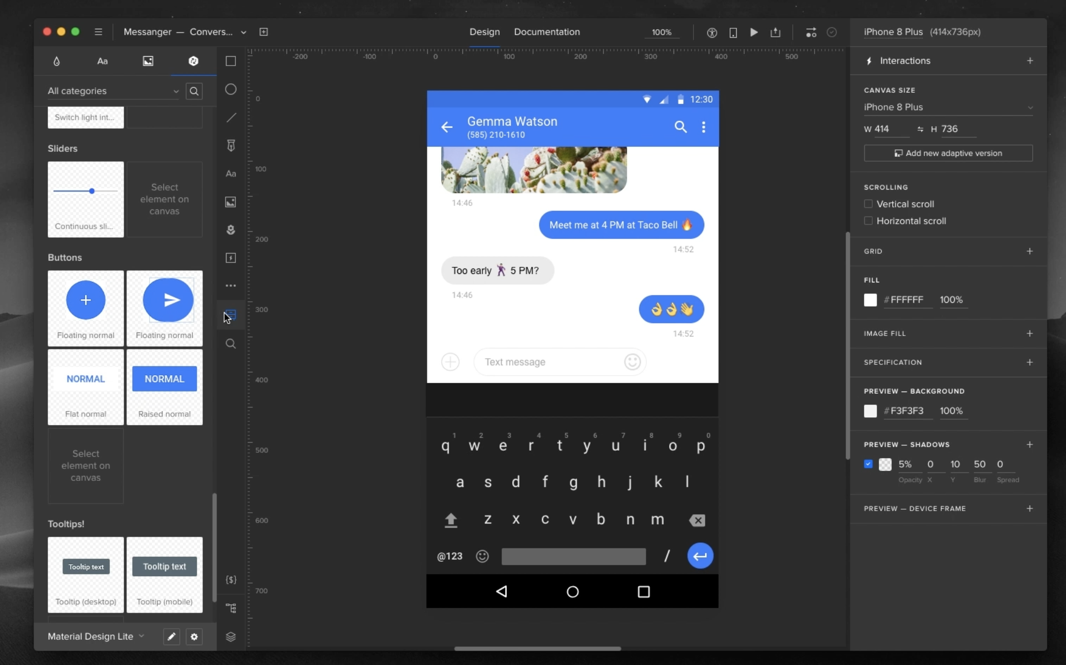
UXPin is a dedicated prototyping app available for Mac, Windows, or in the browser. With many other design tools you can only mimic interactions by linking different elements on your artboard, UXPin gets closer to the code and enables you to work with interactive states, logic, and code components.
There are integrated element libraries for iOS, Material Design and Bootstrap, plus hundreds of free icon sets, to help you on your way. UXPin also has accessibility features to ensure your designs stay in line with WCAG standards. It also supports import from other design tools including Figma. All in all, we find UXPin to be an impressive design environment for advanced wireframing and layered prototypes, but the learning curve is fairly steep for competitors.
09. Proto.io
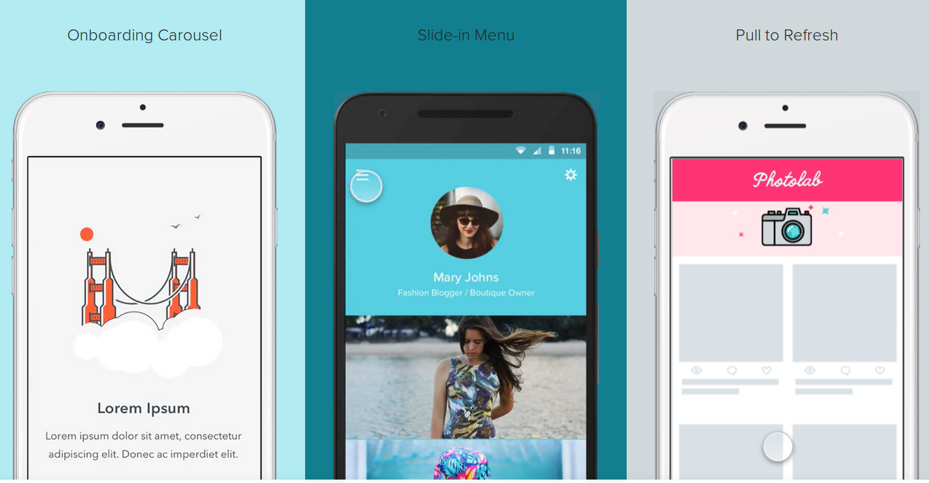
Proto.io is UX design tool that runs in your browser and allows for the inception of lifelike prototypes that begin with rough ideas and end with fully fledged designs. The tool also provides a range of possibilities for your projects, including detailed and custom vector animations.
You can start by developing initial ideas with a hand-drawn style, work them into wireframes, and finish them off with a high-fidelity prototype. The Sketch and Photoshop plugins help if you want to design using other tools, but Proto.io handles the end-to-end design process well. Other features – user-testing, for example – will help validate your designs. A great all-in-one solution. See our guide to the best UI prototyping tools for more.
10. Balsamiq
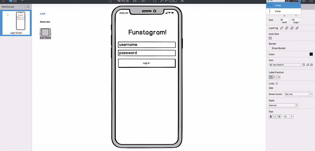
Since the rise of Figma, more and more people expect prototypes to be delivered in high fidelity, but that has its drawbacks since people often start criticising the smaller details such as font color and alignment before more macros issues are established. As such, low-fi wireframing stil has a place.
And if rapid, efficient wireframing is what you’re looking for Balsamiq is a decent choice. It's been going since 2008 and prides itself on its fast, focused no-nonsense approach. You can quickly develop a structure and layouts for your projects with ease. Drag-and-drop elements make life easier, and you can link buttons to other pages. By wireframing, you can quickly start to plan your interfaces and share them with your team or clients. For more options, see our roundup of the best wireframe tools.
11. ProtoPie
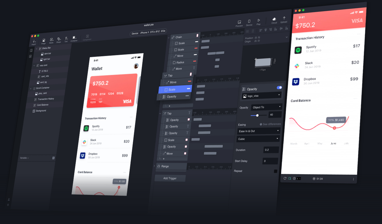
Want yet another alternative for prototyping? ProtoPie allows you to create complex interactions and get close to your design’s ideal end function. Perhaps the standout feature is the ability to control the sensors of smart devices in your prototype, such as tilt, sound, compass and 3D Touch sensors. Depending on your project, this is a great tool for those that want to encompass native app features. It’s easy as pie (sorry) and no code is required.
12. Framer
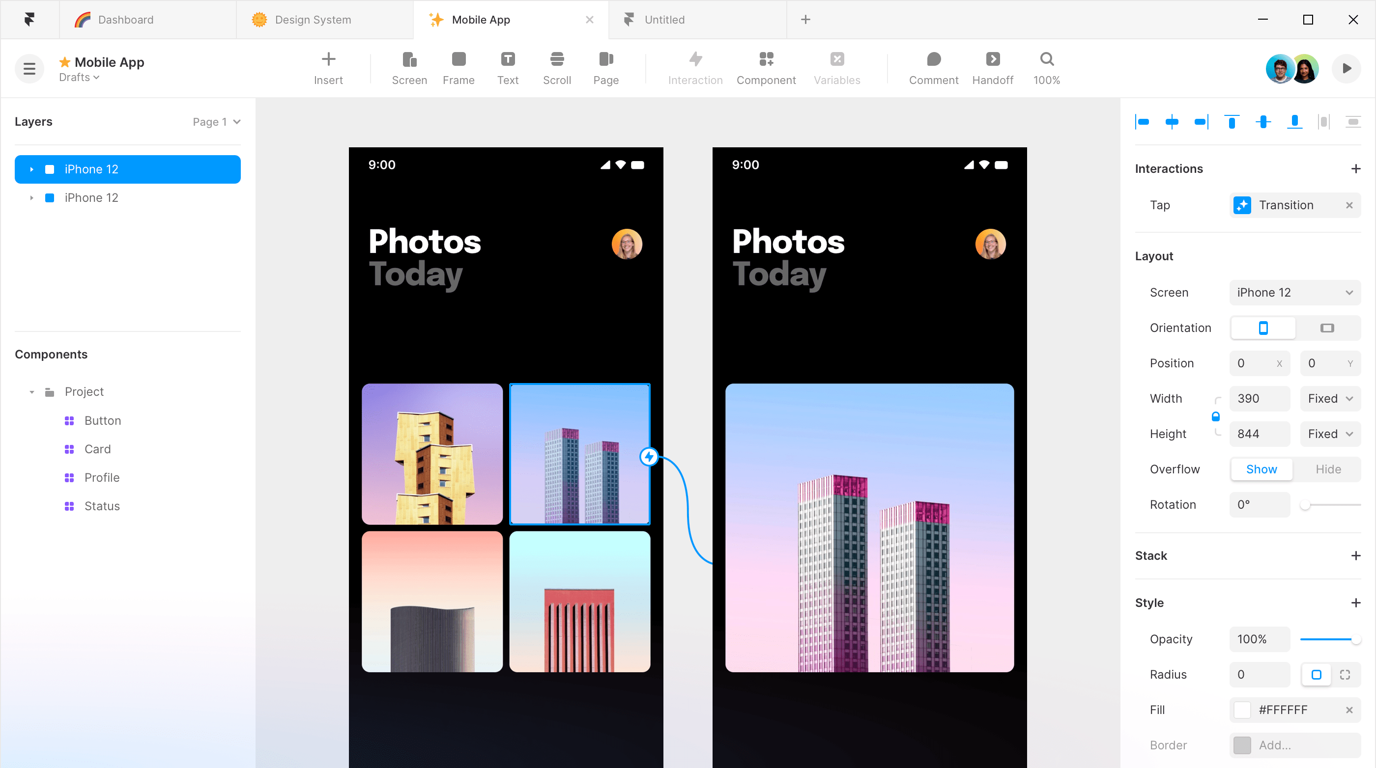
We found Framer to be good for creating websites when the aim is to look beyond the traditional CMS-and-theme approach. More suited to web UX than app UX, it feels familiar and intuitive to use, and a web design can be created relatively quickly, with Framer’s support materials guiding you through. It's easy to add effects and visually connect pages, for example linking a page, scrolling to a specific section, or opening a modal.
Design frameworks and libraries
13. React
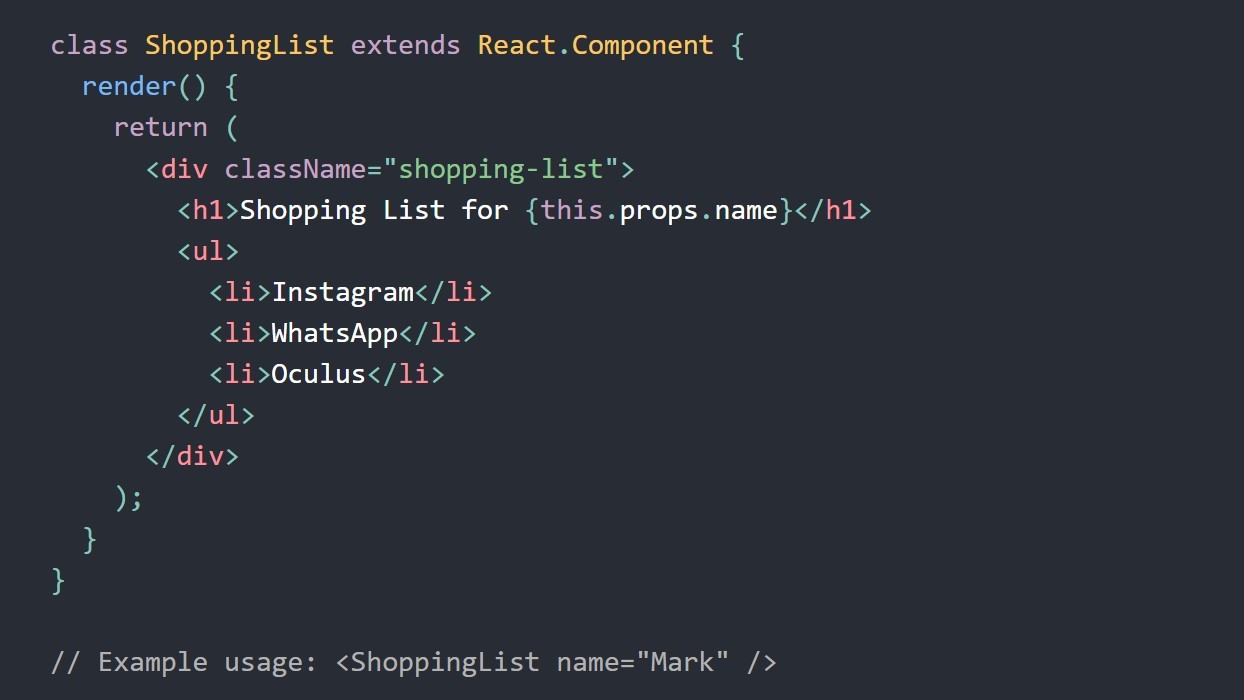
Launched in 2013, React is a JavaScript library that's component-based and declarative, making it painless to create interactive UIs. Design simple views for each state in your application, and React will efficiently update and render just the right components when your data changes. This framework is good for websites and apps with complex view logic, as well as quick prototypes with a low barrier to entry. React can also render on the server using Node and power mobile apps using React Native.
14. Angular
Maintained by a dedicated team at Google, Angular is a free and open-source, web app framework that provides a broad suite of tools, APIs, and libraries to simplify and streamline the development workflow and build fast, reliable applications that can scale with the size of your team and your codebase.
It's a complete rewrite of the former AngularJS using TypeScript instead of JavaScript. (TyepeScript is a superset of JavaScript developed by Microsoft for designing large applications.) Unlike AngularJS, Angular does not have a concept of scope or controllers; instead, it uses a hierarchy of components as its primary architectural characteristic. It uses standalone APIs, Angular Signals, prerendering, hydration, SSR/SSG, View Transitions in the router, control flow and deferred views.
15. Bootstrap
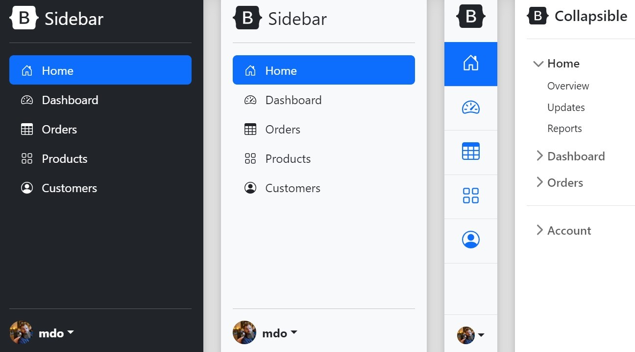
The CSS framework Bootstrap may have declined in popularity, but it's an old favourite that has a lot to offer, and it still has its fans for frontend. Features to look out for include responsive containers that are fluid up to a certain breakpoint, and responsive .row-cols classes for specifying the number of columns across breakpoints efficiently. Bootstrap also has its own open source icon library, Bootstrap Icons, which is designed to work with Bootstrap components.
16. Vue.js
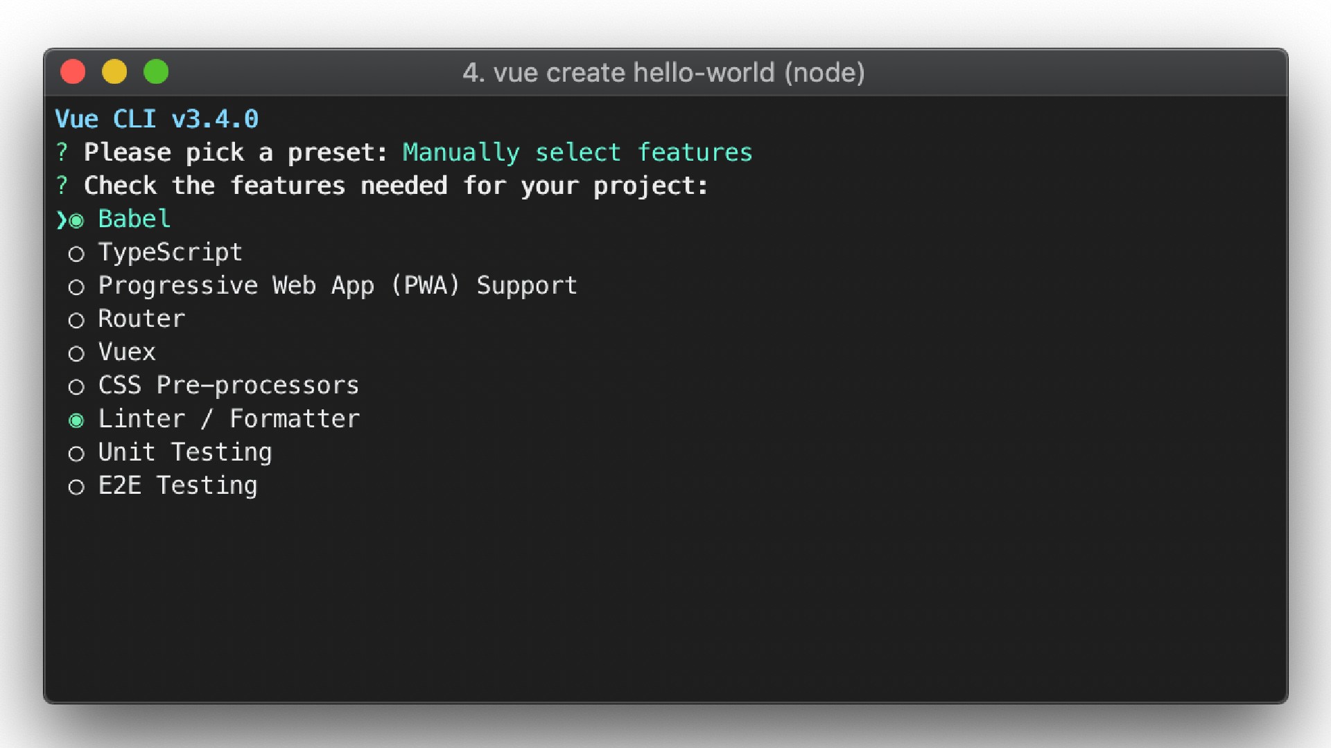
Over a decade after its launch, Vue.js remains a highly user friendly framework for building user interfaces, and uses a virtual DOM. As the name suggests, Vue’s core library is focused on the view layer. Allowing you to build on top of standard HTML, CSS and JavaScript with its intuitive API and first-class documentation, this is a rich, incrementally adoptable ecosystem that scales between a library and a full-featured framework.
17. Pattern Lab
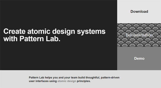
Pattern Lab is a pattern-driven design tool based on the concept of Atomic Design, which says that you should break your design down into its smallest parts – atoms – and combine them to form bigger, reusable components – molecules and organisms – that can then be turned into usable templates.
It's language-and tool-agnostic. It enables you to nest UI patterns inside each other and design with dynamic data. It features device-agnostic viewport resizing tools to help you ensure your design system is fully responsive. And it's fully extensible, so you can be sure it'll expand to meet your needs.
18. Google Material Design
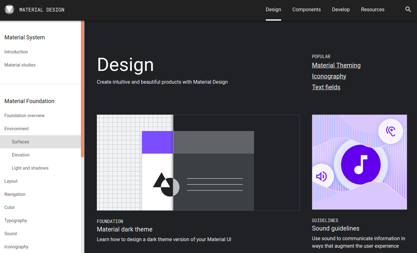
Material Design is a visual language from Google that aims to combine the classic principles of good design with innovations in technology and science to create a cohesive and flexible foundation your website.
Websites and apps created using the Material Design framework will look modern and be familiar to the user, so people will find it easy to use your product right away. There are many tools available to help with this design system; click Resources on the nav bar to find them.
Images
19. Orion Icon
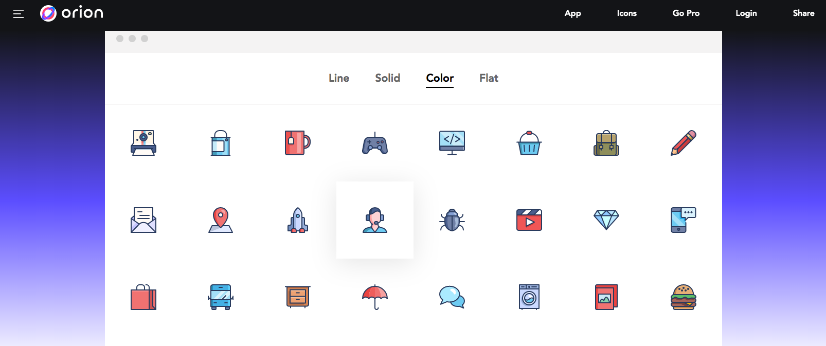
Great icon sets can always be hard to find, even using the best stock libraries. That's where Orion Icon comes in. It makes it to find the right icons and you can then manipulate the style of your icon, including choices of solid, line, colour and flat icons. Every icon comes in SVG and vector format with a bunch of controls to build your perfect set. Another nice feature is that you can build collections for different projects, ensuring you never forget which icons you used and how they were styled.
Also see our roundup of the best free icon sets around.
20. SVGito
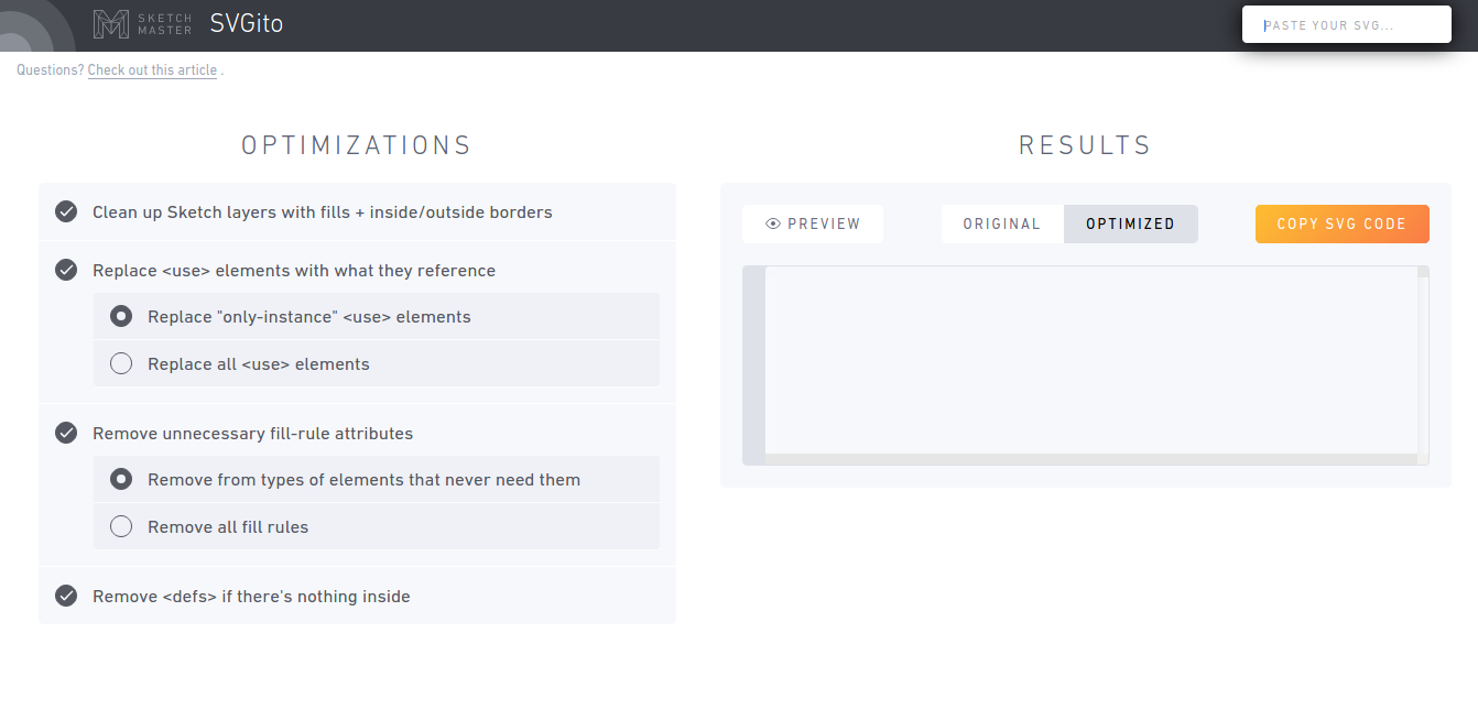
SVGito is a free web app that cleans up your SVG files, to save you the bother of manually editing them. This neat little app automatically optimises your SVGs at the touch of a button, and will typically reduce their size and complexity without changing how they actually look on screen.
21. Squoosh
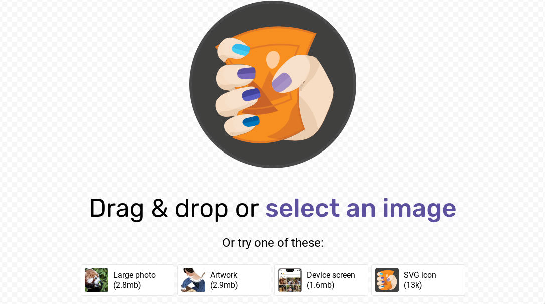
Squoosh is a free app from Google that’s aimed at helping web designers compress their images without sacrificing quality. You drag and drop your image into the app and use a slider to play with the amount of compression, so you can quickly find a good balance between picture quality and file size.
The app works both online and offline, and overall it’s a win-win: web designers save time, and Google gets a faster web that still looks good.
Animation
22. Principle
Principle is great for interaction design – for mobile applications in particular. Tweaking and polishing animated interactions is a breeze with Principle. You can look at individual assets and how they independently animate, right down to timings and easing. This is another Mac-only app.
23. Anima
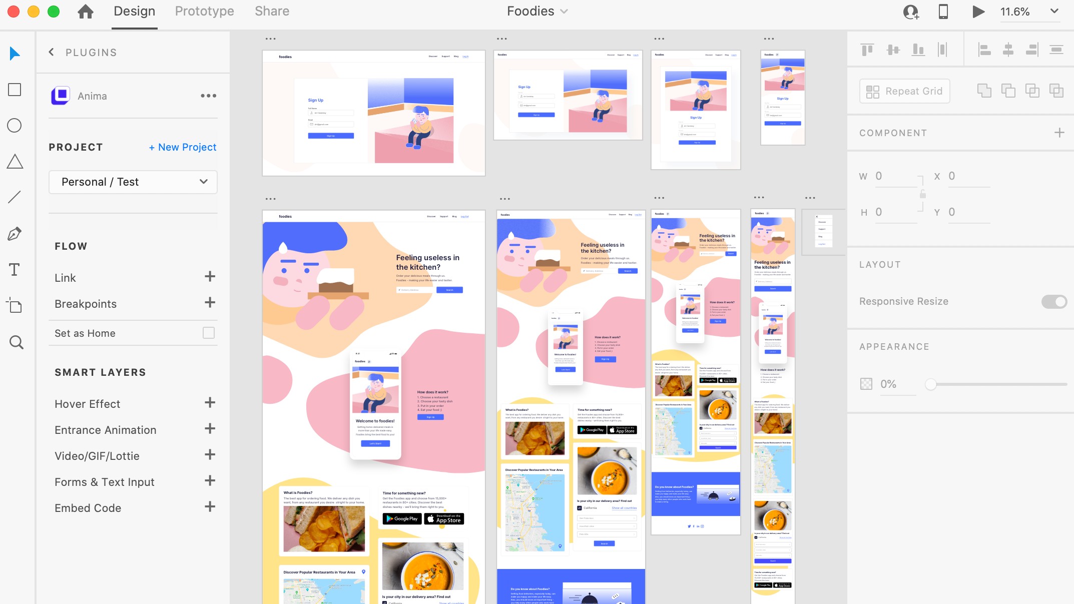
Anima is an awesome plugin if you want to start using Sketch, Figma or Adobe XD for more sophisticated prototyping. For many Sketch users, this can be the missing piece to create really nice transitions and more complex interface animations.
24. Anime.js
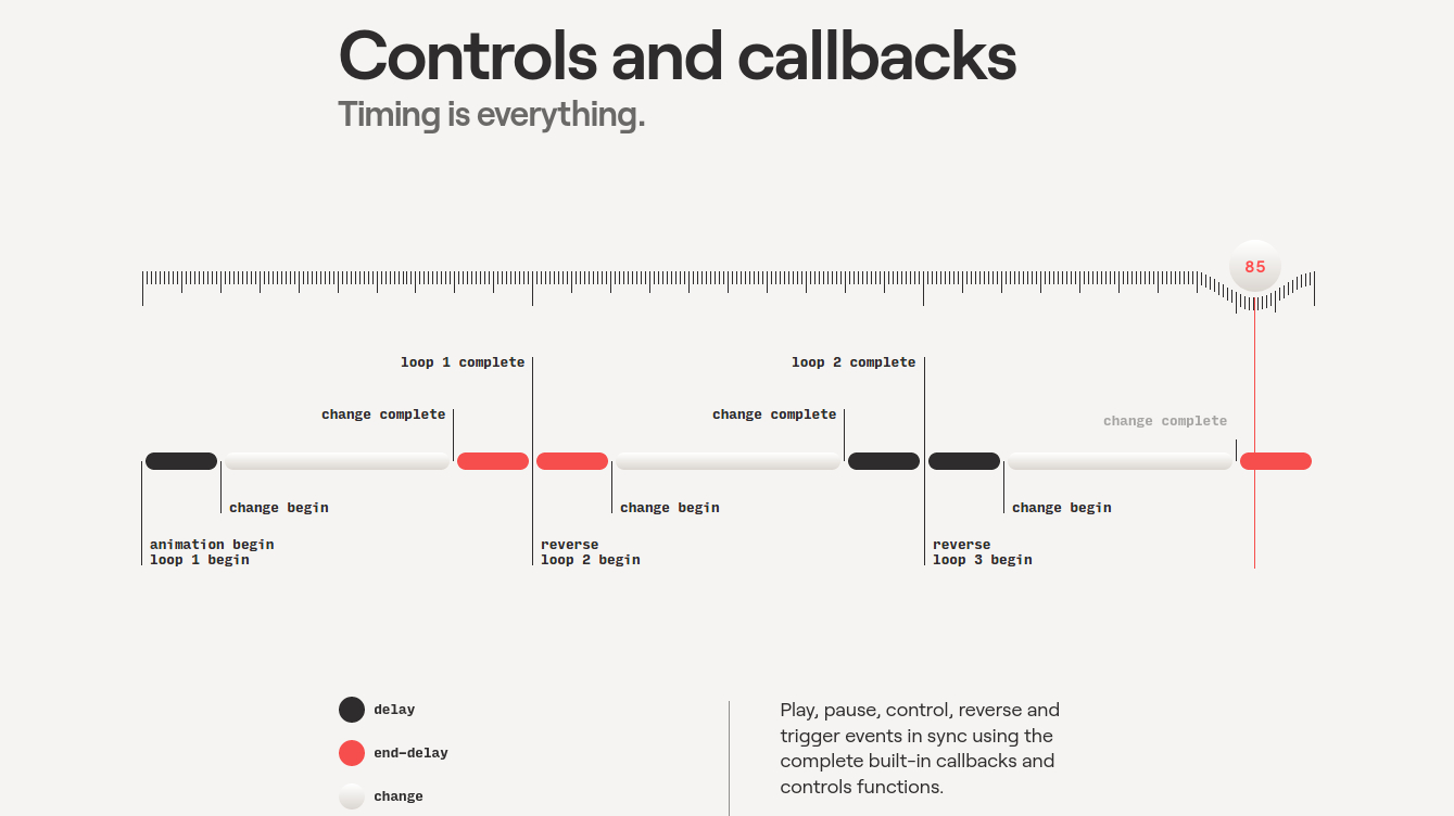
Although web page animations often get a bad rap, used judiciously they can make a website easier to navigate. CSS animations and transitions have been a huge step forward, but more complex interactions often require a library. Anime.js is an animation engine you’ll want to take a look at if you need to add complex animated components to your apps.
25. Hype Professional
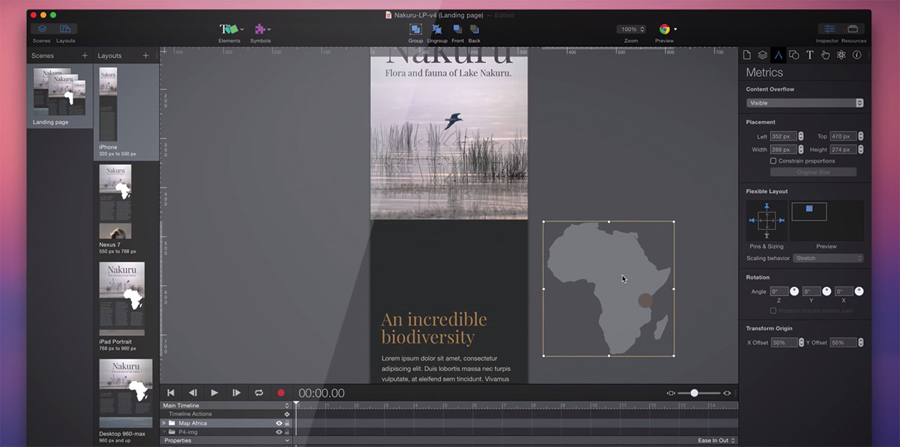
Hype Professional is an application that will allow you to export stunning interactive and animated HTML5 layouts. Animate elements with natural movements and collisions without keyframes or code. This incredibly easy editor provides you with the tools to breathe life into your designs, and leave static interfaces behind.
Testing
26. Tobii Pro
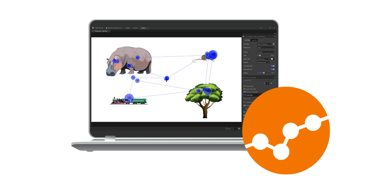
Tobii Pro is a software development suite for eye trackers and analysis. It helps you conduct online eye tracking studies on subjects as they navigate a website layout, ideal for figuring out, say, how to use logos for web design with perfect placement. Similar testing can be done with the tool for online banking portals, streaming services and work portals, offering a more authentic view on online behaviour and the reasons behind particular actions on your web designs. That insight can then be used to optimize a site for user friendliness and engagement.
27. Sizzy
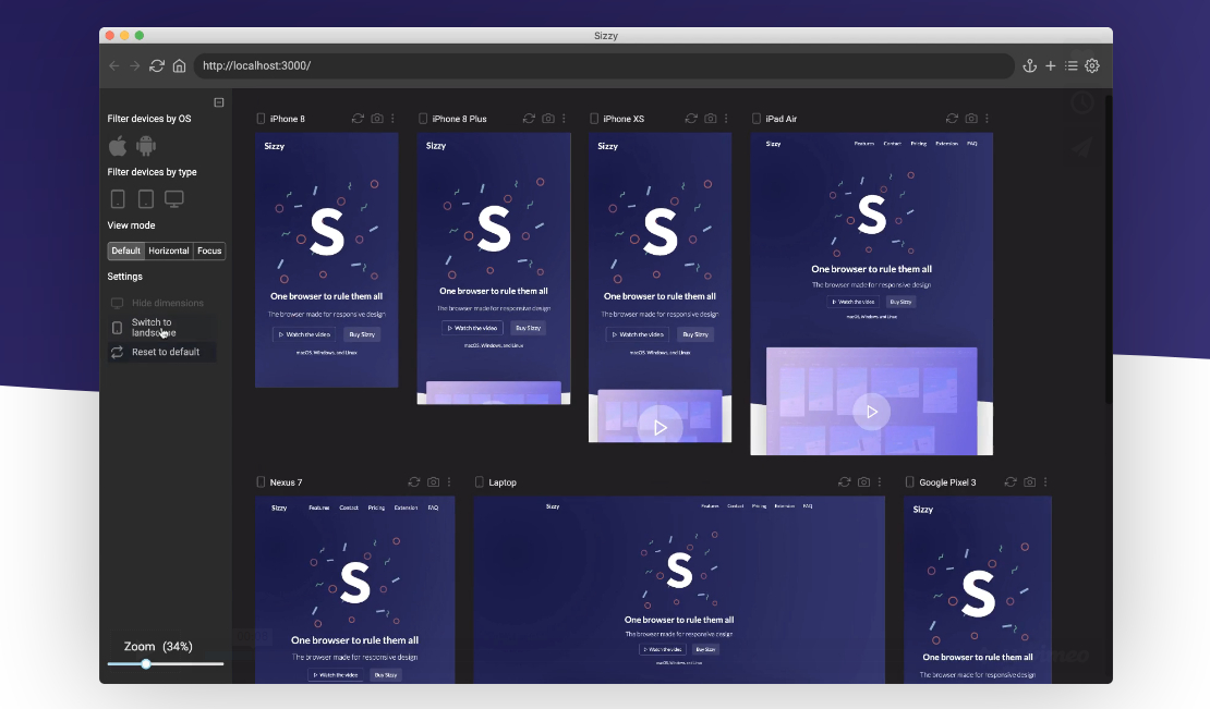
Sizzy is a tool that allows you to preview multiple screens at once while you’re testing out your responsive web apps. Creator Kristijan Ristovski had previously been using react-storybook to switch between the different variations of each component. But he got annoyed having to go back and forth between so many devices. So he built Sizzy, which allows you to see all the changes simultaneously, making it much quicker and easier to spot and fix layout bugs.
28. Linksplit
The most effective way to make your website better is through A/B testing: splitting traffic between two or more different versions and seeing which performs better. And Linksplit makes it a lot easier to set up. It’s free for the first 10,000 clicks, and you don’t even have to sign up to get started. Head to the site, enter your destination URLs and you’re given a single, short test URL to share with your audience. If you like, you can set up rules. For example, if you want people in the UK using Chrome on iOS to end up in a different place to people in the US, that’s pretty easy to set up.
29. Verifier
Fake email addresses registered to disposable domains are the scourge of online communities, and this simple tool can be your site's Batman. Verifier can be dropped into the email sign-up on your site, where it checks through a list of over 18,000 disposable domains in an instant and lets the user know if they need to provide a real address to sign up. It also checks that the domain of the address is valid and exists, and that the syntax is correct.
With a free forever API key, Verifier could be an important step in crushing the spammer blight in online communities – something that its creator is very passionate about. The Sisyphean task of cleaning up the web starts right here.
Exporting and converting
30. Lunacy
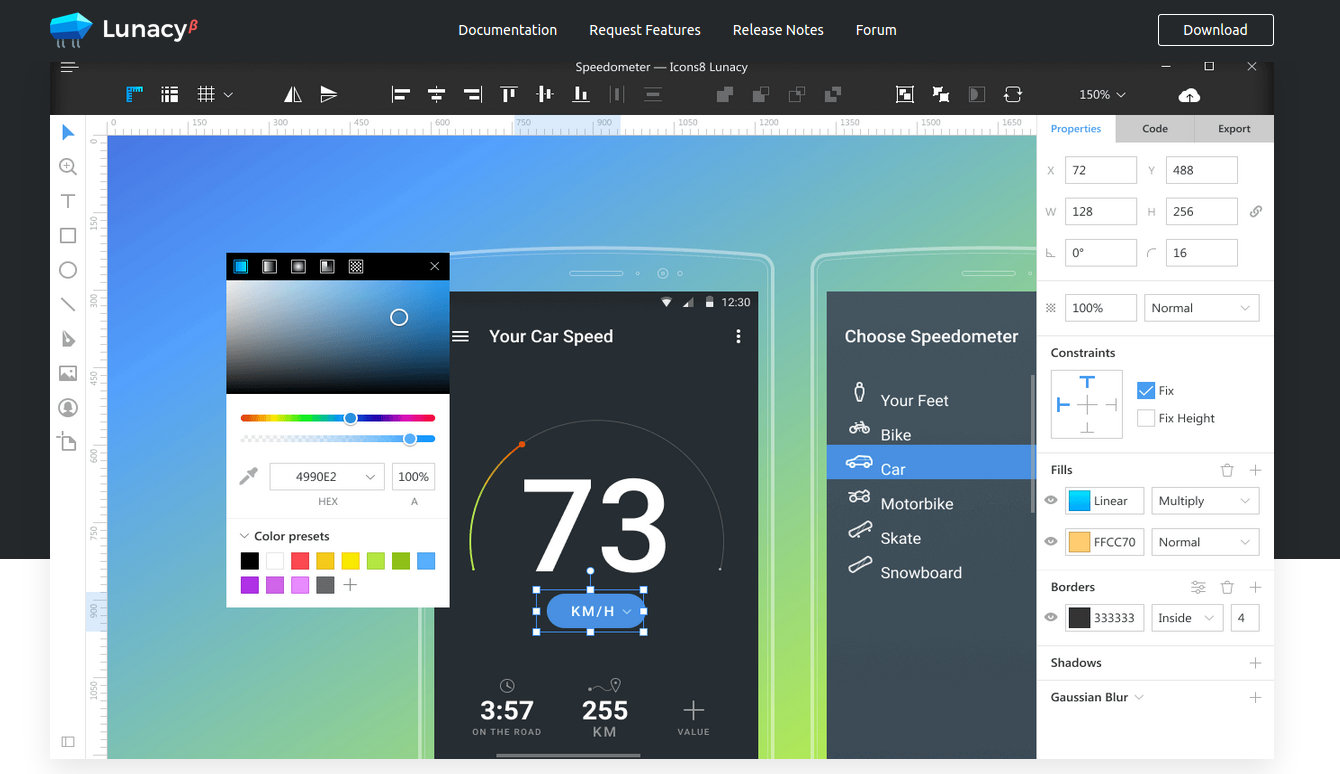
Lunacy can solve the problem of .sketch files being 'stuck' on Macs; now you can open, edit and save them with this free Windows software. It’s a fast program: it will open large files without grinding to a halt, and there is a decent crop of editing tools so you can make tweaks, save the file and send it to coworkers. You can export to PNG and SVG, and Lunacy will automatically download any missing Google fonts.
31. Zeplin
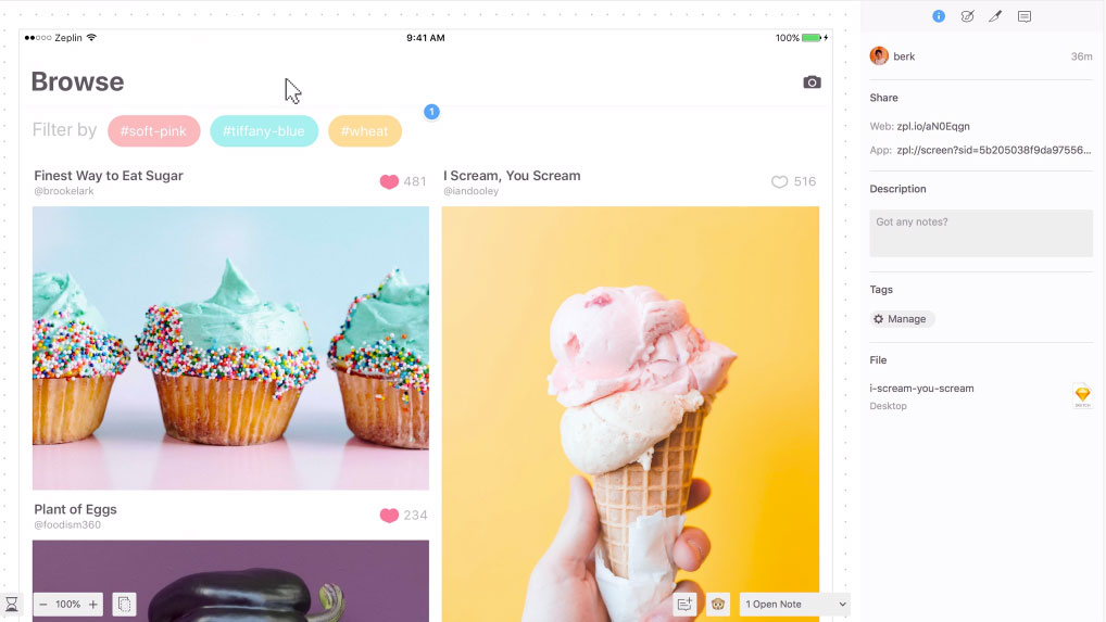
Zeplin allows you to take your design and prototypes and hand them over to developers, complete with all the specs, codes snippets and exportable assets you need from design files. You can upload your Sketch, Photoshop, XD and Figma files to Zeplin and this tool will create an environment for developers and designers to send over the project without the tedious task of creating guidelines. This is wonderful for bigger product teams.
32. React Sketch.app
React Sketch.app provides a super-easy way to manage Sketch assets in a large design system. Built by the team at Airbnb to help bridge the gap between designers and engineers, it’s basically an open-source library that allows you to write React components that render to Sketch documents.
Because React Sketch.app uses Flexbox, its components can have the same rich layout as your real components. That means no more dragging rectangles by hand; everything works like your target layout engine.
React Sketch.app, then, makes it simple to fetch and incorporate data into your Sketch files. It also provides an easy way to build your own custom design tools on top of Sketch. You can learn more about how it works in this post.
VR and AR
33. ARKit
Augmented reality – blending digital objects and information with the environment around you – is a space that’s generating a lot of excitement in the web and app development community right now. Not least because of Apple's ARKit, a framework that allows you to easily create AR experiences for iPhone and iPad.
With ARKit on iOS 12, your AR apps can now be experienced by multiple users simultaneously, and resumed at a later time in the same state. You can also incorporate real-world objects into your AR experiences, giving your users even greater immersive opportunities. And People Occlusion allows AR content to realistically pass behind and in front of people in the real world, making AR experiences more immersive while also enabling green screen-style effects in almost any environment.
34. Tvori
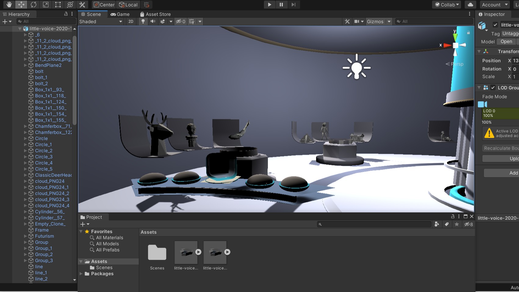
If you're designing for a virtual world, why not actually do so? Tvori makes it easy for you to prototype interfaces, products, and design experiences for both XR and for the real world. And there are some great collaboration features, allowing you to invite teammates and clients in VR to review your design.
Typography
35. What the Font
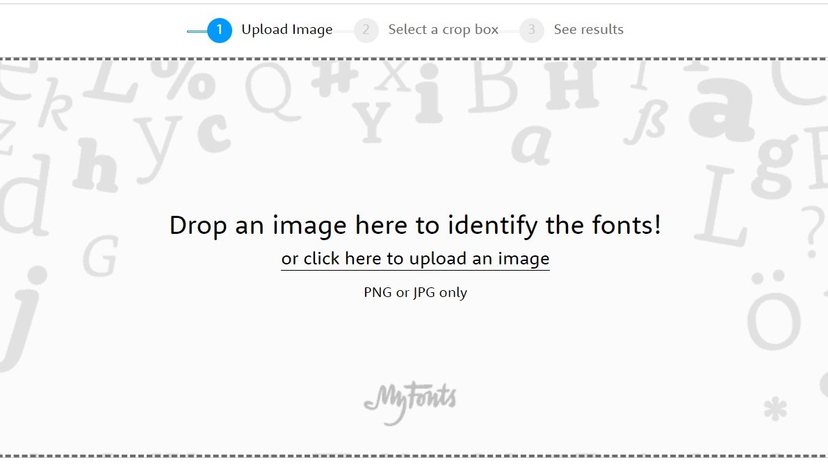
Seen a font you like, but can't work out what it is? WhatTheFont can help. It uses deep learning to search our collection of over 133,000 font styles and find the best match for the fonts in your photo. It even works with connected scripts and when there’s more than one font in an image. Just upload an image, click the font you want to identify, then check out the results.
36. Textblock
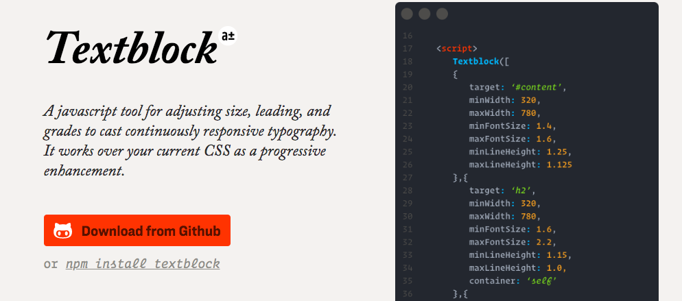
Glyphic's Textblock is a JavaScript tool that adjusts the size, leading and grades of your type to make it fully responsive. It operates as a progressive enhancement over your existing CSS, and making your text adjust to fit any viewport width or device orientation.
37. Gridlover
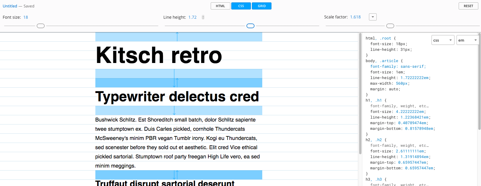
Gridlover gives you the tools to automatically adjust your typography to figure out the most effective approaches. Fiddle with the font size, line height and scale factor sliders, then watch the typography respond.
Other
38. Aquarelo
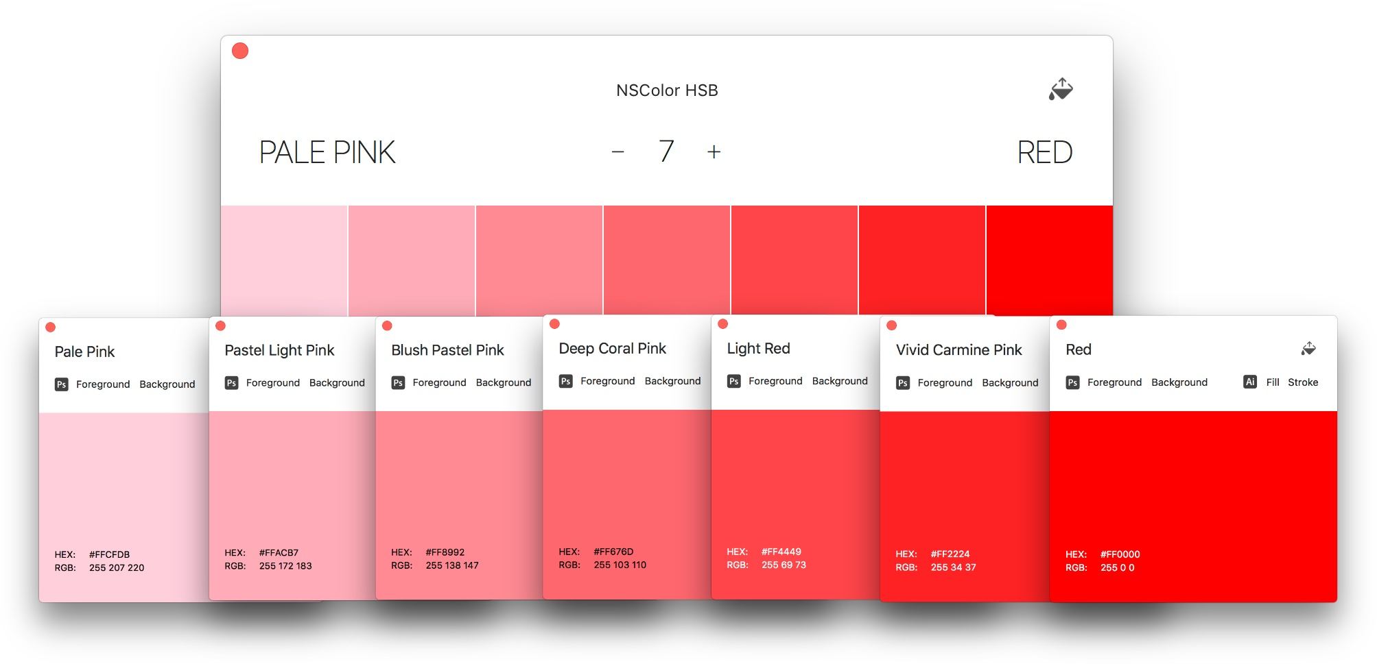
Want to match your website’s colour scheme to a particular image? Then you may well find Aquarelo handy. It's a free Mac app that uses a clustering algorithm to analyse your images and lets you know which colours are dominant in a picture, so you can use that information in your design. You drag and drop your image into the app and the dominant colours appear in a panel. You can then click on any of the colours to add them to your clipboard.
39. Vivaldi
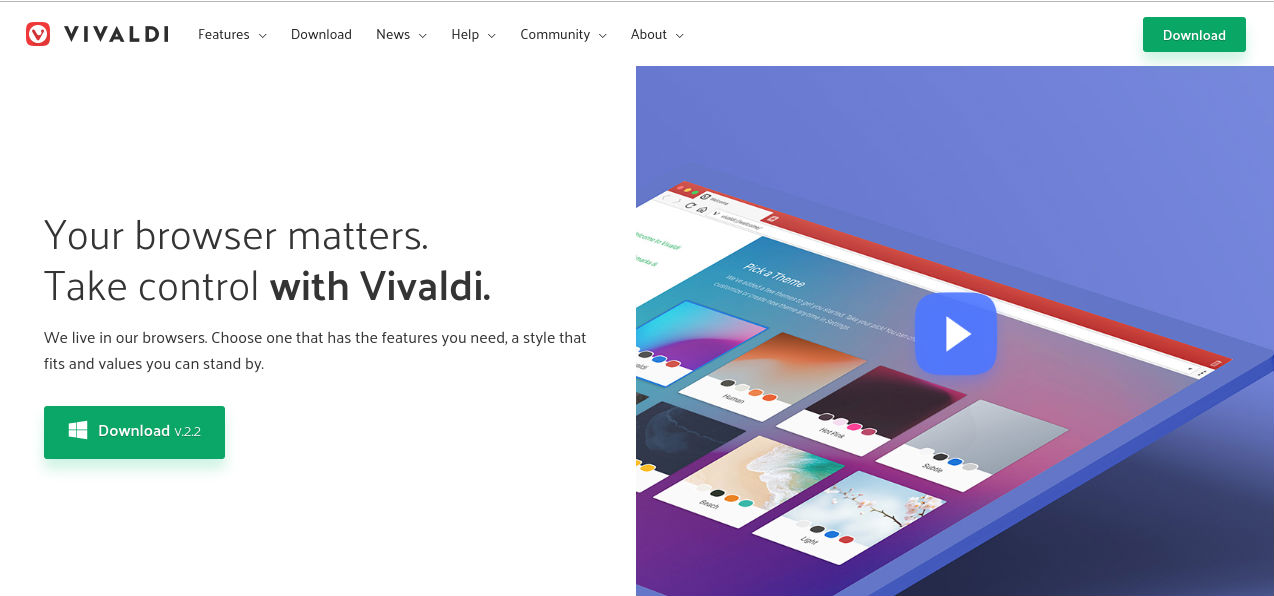
Sometimes the best web design tool can be something as simple as a new browser. Vivaldi is a fast, customisable web browser for power-users built by some of the people who started Opera. Dubbed 'a browser for our friends', Vivaldi is built using web technologies. JavaScript and React were used to make the user interface, along with Node.js and lots of NPM modules.
Vivaldi is the most customisable browser out there, and it offers cool features such as command line control, a panel for taking notes, tab stacking and tiling, and web panels that enable you to put all your favourite sites in one place for easy access.
40. CodePen Projects
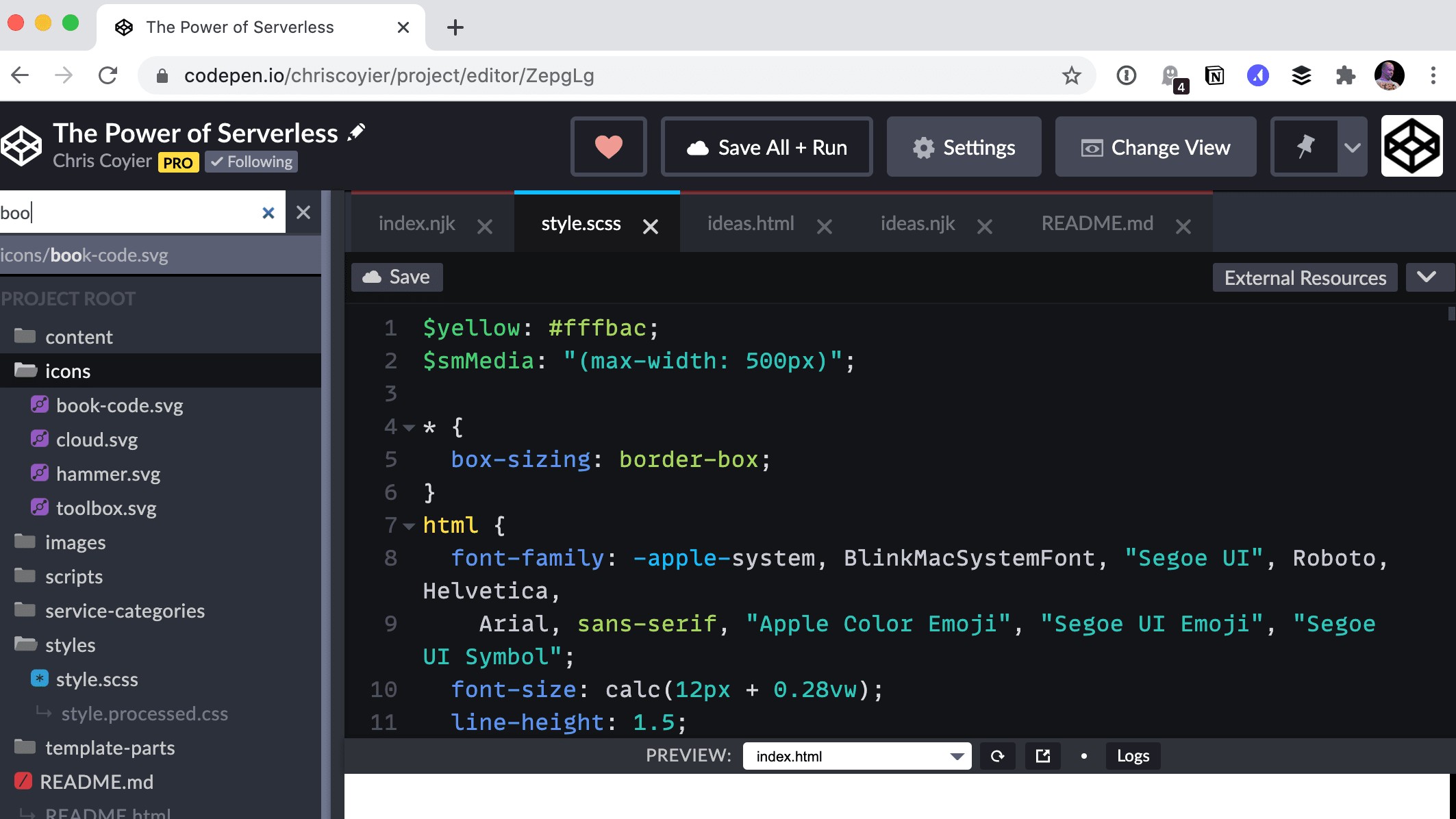
Founded in 2012 by Alex Vazquez, Tim Sabat and Chris Coyier, CodePen has grown to become of the web’s largest and liveliest communities for testing and showcasing HTML, CSS and JavaScript code snippets. For its first five years, it functioned as both an online code editor and an open-source learning environment, where developers could create code snippets ("pens"), test them and get feedback.
Then in 2017, CodePen took another big leap forward by launching its own IDE (Integrated Development Environment), CodePen Projects, which enables you to build websites within your browser.
You can drag and drop your website files, organise them into tabs, and preview your site as you build it. There are templates to help you create sites more quickly if you choose, as well as built-in debugging tools.
Note that, although it works in a similar way to the Pen Editor, CodePen Projects doesn’t replace the latter but sits alongside it. You can learn more about CodePen Projects in this blog post.
41. Foundation for Emails
Foundation for Emails 2 is a framework from ZURB formerly known as Ink. It is used for creating responsive HTML emails that work on just about every platform and service, bundling together email coding best practices. The tool uses a Sass codebase that gives you access to a settings file, wherein you can define all sorts of defaults to suit your needs.
42. EthicalAds

The creators of EthicalAds don't like the fact that monetising a website requires advertising which often detracts from the design by being ugly and obtrusive. The solution they’ve created is an advertising network whose ads have all been vetted - they’re all ethical companies and the ads are tastefully designed.
43. CSS Scan
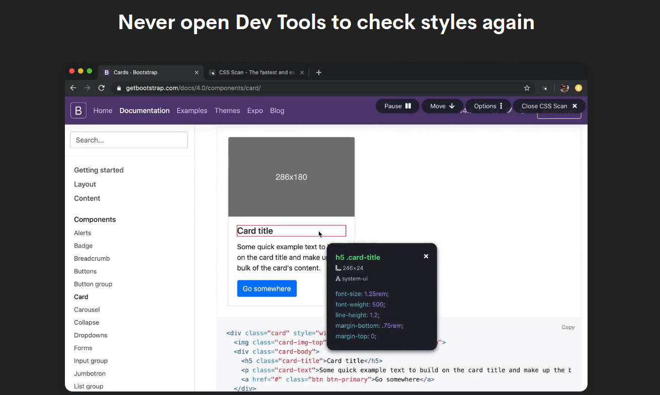
CSS Scan is a browser extension that works on any website you visit in Chrome, Firefox or Safari and it’s great for finding out how your favourite sites are styled. Instead of opening Dev Tools to inspect an element, you can use it to view the CSS of any element you hover over – it appears in a pop-up view and you can copy all its rules with one click. You can use it to copy particular elements from themes or templates to adapt for your own use, and it’s great for debugging your own code.
For more ideas for web design, see our round up of cool CSS animation effects and classic scrollbar designs. We also have a pick of the best laptops for programming.

Tom May is an award-winning journalist specialising in art, design, photography and technology. He is the author of the books The 50 Greatest Designers (Arcturus) and Great TED Talks: Creativity (Pavilion). Tom was previously editor of Professional Photography magazine, associate editor at Creative Bloq, and deputy editor at net magazine.
- Beren NealeEcom Editor

