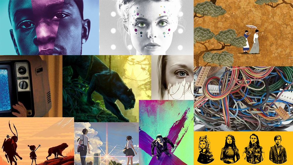
Movie posters not only hint at the storyline of the film – it also gives the studio a chance to get creative (sometimes!). From illustration to photography, 3D art to clever typography placement, here we’ve picked out 16 of our favourite movie posters of 2016 that thought outside of the box. So, without further ado, in reverse order...
16. Paterson

Portraying a hard working bus driver who writes heartfelt poems every day before his shift begins, this illustrated poster compliments the blue colour of the bus driver uniform whilst offering up an imaginative, sombre tone. With the main character’s back to the viewer, looking out into a beautiful landscape, it suggests that Paterson sees the world differently – and he’s taking you along for the ride.
15. Louis Theroux: My Scientology Movie

Harking back to the typography and artwork of Hunter S. Thompson, the poster for Louis Theoroux’s ‘My Scientology Movie’ is a clever nod to how cult groups can distort what is real and what isn’t. As Theroux is placed in the foreground, surrounded by cartoonish figures and constrained by a building, it acts as a metaphor for the pressure on the investigative journalist in his quest to discover the realities of Scientology.
14. Kubo and The Two Strings

'Kubo and The Two Strings' is ultimately a story about friendship; Young Kubo's peaceful existence comes crashing down when he accidentally summons a vengeful spirit from the past, so of course he gains some helpful pals to get him out of the predicament. This simple but gorgeously illustrated poster has a nostalgic feel but still manages to look fresh and original.
13. Christine

Depicting the harrowing story of Christine Chubbuck, a 1970s TV reporter struggling with depression, this clever poster showcases how Chubbuck had to confront her demons infront of a televised audience. Through simple but powerful imagery, it tells us that Chubbuck is unable to escape from the constraints of her career that ultimately destroy her. The colours and framing also give a nice 1970s feel.
12. Your Name

Telling the tale of how two lives – Mitsuha and Taki – are changed forever through a falling star, the poster design for ‘Your Name’ keeps in line with the film’s design as a whole and allows insight into the storyline. Placing the star directly in the middle of the characters proves its importance whilst the landscapes offer an awareness of the difference in characters. By placing their backs to us, the poster suggests the character’s looking to the future, rather than the present.
11. American Honey

Sometimes a single photo can speak wonders for movie poster design. This simple execution for ‘American Honey’ is a powerful image of the American Dream and of the freedom that the country founds itself on. Delicately placing the American flag into the background of the design, whilst incorporating the red, white and blue colour scheme of the flag itself into the font design, the poster for ‘American Honey’ is a beauty.
10. Childhood of a Leader

A film about the roots of a fascist megalomaniac, ‘Childhood of a Leader’ needed an in-your-face poster design that captured the essence of the storyline. A powerful image takes centre stage but it’s really the colour scheme that makes the poster design pop; it makes for a harrowing and horror-like execution that is both intriguing and alarming.
09. La La Land

‘La La Land’ has released a wealth of inspiring poster designs – most of them centring around actors Emma Stone and Ryan Gosling. As a musical, the poster needs to evoke a sense of musicality and this colourful execution is a perfect and inspiring nod to the nostalgia of musical films. The inclusion of the piano keys teamed with the blue colour scheme and the faded imagery makes this a treat to look at.
08. Captain Fantastic

Illustrated poster designs for mainstream movies are sadly few and far between, so this one for Viggo Mortensen’s ‘Captain Fantastic’ is a diamond in the rough. Juxtaposing colours and intricate illustrations of the characters teamed with a faded American flag hints at the family-orientated nature of the movie whilst the decision to use varying fonts for each letter suggests a somewhat chaotic storyline.
07. Suicide Squad

Whilst the film itself divided opinions, there’s no denying that the art direction for DC’s 'Suicide Squad' was an eye-catching marvel. Using garish, neon colours throughout and putting the characters in place of a skull’s mouth is a simple but satisfying nod to the ‘suicide’ aspect of the title. Placing the joker away from the group – and in particular, on the ‘x’ of the eye – suggests that the character is the target of the movie.
06. Lo and Behold, Reveries of the Connected World

In ‘Lo and Behold, Reveries of the Connected World’, iconic filmmaker Werner Herzog examines the past, present and future of the Internet and how it affects human interaction and modern society. Placing the connecting wires as a head showcases how much the internet has impacted our own minds, whilst using only grey elsewhere is a nod to the mundane, unconnected every day.
05. Jungle Book

It’s hard to create an inspiring poster for such a mainstream release but through illustrated depth, this poster for 'The Jungle Book' evokes a sense of calm, mystery and intrigue. The lighting used in the design must be commended, as the darkened foreground suggests danger whilst the bright background suggests a happy ending. A beautiful execution.
04. The Forest

The use of negative space in poster design will almost always provide a clever and encompassing execution. By designing the forest to take over the actor’s face, it gives a harrowing sense of her inability to escape her fate. The disappearance of her mouth also showcases an inability to scream, perfectly depicting the horror-like stance of the film.
03. The Handmaiden

A Korean masterpiece, the poster is a gorgeously detailed vision of the traditional aspect of the culture’s art history whilst also keeping things unique. The small characters juxtapose the beauty that the illustration executes – they are beautiful too but their situations tell a tale that is undeniably catastrophic.
02. The Neon Demon

The art direction for ‘The Neon Demon’ was flawless; like it’s name, the neon used throughout each poster design was devilishly inspiring and evoked a sense of threat throughout the execution. By highlighting the dripping liquid – and using only grey for the background – the danger is heightened by suggesting blood and murder.
01. Moonlight

The poster for ‘Moonlight’ is so aesthetically beautiful in its simplicity and subtle placements showcase an incredibly clever execution. Depicting three chapters of one man’s life, the photography of each stage is teamed with a subtle change in colour, showcasing a difference but still allowing the viewer to realise that it’s the same person. The neon typography compliments the design perfectly.
Related articles:

