14 best-practice rules for striking editorial design
Create great layouts for magazines, books and digital publications with these pro editorial design tips.
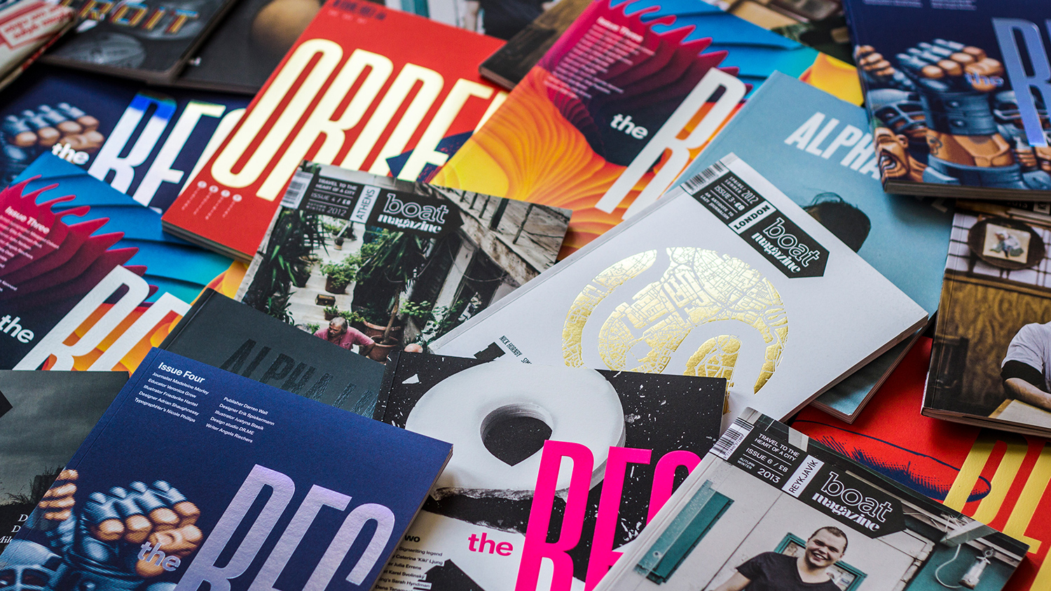
So you want to create better editorial designs? From grids and layout to font pairings, contrast, pace, visual hierarchy and more, the decisions you make as a designer dictate the way information is presented, shared and understood – whether you’re laying out a book, magazine, newspaper or digital publication.
If there’s one thing we know from editorial design icons such as David Carson, it’s that rules are made to be broken. But you have to know the rules first…
Here, I’ll walk you through some best-practice tips for improving your editorial designs. I tend to ignore whatever 'rules' exist, but I’ve developed the following opinions through nine years of mag-making alongside full-time agency roles.
I'm a big believer in the importance of attitude alongside ability, so my 'rules' are a mixture of both...
01. Bring enthusiasm every time
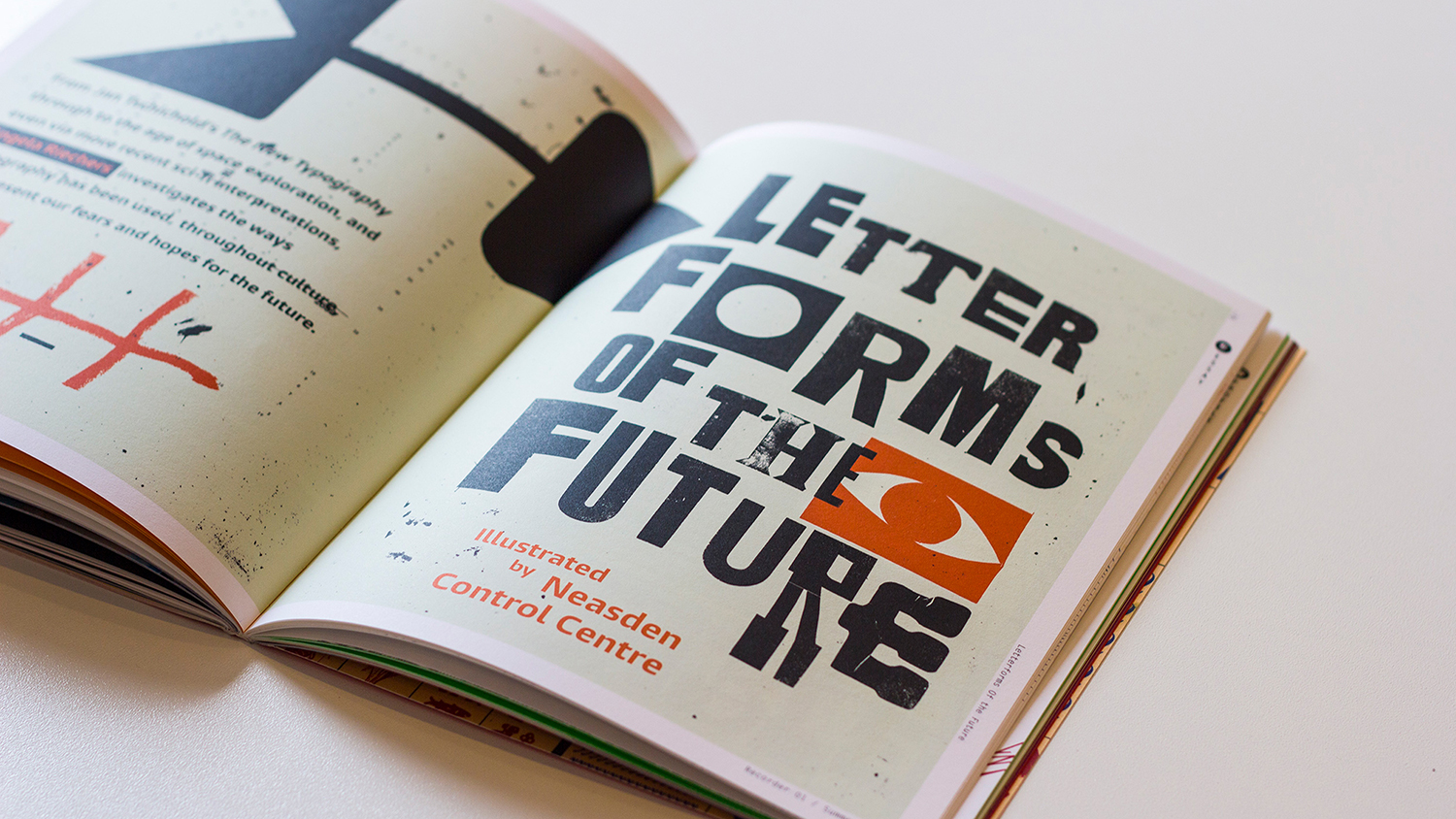
Nothing creates better work than passion for the subject. Of course not every project will speak to you personally, but I know my best work is done when I'm engaged with the subject.
Find some enthusiasm for whatever story you're working on, and the design will be better for it. If the subject isn't your cup of tea, find something in it that speaks to you and let that develop in you an appreciation for the content.
02. Let the grid guide you
I find a blank page as intimidating as the next person, so having a flexible and well considered grid in place means there's always a 'way in' to begin the design. Think of it as a structure for aligning elements against, as and when you want.
Daily design news, reviews, how-tos and more, as picked by the editors.
Grids enable you to stay organised, keep you consistent across issues, and can help to enhance the legibility and readability of body copy. The human eye is finely attuned to spotting discrepancies in patterns, so when you chance a design and misalign an element or two, even if it isn't immediately obvious, it'll likely feel a little 'off'.
A great grid will help you maintain cohesion throughout your layouts, helping multi-page articles hang together. Lastly, grids are also generally a gateway to good editorial design practice – gutters, margins, columns, baseline grids and so on are key.
Also read: Mastering grids in InDesign CC
03. Consider types of type
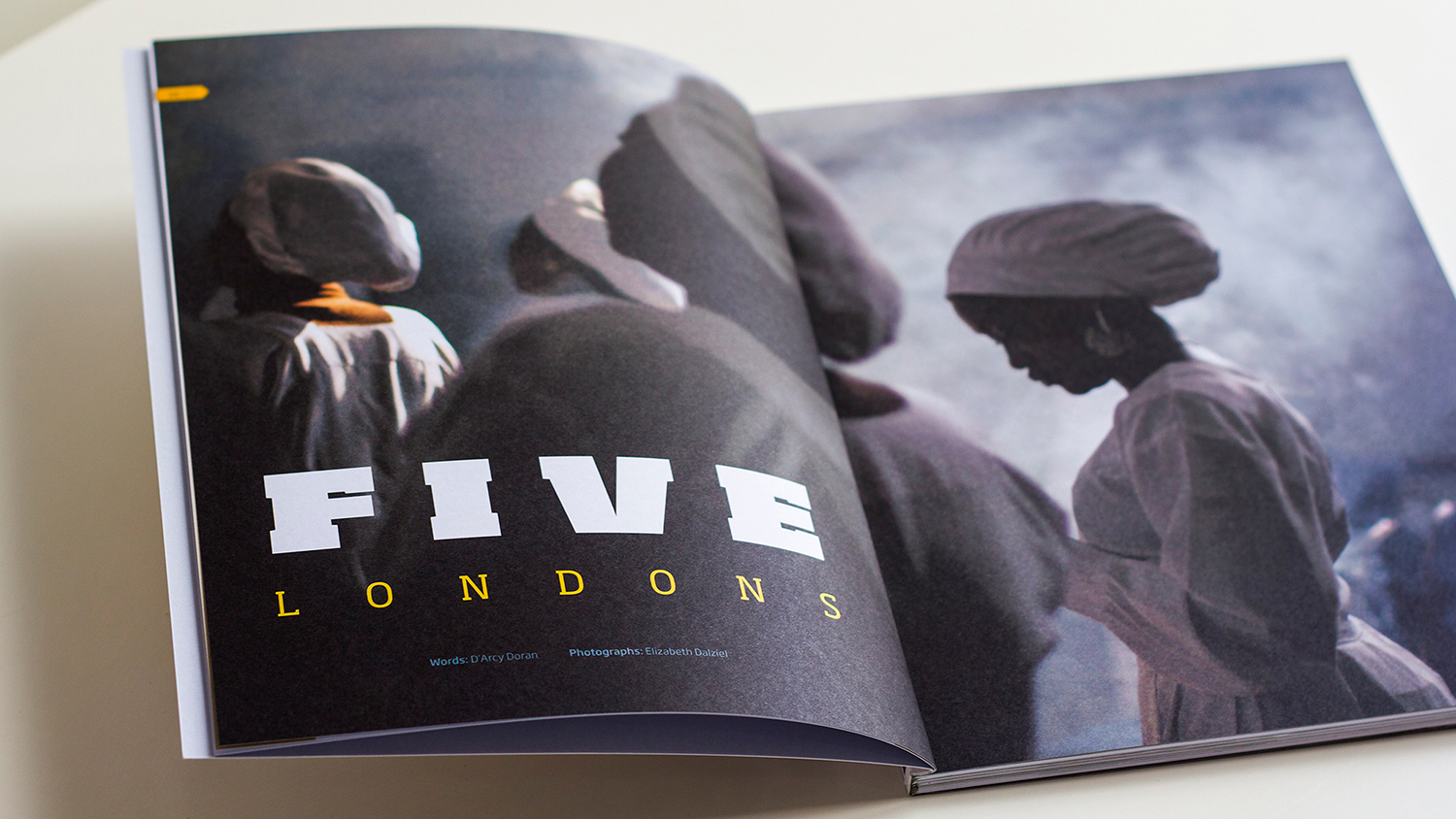
Magazines are a marriage of pictures and words. If fonts are the clothes that words wear, it stands to reason you'll want your text suitably attired.
The right fonts can make or break a magazine, and pairing type is an art in itself. It's ultra-rare to commission bespoke type (like the 29 styles and weights Henrik Kubel developed for the 2015 New York Times Magazine redesign) so for the vast majority of us, it's a case of figuring out how many fonts you require to do what you need.
If in doubt, three is a great starting point. Fonts have distinct personalities: serious, casual, playful, elegant. Match the mood of your type to the purpose of your design. Create intentional visual hierarchy by pairing a display face for headlines with a more legible family, or two for body copy (perhaps a sans and a serif).
Don't forget to check when investing in new fonts whether extra features such as italics, extended or condensed versions are included or available (not to mention full punctuation and glyphs) to give your typographic voice maximum range.
Also read: How to choose the right typeface for a brand
04. Collaborate wisely
Few magazines are created in isolation – they're usually a product of teamwork – even if it's just a partnership between an art director and editor. To be able to care deeply about a publication while allowing others to input into it means walking a tightrope of tensions.
Be generous with each other, patient and encouraging, prepared to compromise – but stand your ground when required. Always try to see the bigger picture, and decide which battles to fight. Keep communicating or the work will suffer.
05. Indulge in strong covers and mastheads
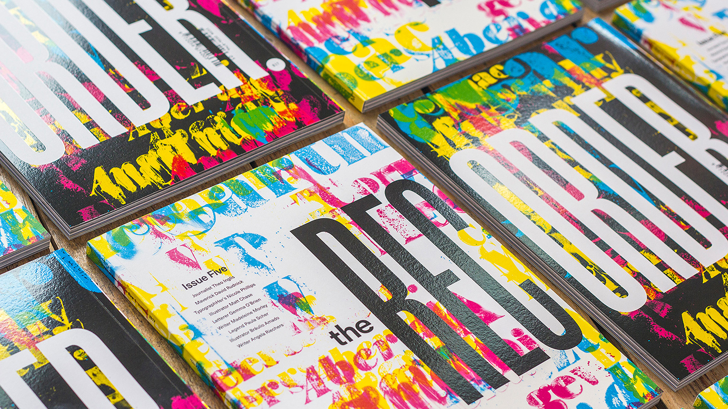
The main event, the signature, the first and last thing people will remember: the cover. Covers have always been important but I'd argue they play an increasingly important role now. Much like the album cover can represent a body of work, so too can the mag cover.
Steven Gregor, aka GymClassMag, wrote brilliantly about how a carefully orchestrated cover can propel an issue to new levels of notoriety.
If you have the opportunity to design a magazine cover from scratch then the masthead – or logotype – is the cornerstone to which everything else relates. With the ever decreasing importance of the physical newsstand and the ever increasing role of the digital thumbnail or jpeg, scale and legibility of your magazine's title is paramount.
This shift also frees up new possibilities for positioning – no longer fighting to peep over the top of other titles on shelf, you can stick it practically anywhere.
Also read: 10 ways to make your magazine cover stand out
06. Compromise carefully
It can sometimes be seen as a dirty word, but most editorial projects are real 'client' work – not self-funded vanity projects. This means there are client concerns to accommodate, and often important commercial aspects to consider – so compromise is vital.
Maybe that spread needs to be replaced with an ad? Or perhaps your branded content isn't branded enough? Whatever the compromise, make sure you're always answering the brief.
The happier the client, the stronger the relationship you'll make and the more permission you'll have to do progressive things down the line.
07. Harness contrast
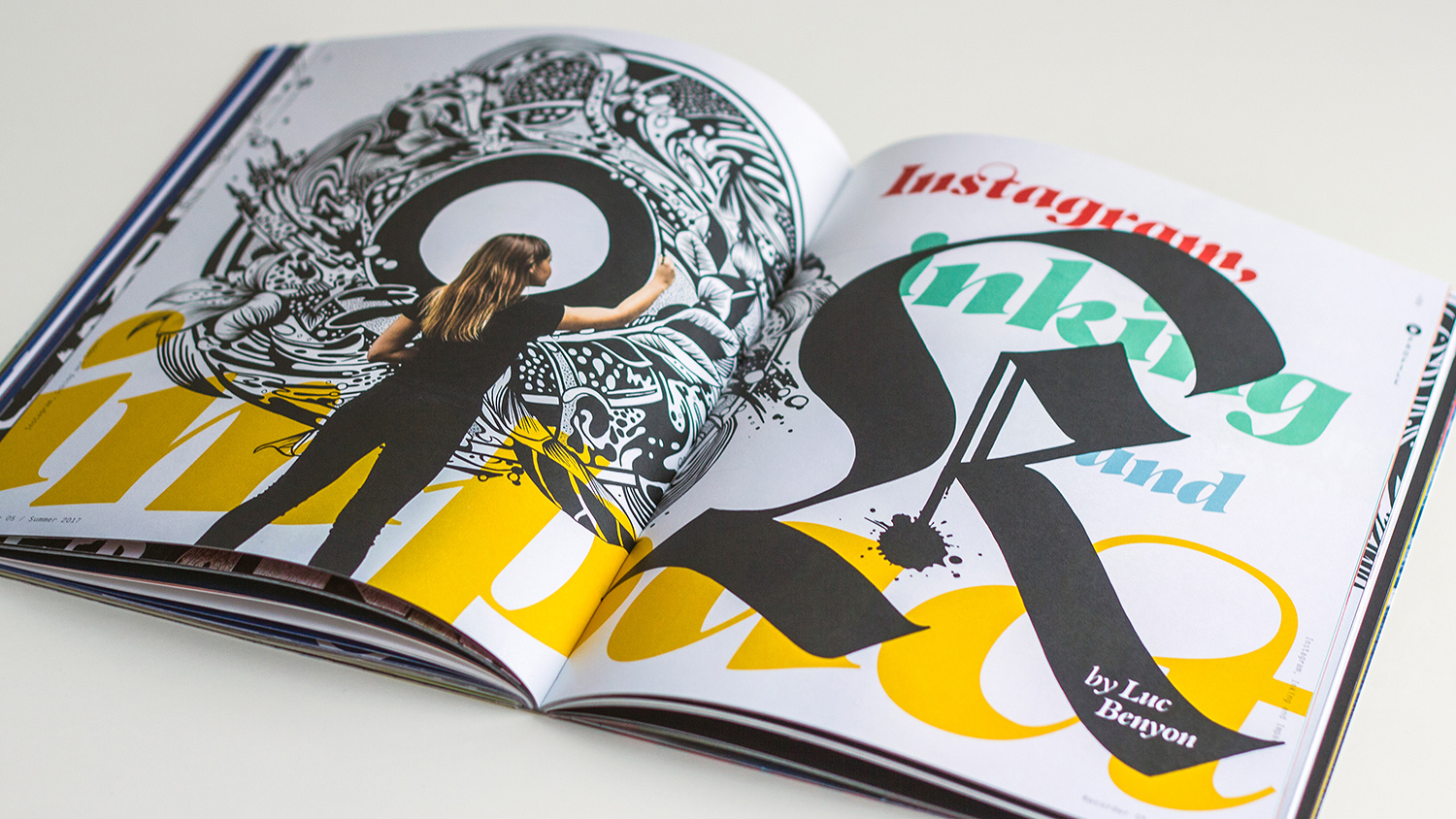
This is another obvious one, but it’s something so easy to overlook: visual contrast is one of the designer’s most powerful tools and easiest to deploy (although not always easy to get right).
Take a look at titles like YouCanNow and Port to see what I mean – contrasts in scale, colour and tone can result in powerful covers and dramatic spreads.
If you want to make an image loom even larger, reduce the title size. If you want to really shout about something, blow up the text until it falls off the page.
08. Set the pace
From grand masters such as Carson and Brody through to (slightly more) modern day marvels such as Leo Jung and Matt Willey, there are countless examples of pace-makers controlling how we feel by clever control of visual pace.
Slow a reader down by injecting a double page spread of imagery, speed things up by type-setting narrower columns, change the mood by inverting type or chill things out with generous leading... 'Editorial design 101' ideas they may be, but they genuinely work.
09. Nail the illustration
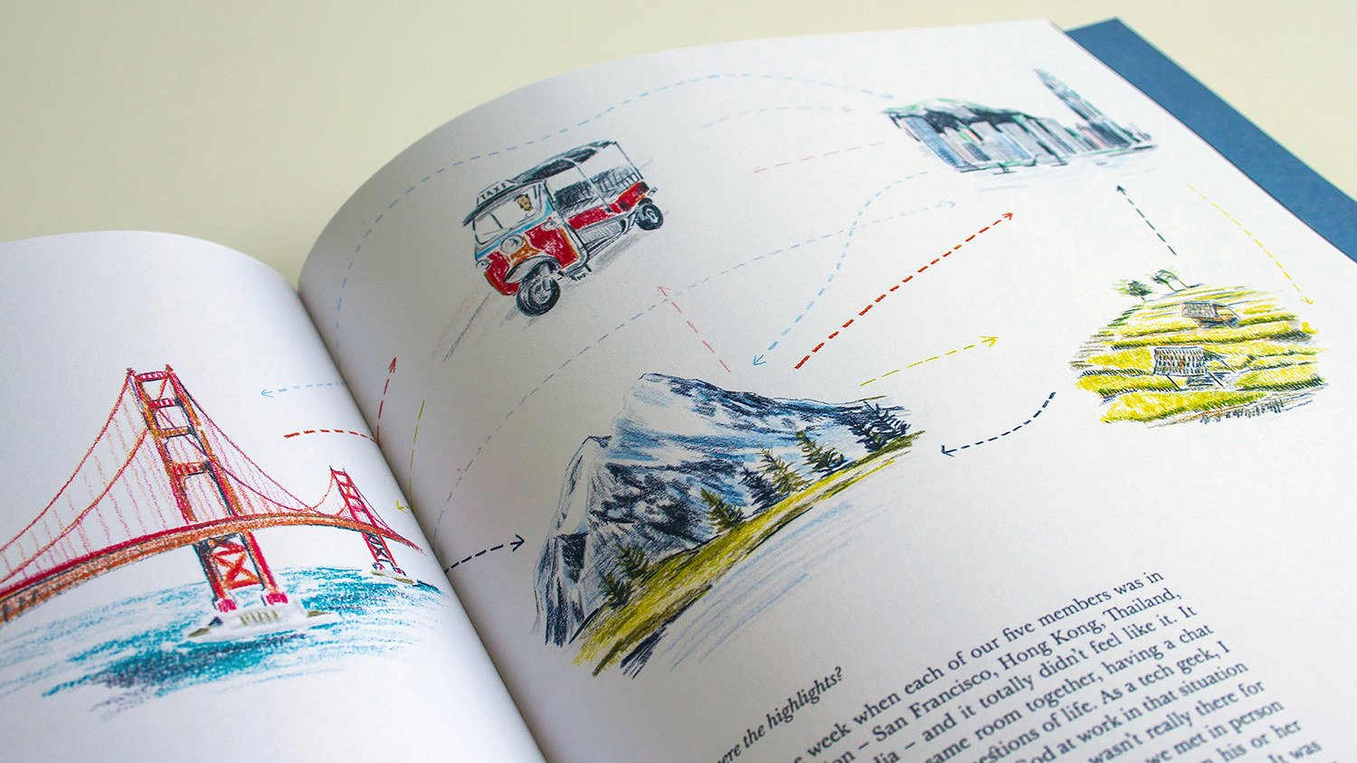
Illustration can bring to life an article when photography is impossible or inconvenient, and can go places a camera cannot – to new worlds, micro or macro, anywhere the imagination can take you.
But if you bumble a brief, fail to provide any insight or direction, or rush a deadline, you run the risk of losing not only goodwill but also quality of output.
Be prepared to learn new levels of diplomacy to get the best out of your contributors, and to spend copious amounts of time writing emails when you'd rather be designing.
10. Remember, a picture is worth…
If you have the luxury of a photo editor helping you then your task is probably to maximise their talent. But presuming you don't, your job is probably to learn to think like one. That means either art directing shoots personally or commissioning them – and then handling, editing and placing imagery to maximum effect.
This role requires conceptual skills to understand what sort of photography will move an audience. It also requires craft skills as you need the ability and confidence to style, crop and lay out photographs to maximum effect.
Everyone knows a picture can be worth a thousand words, so treat photography with the care and attention it deserves.
11. Pay attention to details
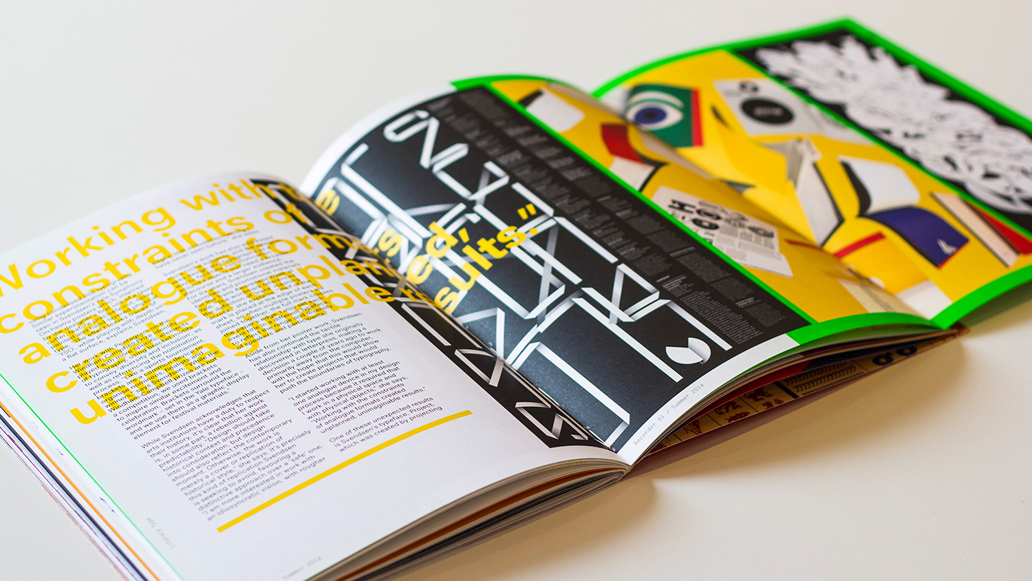
If you're in the rare and privileged position to be producing a magazine about a personal passion, this applies less, but when working on an editorial project, that's rarely the case. The better you can understand your content, the more sensitive and nuanced your design can be. The more you know about your audience, the smarter you can be with your delivery.
The deeper your knowledge of great editorial design, the quicker you can call on inspiration when trying out ideas – or know which clichés or tropes to avoid. Spend time with the content and you'll be able to put together the work much more intuitively.
12. Design for the content
This one might be up for debate, but I'm all about letting the content help shape the look of an article. WIRED UK is a superb example of this. Andrew Diprose and team bring to life the content of a story and investigation through a masterful interplay of dramatic type, images and layout.
It's hardly a new approach, but many of the big sellers of recent years have taken a more stripped back or formulaic approach.
When there's an idea behind the work, it's much easier to know when it's done. Being aware of visual trends is helpful, but work with meaning has greater integrity and will hold up better as time passes.
13. Design for the reader
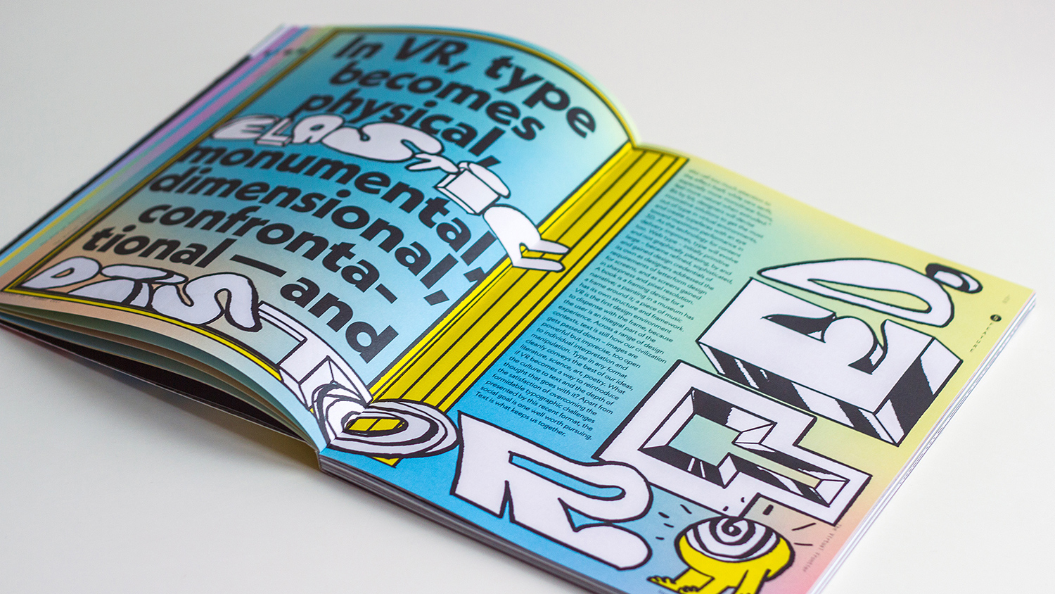
Perhaps it shouldn't need saying, but designers can forget that they're not the totality of the demographic buying their work. Magazine audiences can be very broad – socially, geographically, age-wise – and as such some might not appreciate adventurous layouts or challenging typesetting.
Adapting your style and producing legible and accessible work is vital to engaging your audience; the same goes for decisions around paper stock, page size and count, and so on. Every design decision should be made intentionally with the end user in mind – not design award judges or your designer mates on Twitter.
14. Design for yourself
Lastly, but vitally, do what you feel is right and what you'd love to put your name to. Editorial can be one of those rare 'pure' design experiences where you can really shape a piece of communication and therefore totally affect the audience.
When you produce something you're proud of (presuming your taste is good) it means you've probably nailed it. Learn to trust your instincts and be brave enough to push your design to an exciting new place – and of course, enjoy it.
You could be digging holes in the rain for a living, but you're not. You're designing freaking magazines.
Finally, don't forget to make the most of every editorial opportunity you get. Design should be fun, even if the content isn’t.
Related articles:
