Briefed to design a distinctive logo for an adult-targeted alcohol and gourmet ice cream startup called Mr Cooper, iconic branding firm johnson banks utilised negative space to develope an eye-catching identity system for use on packaging, uniforms and merchandise. Senior designer Kath Tudball explains…
We were asked by Mr Cooper, an ice cream start-up, to create a distinctive logo and set the tone for the company's unconventional new brand.
Specialising in alcoholic and gourmet flavours, Mr Cooper's treats were strictly for grown-ups and they needed an identity to match their approach. After presenting a number of initial designs we developed the idea of a typographic lipstick mark.
This concept really suited our client, expressing the hedonistic nature of the product in an appropriate form. The logo could be rubber stamped directly onto white paper cups and napkins as if a cheeky kiss had recently been planted.
The challenge was to craft a beautiful hand-lettered mark utilising both positive and negative space to spell out the brand name within the lip shape. We worked firstly on paper, drawing and tracing by hand. We then scanned these sketches and created rough vector graphics.
As the logo developed we experimented with a variety of lettering styles and worked through challenges within the design such as legibility and spacing, before arriving at an arrangement and lettering style that really worked.
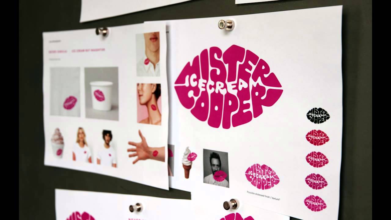
For the next stage we asked lettering specialist Rob Clarke to help us fine-tune the details, making the logo look really voluptuous and unified. Finally we explored how the identity could be brought to life in real-world applications such as packaging, uniforms and merchandise.
Over the following steps I'll walk throughout the design process, from initial sketches to final brand applications. You can follow using the video above or the numbered steps below…
johnson banks' logo for Mr Cooper has been shortlisted for a 2015 Brand Impact Award. See the other shortlisted branding work here.
01. Symbolising hedonism

We had the initial idea of using lips as a symbol of pleasure, sensuality and taste. This developed into the thought that a lipstick kiss mark could be created entirely out of lettering, using both positive and negative space to create the brand name Mister Cooper Ice Cream.
02. Marrying sketches with typography

To test the idea we quickly sketched and traced the various typographic elements, then overlaid them to see if they would fit together comfortably. This initial sketch was then scanned and traced into a rough vector design which showed that the idea could work.
03. First presentation

The rough lips design was presented to the client along with various other approaches. The client liked the thought of the lipstick kiss logo, and asked us to develop it further and refine the design.
04. Tackling problematic characters

Through a development stage of experimentation and further drawing we addressed the challenges encountered in our original rough design, tackling problematic characters, legibility, shape and balance to refine the structure.
05. Back to the client

We arrived at an arrangement and lettering style that worked well, so that sketch was scanned and carefully traced in Illustrator to refine the shapes and curves in the letterforms. This version was then approved by the client.
06. Letterform interaction

Lettering specialist Rob Clarke helped us refine the logo, looking at the interaction between letterforms and creating a more curvaceous and organic mark. He shared his initial sketches with us as well as rough vector variations for our feedback.
07. Finalise the logo

The logo was finalised after feedback and corrections. Here's its development from crude rough, to correctly structured interim version, and then final logo.
08. Creating a rubber stamp

Once it was signed off by the client we created a rubber stamp of the logo to simply and immediately brand items like paper napkins and packaging.
09. Wider brand applications

Ahead of the brand launch, we explored other initial applications for the new Mister Cooper identity such as uniforms, merchandise and stationery.
Words: Kath Tudball
Kath is a senior designer and team leader at johnson banks where she has worked for over a decade. The full version of this article first appeared inside issue 243 – Logo Design Secrets – of Computer Arts. Get up to 55 per cent off a subscription to CA here.
Liked this? Try these...
- The ultimate guide to logo design
- 7 steps for illustrating luxury print collateral
- 3 top character design tips from Adventure Time's lead designer

