6 UX lessons you can learn in the toilet

Sign up to Creative Bloq's daily newsletter, which brings you the latest news and inspiration from the worlds of art, design and technology.
You are now subscribed
Your newsletter sign-up was successful
Want to add more newsletters?
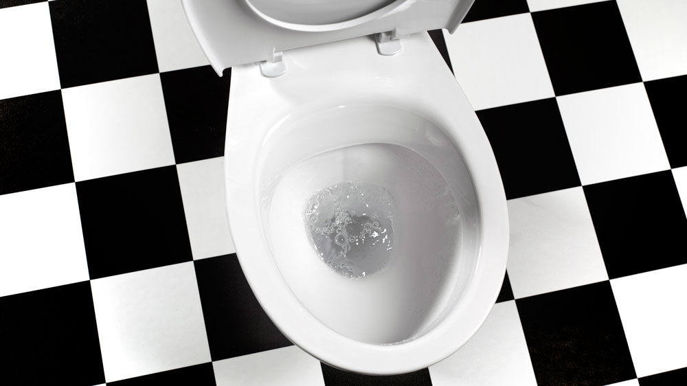
UX lessons can come from the most unlikely of places. After all user experiences are all around us, in every product we use. And that includes the bathroom. Yes, it may sound unlikely, but there are some important UX lessons that can be learned on the toilet. So next time you head to the loo, forget about a magazine or your tablet. All you need is a little observation to gain insights into how to design goal-oriented, task-based, time-critical user interactions and interfaces. Seriously, bear with us, and head to a public toilet near you.
What we're looking for here is actually examples of bad user experience, and that's where a lot of the most important UX lessons can be learned. A lot of public toilets are a catalogue of design failings, and when we realise that, it should perhaps be no surprise that websites and apps have usability issues if all these years, designers still haven't cracked such a simple everyday activity as our need to answer nature's call. So let's take a look and see what UX lessons we can learn from good and bad toilet design.
Make sure you also see our selection of UX mistakes to avoid. And if you're building a new site, see our guides to the best website builders and the best web hosting services.
Article continues below01. Don't create problems
Our first UX lesson that we can learn in the bathroom is to avoid creating problems. Good design is meant to solve problems, yet sometimes design inadvertently creates the problem. In the gents’ toilet at Brighton’s Dome Theatre a notice reads ‘This is a sink’. Unfortunately, despite the attempted clarification, you'll still often see men mistaking the long, metal trough-shaped fitting for a urinal in the hurry before a show.
The blunder here is that a sink shouldn't need a sign to try to explain what it is. I’m sure that when it was displayed in the designer’s studio, the sink looked fantastic, but in situ, the height, colour, material, position and shape disguise its purpose. Avoid that sinking feeling. Always design for the people who will use your products. This means you need to consider the context in which people will encounter the product.
02. Put humans first

Second up, bathrooms can remind us to put people first. Mobile-first and content-first have their place, but I’d suggest the best designs are created human-first. Observing human behaviour helps you create surprising and innovative solutions.
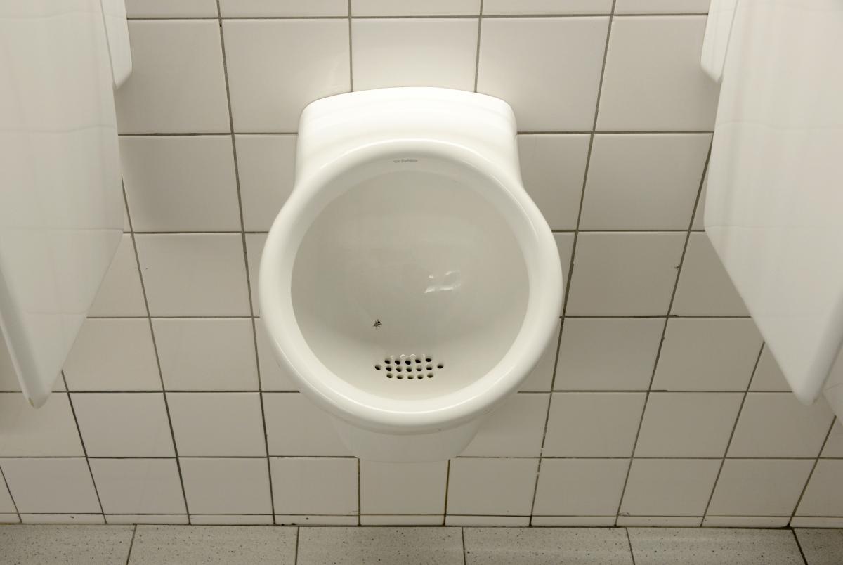
An example of this is an experiment set up by the cleaning staff at Schiphol airport almost three decades ago. By simply adding an image of a fly on the porcelain to aim at, they managed overnight to reduce ‘spillage rates’ in the men’s toilets by 80 per cent, which translates into major savings in cleaning costs.
Sign up to Creative Bloq's daily newsletter, which brings you the latest news and inspiration from the worlds of art, design and technology.
The experiment has been replicated across the world many times since. It turns out men are rather predictable; make the task a competition and you’ll get their concentration much more than you will by putting a sign up imploring them to be careful.
03. Make simple interactions
Train toilets are another place where we can learn some crucial UX lessons as they're a big source of design fails. There are cases in which simply locking the door on a train toilet requires you to read reams of instructions in order to select the correct combination of flashing buttons. I’ve even been on trains that needed a sign to point to the flush because it becomes hidden when the seat is lifted up. This poor design is made worse when the only visible button is a non-labelled and easy to reach emergency stop.
What does this teach us about UX? That clues about how to use a product should be baked into the interface. The need for instructions is a strong indication that your design is not intuitive to use – and we all know that people don't like reading instructions.
04. Communicate, don't confuse
We’ve all been there: bursting for the loo (perhaps after a few drinks) with rising anxiety as we try to decipher the sign on the door. Is it a merman or mermaid? Are berets gender-specific? Remind me, is the XY chromosome an indication of male or female sex-determination?
For most of us, when we need to relieve ourselves, we don’t want to have to solve a puzzle from an escape room. We just want to go through the right door. What can seem like a playful extension of your brand personality can quickly end up in user frustration. However pretty your wayfinding symbols or icons are, if they don’t communicate what you intend at a glance, they're an example of bad design.
05. Tame the technology

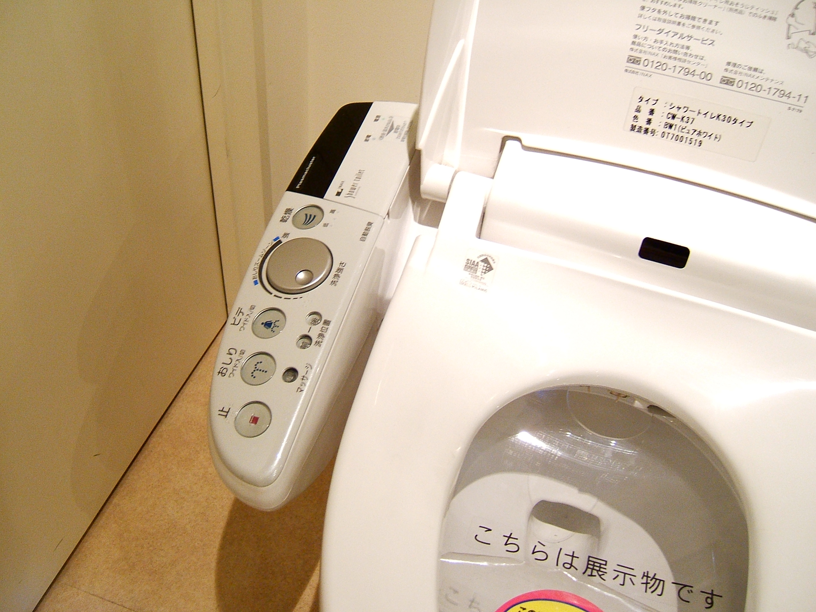
Just because you can build it doesn’t mean you should. Japanese toilets provide a sanitary lesson in the perils of over-engineering and feature creep. On top-end toilets, flushing, raising and lowering the lid, and even keeping a personal ‘performance’ record is all done via a smartphone app. This means that at night, before you can go to the toilet, you need to find your phone (and hope the battery is charged).
Sometimes the minimum viable product should be the extent of the product. In design less is more; and even less is even more.
06. Find space to think
Finally, the toilet provides the perfect perch for contemplation and encouraging curiosity. We're not recommending spending too much time in pubic bathrooms, but these examples just serve to show how pretty much any every day experience you have can give you insights and reminders of important things to consider in UX design. And if you ever just need the room to think, you know where to go.

You can learn about UX design on the toilet, but you can learn a lot more by signing up for Creative Bloq's UX design foundations course. Sign up today.
Related articles:
- UI design tools: The tools you need to create stunning UI
- Top UX testing tools to try
- Essential tips for UX design
