The 10 commandments of business card design
Make your business card the best out there by following these simple rules.
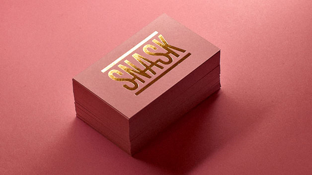
In an increasingly digital age, an innovative business card has the power to make a real impact on a potential client, collaborator or employer. Take a chance encounter at a networking event, say. Sure, you could follow them on Twitter and give them your LinkedIn profile, but maybe the Wi-Fi is patchy – what then? A physical card in their pocket the next morning is a sure-fire way to jog their memory.
Working in tandem with a brilliant design portfolio and CV, your business card shows people what you're about – as well as how to get in contact with you. But there are rules to abide by. Follow our commandments and make your business card the best calling card there is. And if you're looking for some business card inspiration, we've got a post on that, too.
01. Thou shalt not bombard
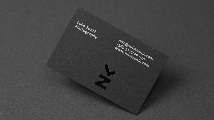
It’s very tempting to try to cram as much as possible onto your business card, trying to sum up exactly what you or your company does. Don’t. Keep it succinct, maybe with just your brand message and logo on one side and your contact details on the other.
Article continues belowRemember, if someone has your business card, it’s very likely they have met you and already know what you’re about. A card simply serves as a reminder. So keep it simple – you just want to jog their memory and point them to your website, or somewhere they can find more information.
02. Thou shalt not be too social
You exist on all social media platforms, right? So why not tell people? Well, because it's important to exercise caution. Don't put your personal Facebook or Instagram on your business card – your prospective clients don’t need to know what you had for breakfast or that you spent the weekend at the boozer. And you really don't want to direct potential clients to a Twitter stream full of work rants.
Only include social accounts if they're professional. If your social media accounts show off your work and industry knowledge, go ahead – your clients will have another avenue to reach you.
03. Thou shalt not use old stock
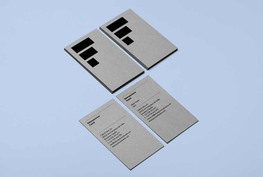
There’s nothing worse for a client or prospective employer than getting a crumpled, smudged business card that you’ve had at the bottom of your bag for months. So keep them in the box they were delivered in or get yourself a cool business card holder (you don’t have to reveal this if it seems a little over the top).
Sign up to Creative Bloq's daily newsletter, which brings you the latest news and inspiration from the worlds of art, design and technology.
Also, if your contact details have changed (maybe you’ve changed phone number) get your cards reprinted; don’t try to patch up your cards or write your new number on the back – it looks scruffy and unprofessional.
04. Thou shalt not design for everyone
It’s very easy – with economies of scale – to design and print one business card for everyone, but it might not always be the best idea. Think about your client base; is it all the same kind of companies in the same kind of industries? Nope, thought not.
So if you’re looking at pitching to more heads of marketing and fewer creative directors, tailor your cards accordingly. And if you’re pitching to luxury clients, your card needs to reflect that (check out these gorgeous examples of letterpress business cards for inspiration) as a flimsy stock will just get binned.
05. Thou shalt reinforce your brand
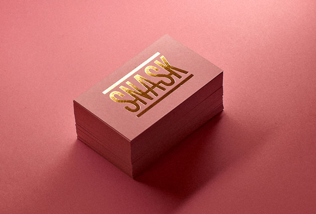
Try to make your logo or branding the only image on your business card. If you're printing double-sided (which you should do), the reverse needs to include your contact details. You are synonymous with your brand and your clients or peers need to associate you with it immediately. So don’t stray from your brand’s colours in any way – it’s just confusing.
06. Thou shalt not scrimp on legibility
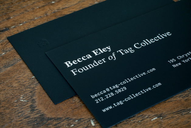
Unless you’re a calligrapher, there’s no reason whatsoever to use a script font on your business card. It may look fancy but if it can’t be taken in at a glance you’ve just negated the point of your card. Our advice? For your details use a clean, sans-serif typeface. But not Arial, please. (That said, a well-chosen serif will also look fantastic.)
In summary, just make sure your name and contact details are clearly displayed. And keep your main text above 8pt. Looking for inspiration on which fonts to choose? Take a look at our roundup of free fonts or perfect type pairings.
07. Thou shalt not gimmick (unless it’s a really good one)
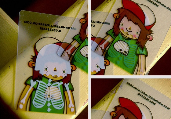
It’s very tempting to give your business card a gimmick – and if it’s a good one that suits your business, it can be a good way to stand out. Many illustrators and designers over the years have used different materials to great effect – metal, plastic, you name it. But – and it's a big but – don’t push it too far.
A business card is designed to put in a wallet, purse or pocket – so an odd shape could make it hard to store and ultimately cause it to be discarded. Your card should make people raise their eyebrows, in a good way.
08. Thou shalt not overcomplicate
Go back to commandment five – where we preach about you reinforcing your brand. Oh, and go back to commandment four as well, where we tell you not to design for everyone. This commandment kind of combines the two – you need to be very careful not to influence your clients into thinking you only work in a certain style by the graphics and typography you use on your card.
If in any doubt at all when going to meet prospective clients, keep your card very simple, with your mark on one side, your contact details on the other, and perhaps a special finish such as an emboss or spot varnish.
09. Thou shalt not go budget
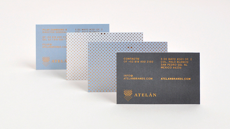
Whatever you do, get your business cards professionally printed. Even if you have a top-of-the-line printer, your cards will still look unprofessional due to inconsistencies in cutting. Go to a local printer and explain exactly what you want – even the likes of Vistaprint offer metallic and foil finishes and spot UVs –and make sure your card is printed on top-quality stock. Costs are reasonable, and well worth it.
10. Thou shalt be original
This is perhaps the most important commandment of all – the ‘thou shalt not murder’ of business card design. Whatever you decide to do with your design, make it about you. Make it original and make it memorable. Whether this is through your unique message, a well thought-out format or a subtle die-cut, make your clients remember you and ensure your card doesn't get throw into the bottom of a bag to be recycled six months later.
Related articles:

Rob is editorial, graphic design and publishing lead at Transport for London. He previously worked at Future Publishing over the course of several years, where he launched digital art magazine, ImagineFX; and edited graphic design magazine Computer Arts, as well as the Computer Arts Projects series, and was also editor of technology magazine, T3.
