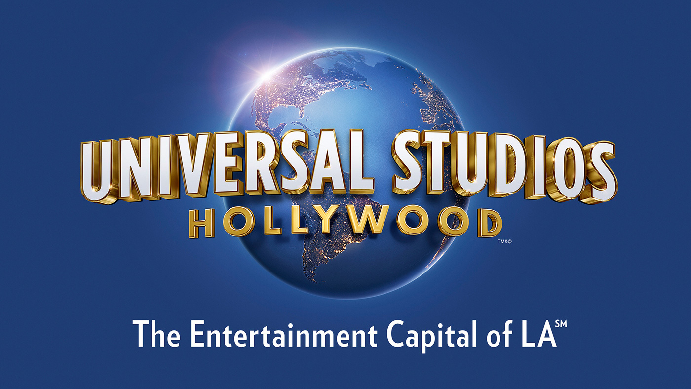
Universal Studios Hollywood logo dissected
Universal Studios Hollywood's latest logo aims to cement the destination's five-year transformation. We critique it from three perspectives.

As part of a five-year transformation that's seen 75 per cent of its theme park completely redeveloped, Universal Studios Hollywood recently unveiled an updated logo design, created by the team at Struck.
We asked three creatives - including Struck's own creative director, for their thoughts on the new design. Here's what they had to say…
A complete overhaul
Struck's Scott Sorenson says: "Knowing we wanted to utilise the updated Universal globe, and eliminate the unnecessary ring around the previous version of the globe, we explored two principal directions: an evolution of the previous type story and a complete overhaul of the same.
"For the evolution, we researched historical typefaces and modern throwbacks before ultimately landing on a custom typeface that sits somewhere between the golden age of Hollywood and the art deco period. While cleaner and more legible, it still retains some of the legacy of the previous mark."
Bring back the black
"The use of a computer generated globe says to me that Universal Studios is embracing new methods, while the Universal text staying in a similar style shows that it's not losing touch with tradition," observes web developer George W. Langham.
"My major problem with the design is the removal of the black background – it feels like this was a key part of the meaning of the brand as the black implied that inky vastness of space, and tied into the name of the brand in an emotive way. The rest of it is really, really cool: not so different as to be jarring and also more modern and contemporary."

Contemporary with high definition finish
Creative director at True Story Eric Wagner says: "In Universal Studios' iconic logo animation, the word 'Universal' dynamically circles planet Earth. The logo for Universal Studios' theme park is a static variation of that animation, and this latest update walks the fine line of looking contemporary with high definition finishes while evoking the romance of historic Hollywood.
Sign up to Creative Bloq's daily newsletter, which brings you the latest news and inspiration from the worlds of art, design and technology.
"However, something is off about the construction. The longer line of type has been flattened to maintain legibility, but the forced perspective on the extrusions is trying to overcompensate, and the vanishing point seems to be near the South Pole. It can't decide whether it's wrapping the globe or not."
This article originally appeared in Computer Arts issue 259; buy it here!

Rosie Hilder is Creative Bloq's Deputy Editor. After beginning her career in journalism in Argentina – where she worked as Deputy Editor of Time Out Buenos Aires – she moved back to the UK and joined Future Plc in 2016. Since then, she's worked as Operations Editor on magazines including Computer Arts, 3D World and Paint & Draw and Mac|Life. In 2018, she joined Creative Bloq, where she now assists with the daily management of the site, including growing the site's reach, getting involved in events, such as judging the Brand Impact Awards, and helping make sure our content serves the reader as best it can.

