Use spacing effectively in typography
Discover how designers can use tracking, kerning and leading for optimum results.
Paying attention to the detail in typography is extremely important for the professional designer. It is the job of the designer to ensure that adjustments are made to the spacing of letters, words and lines of type to create good typography.
Default settings
System preferences and software settings have been established to enable most people who are unconcerned about fine typography to set type effectively, but these settings cannot ensure that all text will be displayed to its optimum level. There is little in the way of a formula that can be applied to create good text setting, each situation must be judged individually.
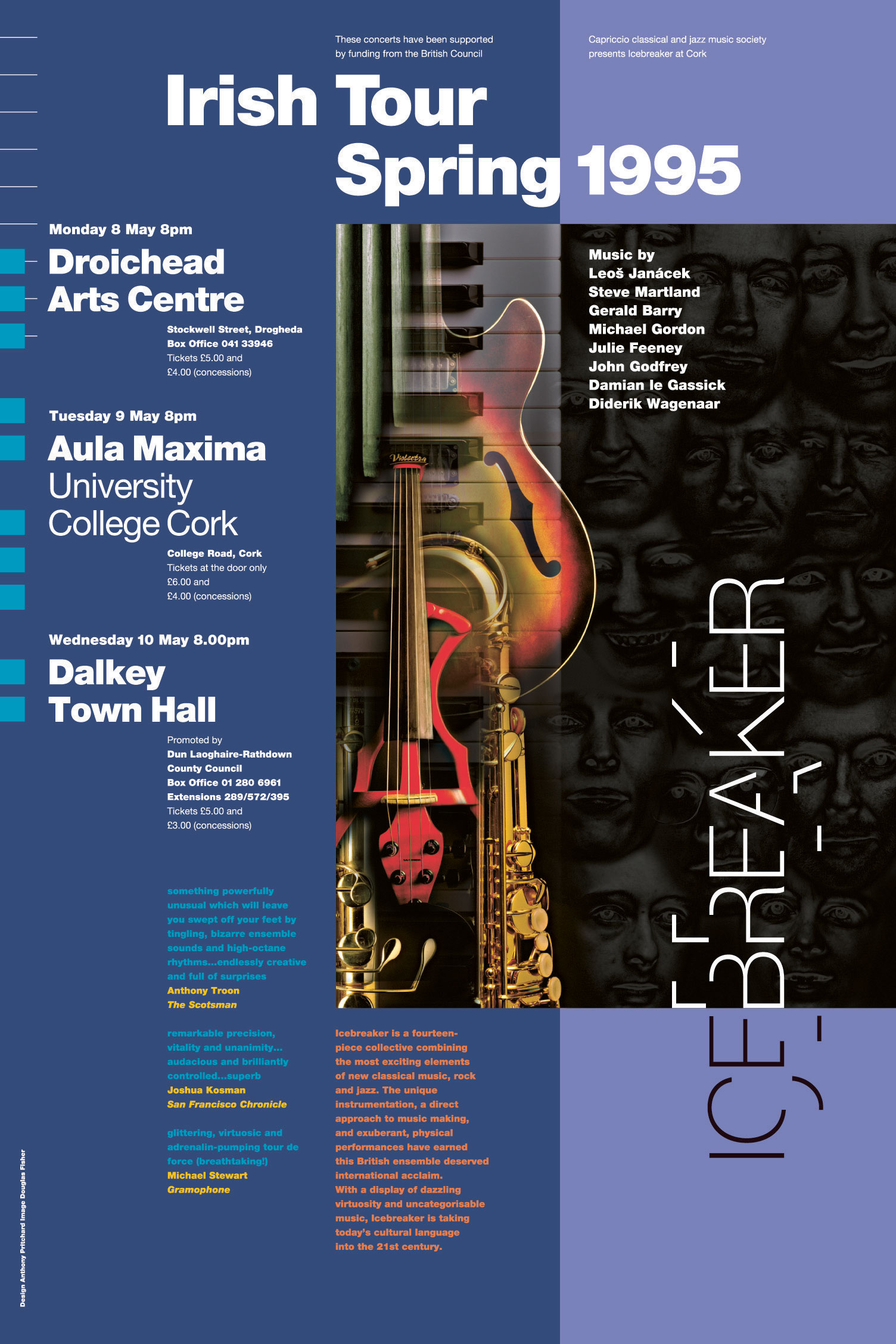
Most raw typesetting on the Mac delivers a reasonable starting point for making adjustments to the overall letter or word spacing. Typefaces are different and the fit of the letters varies accordingly: certain typefaces benefit from tighter or looser letter spacing or tighter word spacing, for example. Graphic designers must also consider the medium in which the typography will be delivered – for screen, print and spatial environments. Scale also plays an important part.
Article continues below 
Letter spacing (tracking)
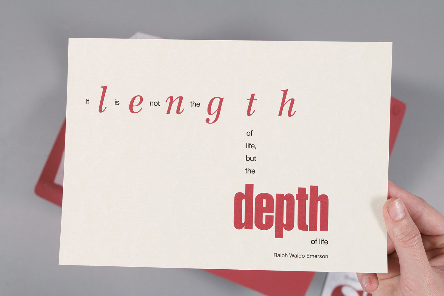
Letter spacing in a block of text can be adjusted to have an overall looser or tighter spacing, and this is known as tracking. Particular typefaces benefit from a tighter setting, others a looser approach. The amount of tracking used is to an extent down to personal preference – most settings will require slight adjustments and can be quite subtle.
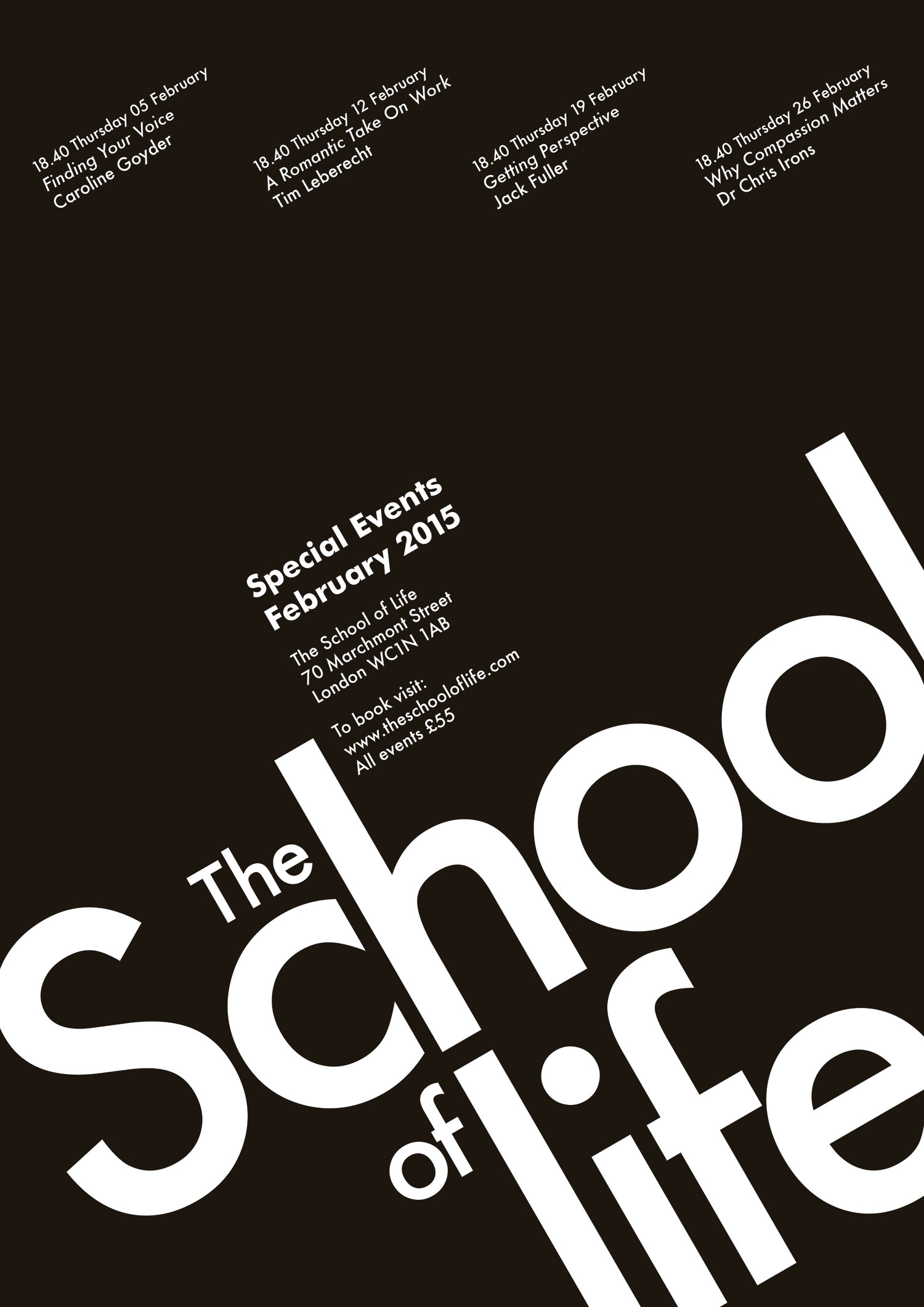
Words set in capital letters benefit from a looser setting. This helps both with the fit of the letters and the overall readability. Some words will have awkward combinations of letterforms. Consider the word RAILWAY. The R and the A slope away from each other creating space, whilst the I and the L as two verticals side by side have less space. The capital letter L followed by a capital letter A such as in LAND or LABOUR creates a large space, which is difficult to equalise amongst the following letters. This creates unevenness in the spacing of the letters in a word. The role of the designer is to make optical adjustments to create that evenness of spacing. Care also needs to be exercised when setting in capitals as words are recognised by their shape, and words in capitals are more uniform with a less distinctive shape.
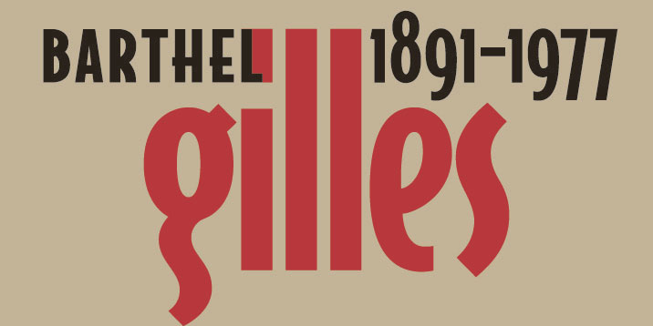
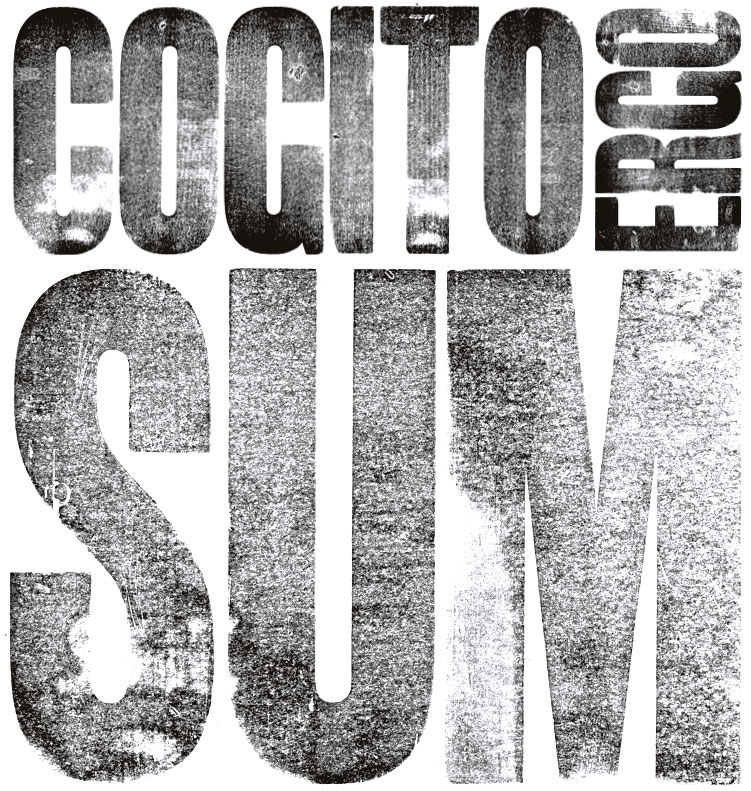
When setting type large, say in poster designs, it's possible to minus track the letter space of lowercase letters (close but not touching). Conversely, many designers feel that too much spacing, particularly of lowercase, can break up the word shape and therefore the word's recognition. Frederic Goudy famously intimated this should be a hanging offence with his oft quoted 'anyone who would letter space black letter would steal sheep.' Erik Spiekermann later borrowed this idea for his book Stop Stealing Sheep (and find out how type works).
Letter spacing (kerning)
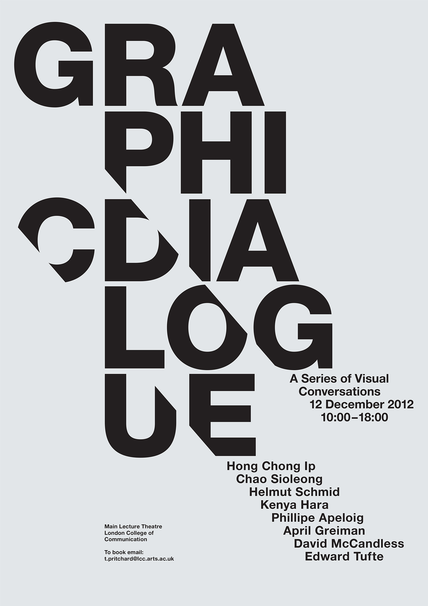
Within phototypesetting, manufacturers of typefaces have established an overall kerning for each of their typefaces. Kerning is the adjustment of space between two specific characters.
Sign up to Creative Bloq's daily newsletter, which brings you the latest news and inspiration from the worlds of art, design and technology.
The overall kerning of most typefaces is reasonably good, however, there will always be combinations of letters that do not fit very well together. Kerning is most crucial in display setting, but it is a good idea to scan your text setting and adjust the more noticeable instances.
Aligning numbers tend not to be kerned (they are set on an even body), as when they are set in tables they should line up underneath each other. Numbers that do not appear in tables, such as years, need to be kerned. Consider 1991 before kerning – the two nines cling together, while the ones move away at the front and end of the year.
Certain letters, such as a capital 'T', need to be undercut by the following letter – as in the word Telephone. Software manufacturers such as Adobe have built in kerning options such as auto, optical and metrics.
Experienced designers will want to determine their own kerning, while novices may prefer using optical (available in the Character palette in InDesign and Illustrator CC) as a starting point.
Word spacing
Word spacing for most typefaces being set in text tends to be quite acceptable. Occasionally, the word spacing of a typeface will look wide in comparison to its letter spacing, and in these cases it is advisable to close up the overall word spacing
Contemporary setting favours a tighter word spacing than in the past, and can now be as small as the width of a lowercase i. As with other types of spacing, there is an element of personal preference. Word spacing can be altered in the Paragraph palette within Illustrator and InDesign CC.
Justified setting should be avoided, as the variance in, and control over, the word spacing can result in unfortunate changes in word spacing between lines. In justified setting, you should not alter the letter spacing to compensate for poor word spacing, and should take care of selective hyphenation also.
Line spacing (leading)
A general rule in text setting is that the visual space between lines should never be less than the space between the words. The eye needs to be carried from one line to the next – lines that are too close or too far apart interrupt reading. As the column measure increases, so should the interline spacing. Typefaces with larger x-heights can require more leading than those with small x-heights, as is also the case with faces that have long ascenders and descenders. In display setting, the frequency of ascenders, descenders and capitals can have an influence. A skilled designer, in unusual circumstances, may set each line with a different leading.

Paragraph spacing
The space between paragraphs should be carefully considered. Most designers will relate the amount of spacing mathematically proportionate to the overall leading. Some designers prefer a full line space while others will opt for a half line space. If you are setting 8pt type size on a 10pt line feed, a full line space will measure 20pt from the baseline of the last line of a paragraph to the baseline of the first line of the next paragraph. A half line space will result in a 15pt measurement.
The visual advantage of a line space is that in a multi-column setting, the baselines will always line across. Also, where there is some show through in the paper, the text will be aligned on both sides of the paper. With half line spacing in a multi-column setting, the baselines within paragraphs will come in and out of alignment in every other paragraph.
This article originally appeared in Computer Arts issue 258; buy it here!
