Clean up thumbnails for animation
Dylan White reveals how to smooth and prepare rough storyboard drawings for use in a comic-style animation
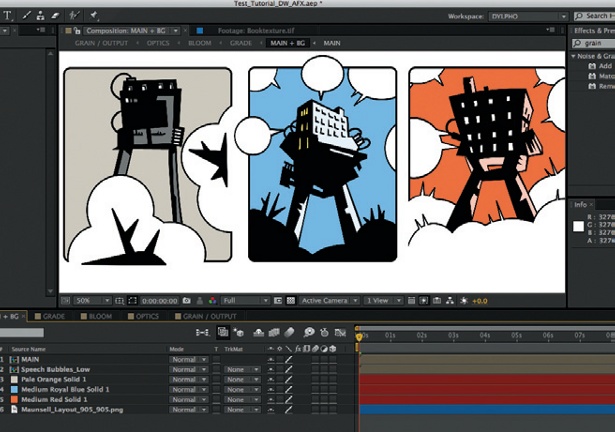
06 Precompose your main composition, and then create three masked solids beneath it for the background colours. I’ve called this comp ‘Main + BG’. In a further sub comp, I also created some speech bubbles with the same technique that I used to create the clouds.
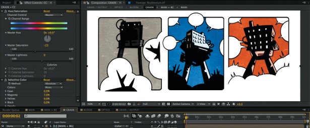
07 Now precompose the Main + BG comp into a new comp called ‘Grade’, to colour correct and add texture. I used a vintage film texture and a scan of my sketchbook cover, with blending modes of Overlay and Soft Light respectively. On an adjustment layer I used Hue/ Saturation and Selective Color to desaturate the blue in my image.
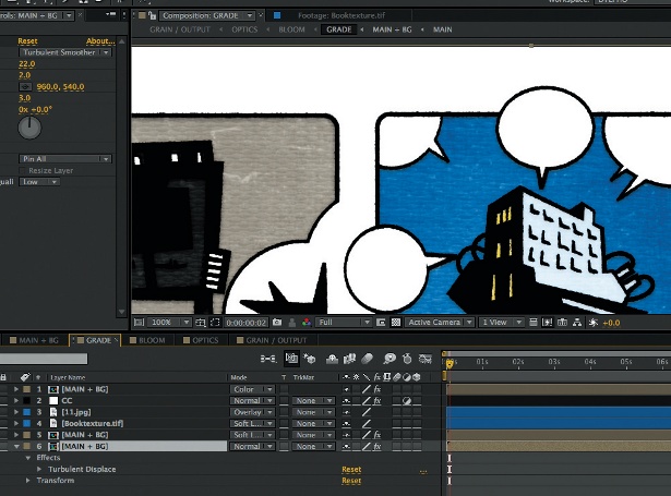
08 I added the Turbulent Displace effect to my lowest Main + BG layer (displacement: Smooth; amount: 22; size: 2; complexity: 3) to bring some roughness back into the linework. Despite often working with Illustrator, I don’t like things to appear too vectory, and the Turbulent Displace effect always helps with this.
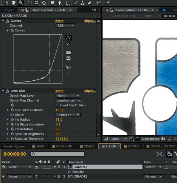
09 To create a soft bloom, duplicate your Grade comp within a new composition and then crank the Curves down to leave only the highlights in the top layer. Using the Lens Blur effect and altering the Iris settings helps to bring some camera artefacts into your bloom. Next, dim this layer to 65% opacity and set the blending mode to Screen.
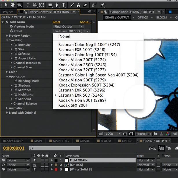
10 Finally, I’ve separated and shifted the channels and added grain on top. It’s really worth experimenting with the values within the grain settings to get a coverage that suits your particular image. I like how there is more grain information in the lighter bloomed areas of the image, and less in the darks. Try altering the values to create a nice finish for some of your own work.
Sign up to Creative Bloq's daily newsletter, which brings you the latest news and inspiration from the worlds of art, design and technology.

The Creative Bloq team is made up of a group of art and design enthusiasts, and has changed and evolved since Creative Bloq began back in 2012. The current website team consists of eight full-time members of staff: Editor Georgia Coggan, Deputy Editor Rosie Hilder, Ecommerce Editor Beren Neale, Senior News Editor Daniel Piper, Editor, Digital Art and 3D Ian Dean, Tech Reviews Editor Erlingur Einarsson, Ecommerce Writer Beth Nicholls and Staff Writer Natalie Fear, as well as a roster of freelancers from around the world. The ImagineFX magazine team also pitch in, ensuring that content from leading digital art publication ImagineFX is represented on Creative Bloq.
