Charlie Hebdo and 100 years of radical design
A new book shows how Charlie Hebdo is part of a long tradition of avant-garde magazine design, explains Justin Reynolds.
Contrarian, acerbic, offensive and utterly unapologetic: the Parisian magazine Charlie Hebdo is one in a long tradition of satirical journals whose editors, writers and illustrators have been prepared to assert their right to publish whatever they want, at any cost.
A new book by the graphic design historian Steven Heller, published shortly before the horrific events of this month, casts light on the magazine's uncompromising stance by setting it within the context of more than 100 years of radical publishing.

Merz to Emigré and Beyond, first published in 2003 and now available in a new edition, is a richly illustrated chronicle of avant-garde magazine design through the 20th century.
The magazines and newspapers surveyed in the book embraced a huge variety of aesthetic styles and philosophies, but shared a desire to break open the bounds of what had previously been considered politically and aesthetically acceptable. Heller writes:
A true avant-garde will not overtly appeal to mass taste, and indeed encourages bad taste as a means to replace the sanctified with the unholy. An avant-garde has to produce such unpleasant alternatives to the status quo that it will be unequivocally and avidly shunned by all but those few who adhere to it. An avant-garde must make noise.
Importantly, for radical publishers, incendiary words must be amplified through provocative design:
Although words are the building blocks of meaning, visual ideas can be expressed much more persuasively through the medium of graphic design (the marriage of typography, layout and image); it is a code that telegraphs intent. One might argue that radical ideas must appear vanguard to be vanguard. Harsh words on a tame page cannot have the same impact as a boisterous layout. The impression portrayed through design must be unsettling, if only at first, in order to provoke the reaction of readers.
Sign up to Creative Bloq's daily newsletter, which brings you the latest news and inspiration from the worlds of art, design and technology.
Heller attempts to impose some order on the hundreds of publications he references by organising them into several interconnected movements that follow a rough chronology, summarised below.
01. Expressionism
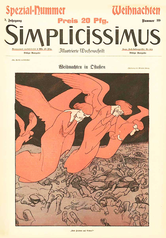
The story starts with a cluster of German and Austrian magazines published in the early 1900s that rebelled against the visual clutter typical of 19th century print.
The German satiric weekly Simplicissimus, for example, and Ver Sacrum, the house journal of the Viennese Secession, emphasised clean lines, bold colours and spare, forceful imagery in an effort to reinforce their radical political messages through a complementary aesthetic.
02. Futurism and Dada
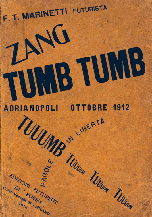
The Futurists idealised the beauty of the machine, and the spirit of invention sparking industrial innovation. For hundreds of years since the Renaissance print design had drawn inspiration from the forms of nature, but the Futurists replaced traditional ornamentation with a new visual language inspired by technology.
Marinetti's poem Zang Tumb Tumb, published in 1914, was and remains a radical adventure in expressive typography. An account of Marinetti's participation in the battle of Adrianopolis of 1912, it dispensed with traditional typographic rules, scattering its onomatopoeic letters, words and phrases across the page to convey something of the effect of grenade blasts and machine gun fire.
Though sharing the Futurist impatience with bourgeois convention, Dada was a movement of radical sceptics who rejected militarism, and were ambivalent about rapid industrial change.
If Dada had any philosophy it was the necessity of unceasing change: graphic design as a form of permanent revolution. But although discarded by their creators as soon as they appeared, some of their publications stand out as landmarks in graphic design history.
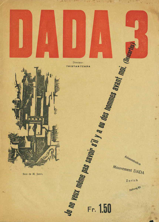
Dada Number 3, for example, was notable for pushing graphic experimentation beyond the limits of anything that had appeared before. Much of the text was printed sideways, with ads for other magazines breaking at random into the flow of the editorial content.
Skewed and angular lines of text confused a jumble of serif, sans-serif and medieval typefaces. Here the concept of the avant-garde was taken to its logical conclusion: there were no rules other than the obligation to continually break them.
03. Surrealism
Surrealism, another interwar movement, might be thought of as Dada's inverse. For the Dadaists visual anarchy was a means for expressing the turmoil of the outer world, but for the Surrealists it was a catharsis for within, a channel for the unfettered subjectivity of the artist.
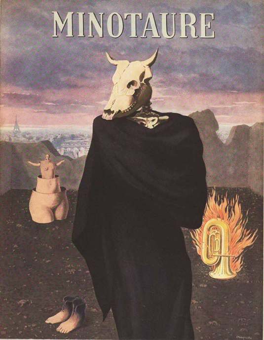
Major Surrealist publications such as Littérature, La Revolution Surréaliste and, most famously, Minotaure – which featured work by leading artists such as Rene Magritte, Salvador Dali and Pablo Picasso – encouraged their contributors to render the invisible visible, to bypass the filters of reason, aesthetics and morality and give visual expression to the unmediated imagination.
04. Modernism
Such is its continued influence today it is hard to realise that when it emerged during the 1920s the fledgling Modernist movement was just as radical as Futurism and Dada.
Modernism rejected all subjective experimentation in favour of logical designs constructed using rational grids, disciplined typography, geometric graphic components, and simple, informative photography.
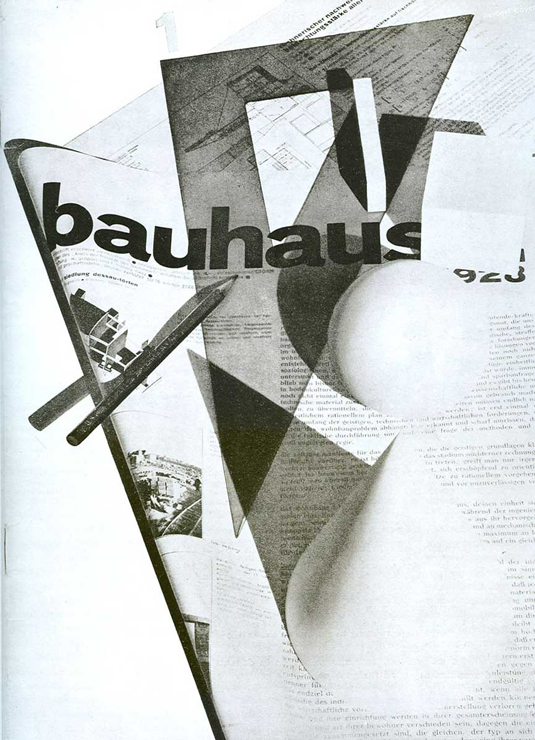
Here was the Futurist machine aesthetic purged of all artistic licence: Modernism sought to develop an 'objective' visual grammar that could be applied across all communications media, from the traditional printed page to the emerging fields of film and photography.
For the Modernists the ordered use of design elements offered inherent aesthetic satisfaction. Heller puts it nicely: 'The adherents of Modernism promoted the idea that graphic tension and drama could co-exist with clarity and accessibility.'
This ideal found its purist expression in Russian Constructivism, an early Soviet design movement which collapsed any distinction between the visual arts and industry. After World War II Modernism morphed into the International Style, the dominant graphical language of the second half of the century. In so doing it lost its utopian political dimension, becoming an agent of mainstream commerce.
05. Situationism, the Sixties Underground and Punk
The radical publishers of the interwar years were the direct forebears of the sprawling 1960s 'underground' press that seeded satirical magazines like Charlie Hebdo. The Situationist movement was a spiritual successor to Dada, drawing on the absurd to ridicule what it regarded as the crass commercialism of mainstream culture.
Situationism's founding text, The Society of the Spectacle, argued that consumerism imprisoned citizens in an attitude of docile conformity from which they could be awoken only through the force of 'counter-spectacles'.
The movement's flagship journal, The Situationist Times, was intended as one such spectacle. Designed expressly to offend, its grotesque illustrations, cartoons and picture stories highlighted what its contributors took to be the everyday absurdities of capitalist society.
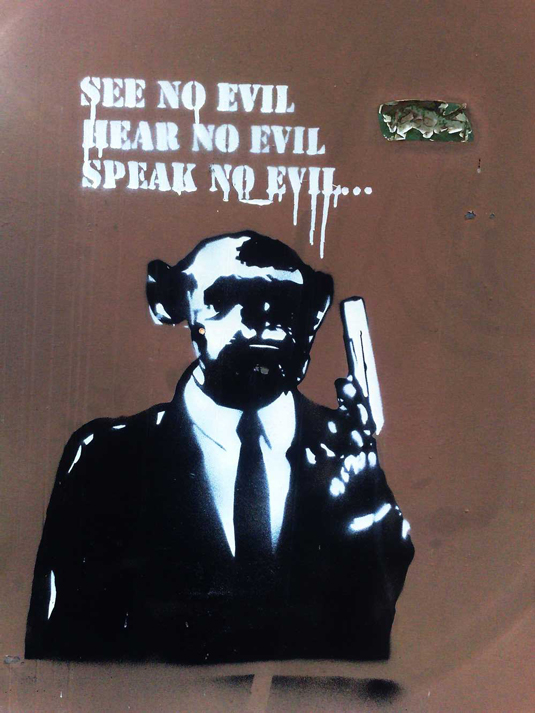
The paper helped to open an imaginative space and create an audience for the confusion of independent publications that became known as the Sixties Underground. The slapdash, unorthodox appearance of prominent Underground magazines such as The East Village Other and The Oracle was part design, part economic necessity.
The Oracle, for example, stumbled upon its influential psychedelic colour gradations through experimentation with whatever cheap printing materials happened to be available. The Underground's lo-fi aesthetic was also, however, a deliberate subverting of mainstream expectations, symbolic of the movement's commitment to a non-capitalist counter-culture.
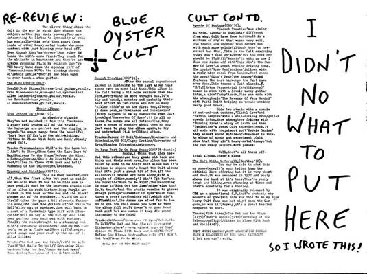
An angry new wave of DIY publications overtook the Underground in the mid-1970s, following in the slipstream of rock music's turn from hippiedom to the primal energy of punk.
Magazines such as Slash and Sniffin' Glue transposed the violence of a Sex Pistols guitar riff to the printed page. They had stark, simple, black and white designs that evoked the Futurist aesthetic. Punk was anarchist, not fascist, but shared Futurism's dynamism and disdain for the past.
06. Digital design
Before the advent of popular computing in the 1980s and 90s, print design had been a time-consuming, expensive process. New design apps like PageMaker, Quark and Fontographer made experimentation easy.
One of the earliest digitally produced publications, the typography journal Emigre, founded in 1984 by Zuzana Licko and Rudy VanderLans, was a kind of digital Dada, a rebellion against the Modernist design orthodoxies of the day, employing type as a decorative graphic element rather than as a transparent vessel for the transmission of content.
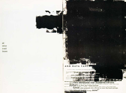
Emigre was rubbished by leading Modernists – Massimo Vignelli famously dismissed the magazine's typography as 'garbage'. But it had immense influence on the development of graphic design through the 1990s.
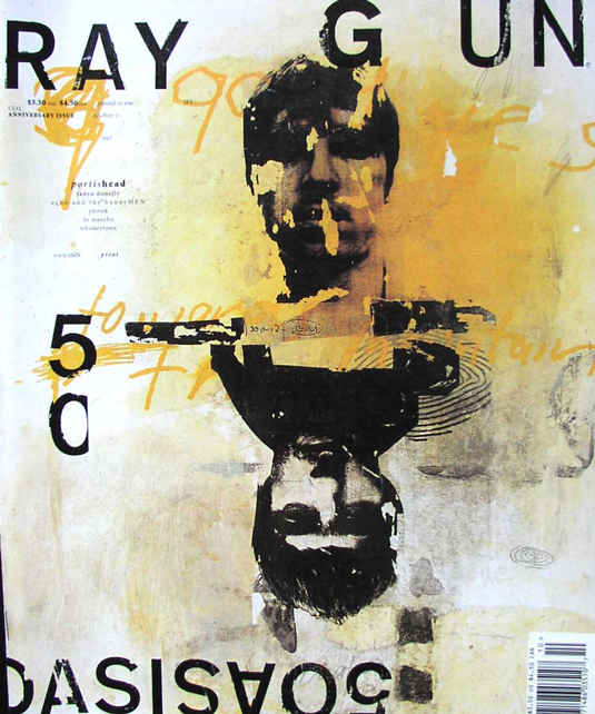
Magazines such as Beach Culture and Ray Gun, designed by David Carson, pushed Emigre's riotous visual experimentation to its (il)logical conclusion.
Carson reduced words to textures, designing dense layouts that were closer to abstract expressionist canvases than pages in a magazine.
07. Rise of the web
The second shockwave of the 1990s was the emergence of the web, which allowed the avant-garde to move online. Minimal start-up costs made possible digital newspapers, magazines, blogs, forums and social media channels representing every conceivable shade of radicalism, from the Occupy movement to the Tea Party.
But while the web allows radical publications to proliferate more rapidly than ever before, in the move from the printed page to the digital screen the classic avant-garde emphasis on the potent combination of word and image is being lost. The web imposes a certain uniformity of style: bandwidth considerations rule out overly complex layouts, and blogging and social media platforms tend towards a limited range of page layouts, reducing scope for visceral visual impact .
It might well be said that at the end of the day the aesthetic battle has been won by one particular movement, Modernism, which with its emphasis on disciplined use of grids, whitespace, clear typography, vector graphics and sharp photography dominates the visual language of the web. In this sense Charlie Hebdo is perhaps one of the last of its line: a printed magazine retaining the capacity to shock and offend through a fearless combination of message and medium.
Words: Justin Reynolds
Justin Reynolds is a web designer, blogger and copywriter based in Edinburgh, Scotland. This article is an edited version of a longer review that first appeared on his blog Metropolis2520.
All images courtesy of Merz to Emigré and Beyond: Progressive Magazine Design of the Twentieth Century
Like this? Read these!
- The easy guide to design movements: Bauhaus
- The designer's guide to special characters
- Illustrator tutorials: amazing ideas to try today!

The Creative Bloq team is made up of a group of art and design enthusiasts, and has changed and evolved since Creative Bloq began back in 2012. The current website team consists of eight full-time members of staff: Editor Georgia Coggan, Deputy Editor Rosie Hilder, Ecommerce Editor Beren Neale, Senior News Editor Daniel Piper, Editor, Digital Art and 3D Ian Dean, Tech Reviews Editor Erlingur Einarsson, Ecommerce Writer Beth Nicholls and Staff Writer Natalie Fear, as well as a roster of freelancers from around the world. The ImagineFX magazine team also pitch in, ensuring that content from leading digital art publication ImagineFX is represented on Creative Bloq.
