The 8 biggest logo designs of May 2014
We take a look back this month's biggest logo designs and redesigns including Disney and Vimto.
Sign up to Creative Bloq's daily newsletter, which brings you the latest news and inspiration from the worlds of art, design and technology.
You are now subscribed
Your newsletter sign-up was successful
Want to add more newsletters?
As creatives, we constantly strive to reinterpret the world in new and visually exciting ways. Yet we can also be conservative and often have a knee-jerk reaction to something new.
So, on the day a new logo design is launched for a familiar brand, the first reactions are usually negative. Once some time has passed and the new design has been seen in action, though, it can be a different story. Here we take a look back at the month's biggest new designs and redesigns: with a bit of fresh perspective, what do you think of them now?
01. Disney Channel
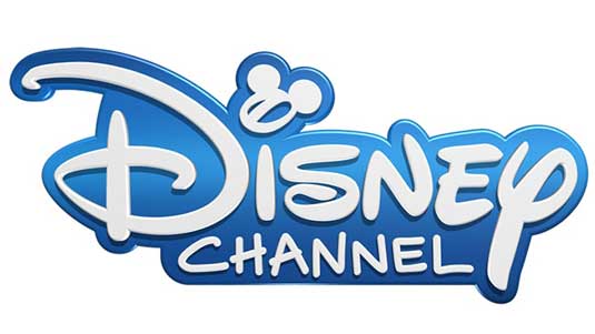
This month the Disney Channel rolled out a new logo design (above) across all its international TV networks - and it's a radical change from the previous identity. At first glance it looks like a purely typographic logo, in which the Mickey Mouse silhouette that dominated the old logo (below) is nowhere to be seen.
Article continues below 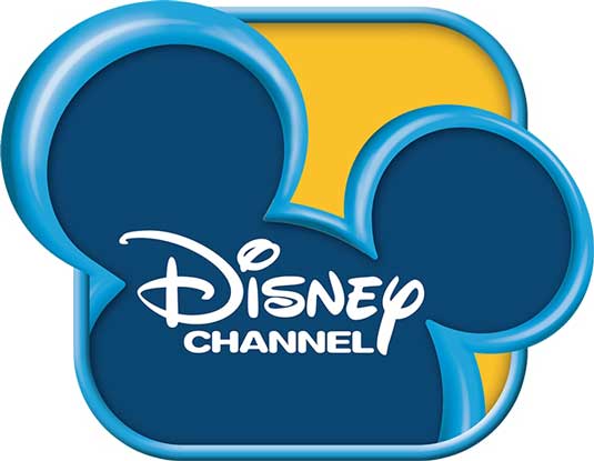
02. Batman vs. Superman
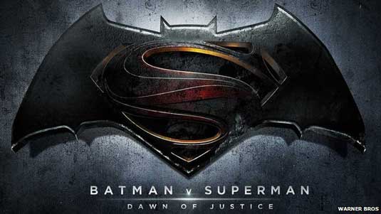
It's not due to open until May 2016 but Warner Bros has already released the logo design for Zack Snyder's forthcoming film Batman v Superman: Dawn of Justice, as shown above.
The official design won't be a huge surprise to hardcore fans, though. It's more or less the logo that was flashed onto the screen at last year's ComicCon, with some gritty texturing that suggests the movie will continue the murky tone set by Christopher Nolan's Dark Knight trilogy.
03. Google

Kerning. It can be the difference between your type being aesthetically pleasing and jarringly horrid, and getting it right is one of the 10 commandments of typography. Never one to rest on laurels, the Google branding team have adjusted the famous logo - which received a redesign only eight months ago - to improve the kerning.
04. Instapaper

Founded in 2008, Instapaper is a popular tool for saving web pages to read later on one's smartphone, e-reader, tablet or desktop computer. The new logo was commissioned by New Zealander Kris Sowersby under the direction of Justin Van Slembrouck.
Sign up to Creative Bloq's daily newsletter, which brings you the latest news and inspiration from the worlds of art, design and technology.
They describe the new wordmark they've released today as "Instapaper’s first 'real logo'", admitting that "earlier versions were just our name typed in a serif font".
05. FIAT/Chrysler
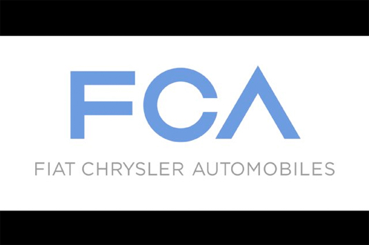
Automobile leaders Fiat and Chrysler have come together to offer customers a clear and consise brand for the minivan business. Their logo represents this ethos, with a simple and sleek execution that was debuted earlier this month. The font choice may not be to everyone's taste but it's certainly a strong identity as both had wished for.
06. Codeacademy
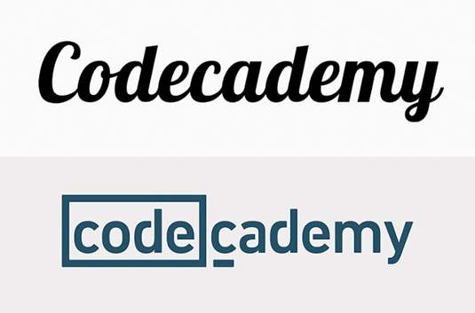
Online programming education platform Codeacademy have only been around since 2011 but they already have a community-driven environment of over 24 million users.
The new wordmark is constructed of two distinct parts that convey Codecademy’s core values. Inspired by programming cues, the word 'code' has been highlighted in a frame or field that sets off what the platform is all about. The frame can also be used to hold iconography, programming symbols, or other typography.
07. Vimto
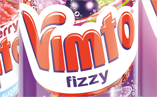
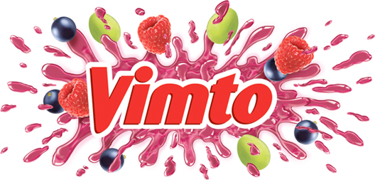
Working with Springetts Brand Design, the new logo from soft drink brand Vimto is designed to drive trial and frequency of purchase. Inspired by the brand's 'Seriously Mixed Up Fun' tag line, the logo is designed to 'burst' from the packaging. We think it certainly packs an eye-catching punch.
08. Intel
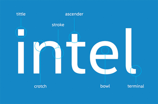
With more and more of you visiting sites via your mobile devices, Intel were very clever with this very subtle logo redesign. The tech giant has created its own proprietary font, Intel Clear, designed to be easier to read on screens and which can be used across different alphabets. The new font was developed by Red Peak and font house Dalton Maag.
What do you think of this month's biggest logo designs? Let us know in the comments box below!

Sammy Maine was a founding member of the Creative Bloq team way back in the early 2010s, working as a Commissioning Editor. Her interests cover graphic design in music and film, illustration and animation. Since departing, Sammy has written for The Guardian, VICE, The Independent & Metro, and currently co-edits the quarterly music journal Gold Flake Paint.
