Agency reveals how to break the rules of branding
After nearly a decade of the same branding, digital design agency Huge decided it was time for a change.
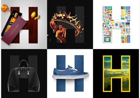
A small venture that began in an apartment in Brooklyn in 1999 has since grown into a leading digital design agency, with offices all over the globe and over 700 employees under its belt. It's Huge. Literally.
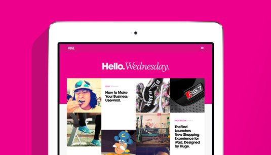
Recently, after seven years of the same old branding, the company has undergone a gorgeous, sleek new makeover. Here we talk to executive creative director Jon Jackson and director of front end engineering Karl Stanton about the redesign and why they like to break the rules.
What prompted this latest iteration to your brand?
Jon Jackson: We're very focused on pushing our design work as far as possible, and for as long as possible. The idea that design is never finished and can aways be improved is just a part of how we work. When we think something is done we put it in front of users to see how it could be improved upon.
Article continues belowThe same thing goes for our brand; we've been working and living with the previous design for seven years and along the way we've been collecting all the ways that we could improve. So when we decided to put out a new site to showcase our work it was a natural time to refresh our brand guidelines, and evolve for the next generation of Huge.
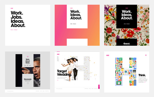
In the redesign press release, you mention that every Huge project starts with a grid. Why?
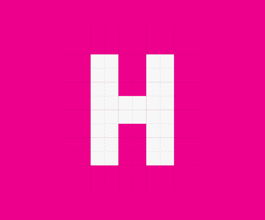
JJ: A major component to design is alignment and so a grid is always a great place to begin. It's a simple but variable structure, that gives your work a base layer of alignment which can then be broken for visual impact. To break rules you need to know them. Having a grid as a base layer of design lets us spend time trying to find new and interesting ways to break the rules.
What was the idea behind simplifying the colour palette?
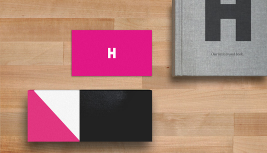
JJ: The idea was to reign in the ways that the previous Huge brand guidelines were being pushed. As brand guidelines age they evolve in all sorts of ways, some good, some bad. We were seeing the use of colour pushed from the original black, yellow and magenta, and the questions of when and how to use the colours came up often.
We were inspired by brands like Coke and Starbucks who have pushed their brand to one base colour
We wanted to reset, and make our brand more bomb proof for the size the company is now. We were inspired by brands like Coke and Starbucks who have pushed their brand to one base colour. We've simplified to magenta, black and white, which we were using most anyway.
Sign up to Creative Bloq's daily newsletter, which brings you the latest news and inspiration from the worlds of art, design and technology.
What did you use to build the site?
Karl Stanton: The initial prototype was built using NodeJS with Mustache and SASS which allowed us to rapidly scaffold the templates. Once we were happy with the templates, we moved over to Sitecore 7 as the CMS platform.
Sitecore is a fantastic platform which enables our content team relative ease and flexibility when creating and editing content. We tried out various things on this project, including NodeJS, GruntJS, Hogan and Bower, but the front-end work makes use of HTML5, jQuery, Compass/Sass.
Liked this? Read these!
- Create a perfect mood board with these pro tips
- The ultimate guide to logo design
- Brilliant Wordpress tutorial selection
Have you come across some wonderful branding? Let us know in the comments box below!

The Creative Bloq team is made up of a group of art and design enthusiasts, and has changed and evolved since Creative Bloq began back in 2012. The current website team consists of eight full-time members of staff: Editor Georgia Coggan, Deputy Editor Rosie Hilder, Ecommerce Editor Beren Neale, Senior News Editor Daniel Piper, Editor, Digital Art and 3D Ian Dean, Tech Reviews Editor Erlingur Einarsson, Ecommerce Writer Beth Nicholls and Staff Writer Natalie Fear, as well as a roster of freelancers from around the world. The ImagineFX magazine team also pitch in, ensuring that content from leading digital art publication ImagineFX is represented on Creative Bloq.
