Batman rebrand updates Wayne Enterprises
Batman fan brings Bruce Wayne's business up-to-date with this sleek new rebrand.
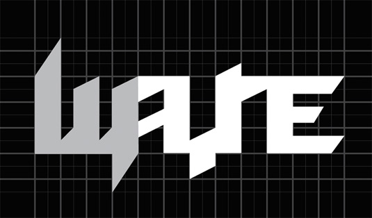
Every company needs an update once in a while, even if they're a fictional conglomorate owned by a superhero.
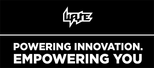
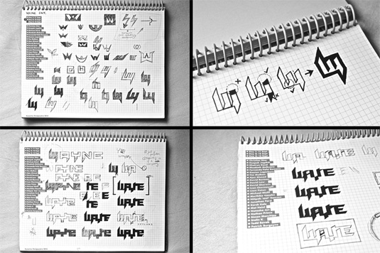
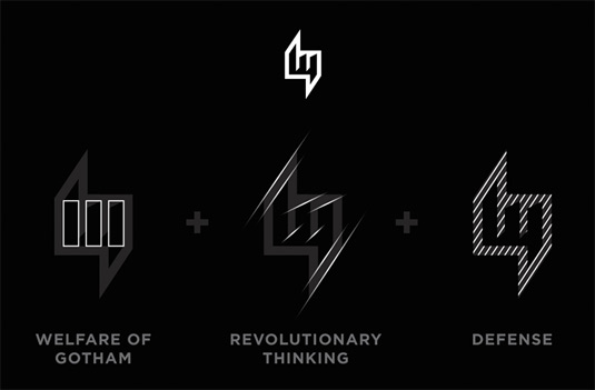
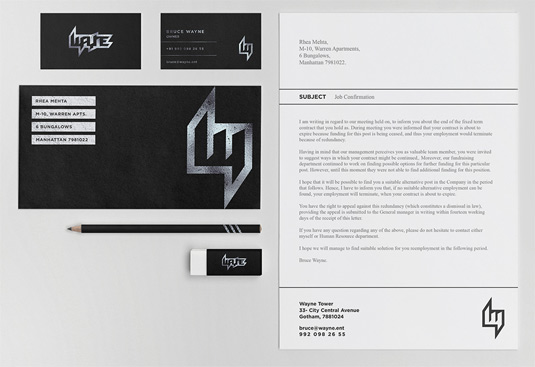
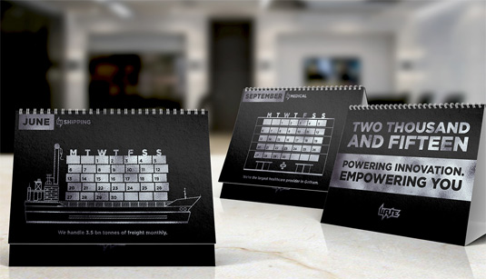
This redesign of Batman's Wayne Enterprises was created by Indian-based artist Mazhar Bagasrawala as a classroom module on corporate identity, and the whole project packs impressive attention to detail.
From using the Gotham font to streamlining the company's name to just 'Wayne' ("the suffix 'enterprises' is an obsolete trend" Mazhar explains), this rebrand cleverly injects the comic book universe with a marketing spiel.
Check out the whole project on his Behance page, and browse some of Mazhar's impressive work below.
Liked this? Read these!
Sign up to Creative Bloq's daily newsletter, which brings you the latest news and inspiration from the worlds of art, design and technology.

Dom Carter is a freelance writer who specialises in art and design. Formerly a staff writer for Creative Bloq, his work has also appeared on Creative Boom and in the pages of ImagineFX, Computer Arts, 3D World, and .net. He has been a D&AD New Blood judge, and has a particular interest in picture books.
