Bold new logo and branding for health and safety
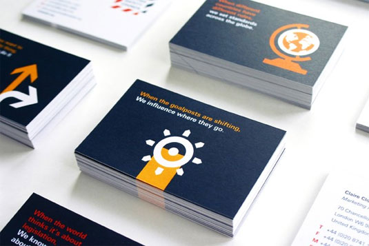
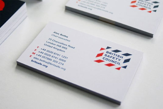
The British Safety Council's new brand proposition 'helpful simplicity' is portrayed in their striking, minimal new visual identity.
Sign up to Creative Bloq's daily newsletter, which brings you the latest news and inspiration from the worlds of art, design and technology.
You are now subscribed
Your newsletter sign-up was successful
Want to add more newsletters?
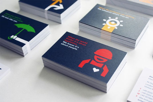
The British Safety Council is one of the world's leading health and safety organisations, so their branding has to be consise, engrossing and memorable. London based designer Carina Hinze took on the task of recreating their look.
Hinze worked alongside Gilmar Wendt, to create the corporate logo and sub-brands, illustrations, defining colours and typography, and art directing, which included photo shoots with photographers Nick Daly and George Brooks.
The visual identity takes its inspiration from hazard stripes as the core language of health and safety. It's a bold execution from the design pair and one that we think portrays the British Safety Council perfectly.
Article continues below 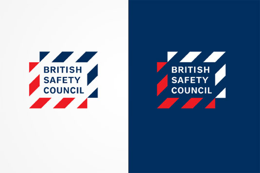
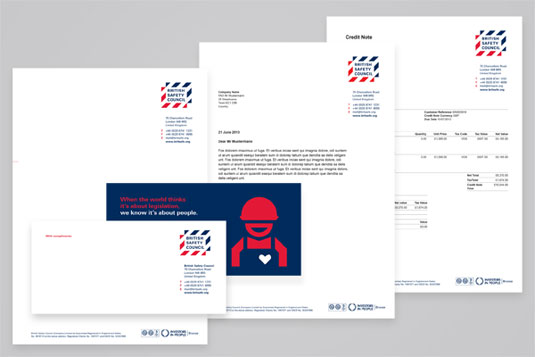
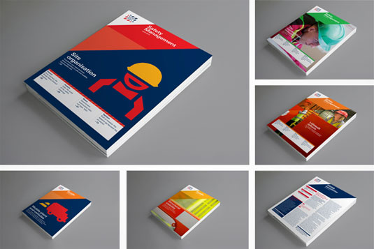


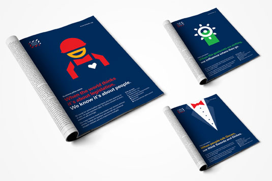
See more of Hinze's work over on her website.
Like this? Read these!
- Brilliant Wordpress tutorial selection
- Free tattoo fonts for designers
- Free Photoshop actions to create stunning effects
What is your favourite example of bold branding? Let us know in the comments box below!
Sign up to Creative Bloq's daily newsletter, which brings you the latest news and inspiration from the worlds of art, design and technology.

The Creative Bloq team is made up of a group of art and design enthusiasts, and has changed and evolved since Creative Bloq began back in 2012. The current website team consists of eight full-time members of staff: Editor Georgia Coggan, Deputy Editor Rosie Hilder, Ecommerce Editor Beren Neale, Senior News Editor Daniel Piper, Editor, Digital Art and 3D Ian Dean, Tech Reviews Editor Erlingur Einarsson, Ecommerce Writer Beth Nicholls and Staff Writer Natalie Fear, as well as a roster of freelancers from around the world. The ImagineFX magazine team also pitch in, ensuring that content from leading digital art publication ImagineFX is represented on Creative Bloq.
