Chocolate branding is wildly enticing
New branding for Wellington chocolate bars harnesses beautiful images of nature to convey its hand-made approach.
Sign up to Creative Bloq's daily newsletter, which brings you the latest news and inspiration from the worlds of art, design and technology.
You are now subscribed
Your newsletter sign-up was successful
Want to add more newsletters?
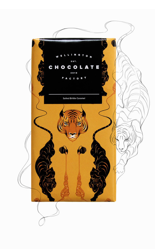
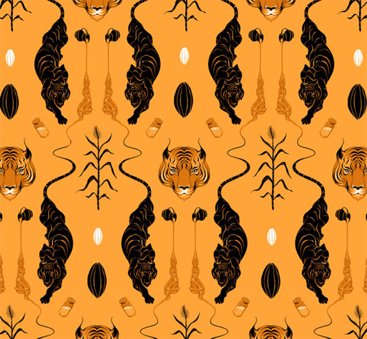
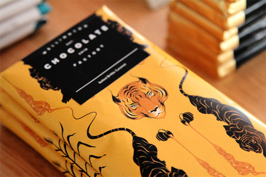
Chocolate branding is usually filled with bright and bold typography, childish imagery and in-your-face aesthetics. However, this charming offering from Inject Design for Wellington Chocolate Family is as classy as it gets - featuring beautiful illustrations from New Zealand based artist Gina Kiel.
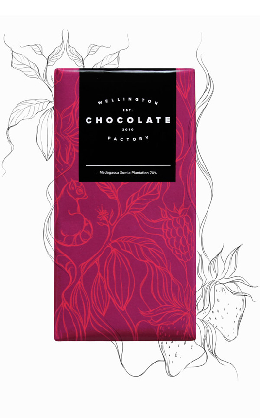
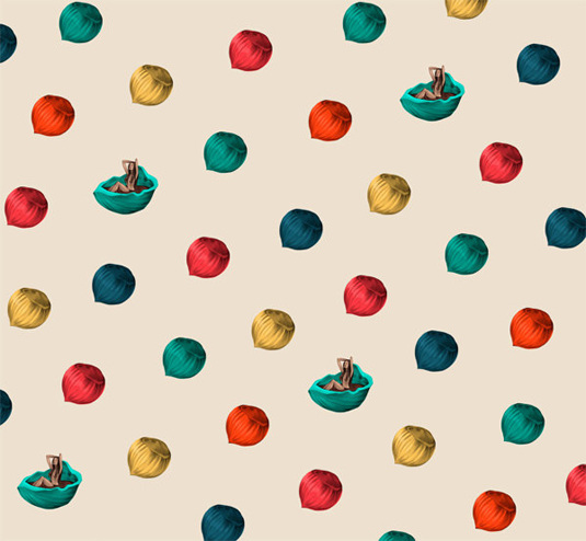
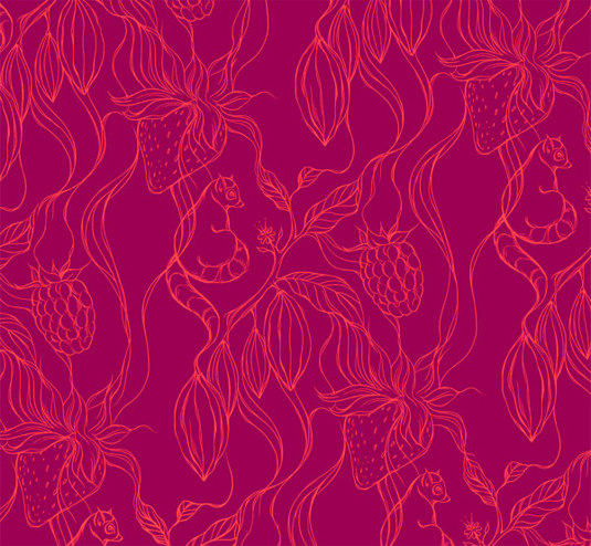
"The brand new Wellington Chocolate Factory specialise in beautiful handcrafted chocolate. To marry with this handmade ethos a brand was developed featuring unique illustrations from an array of artists to represent each chocolate flavour and variety," Inject Design explain.
"Accompanying that is a simplistic minimal wordmark which is elegant and timeless enough to stand on it's own yet humble enough to give space to the beauty of these illustrations. With the constant of the black and white, yet the limitless opportunity for new illustrations, Wellington Chocolate Factory has the ability to visually grow alongside their ever expanding flavour range."
Article continues below 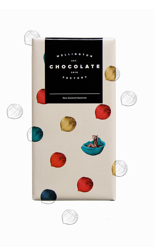
See more inspiring work over on the Inject Design website.
Liked this? Read these!
- The designer's guide to working from home
- The best collage maker tools - and most are free!
- The designer's guide to special characters
What do you make of this branding? Let us know in the comments box below!
Sign up to Creative Bloq's daily newsletter, which brings you the latest news and inspiration from the worlds of art, design and technology.

The Creative Bloq team is made up of a group of art and design enthusiasts, and has changed and evolved since Creative Bloq began back in 2012. The current website team consists of eight full-time members of staff: Editor Georgia Coggan, Deputy Editor Rosie Hilder, Ecommerce Editor Beren Neale, Senior News Editor Daniel Piper, Editor, Digital Art and 3D Ian Dean, Tech Reviews Editor Erlingur Einarsson, Ecommerce Writer Beth Nicholls and Staff Writer Natalie Fear, as well as a roster of freelancers from around the world. The ImagineFX magazine team also pitch in, ensuring that content from leading digital art publication ImagineFX is represented on Creative Bloq.
