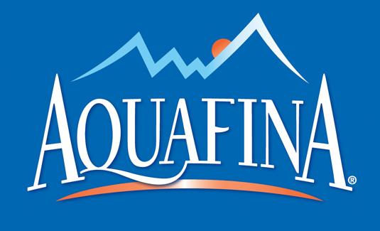
Pepsi reveals new logo design for its bottled water brand
Aquafina gets its first major redesign since it launched in the 1990s, and it's looking fresh.
Sign up to Creative Bloq's daily newsletter, which brings you the latest news and inspiration from the worlds of art, design and technology.
You are now subscribed
Your newsletter sign-up was successful
Want to add more newsletters?
Pepsi has revealed a new logo design for its bottled water brand, Aquafina, and it's a bold refresh for a brand that's remained largely untouched for 20 years.
Aquafina has had more than its share of headlines over the years thanks to the revelation that, like Coca-Cola's Dasani, it's basically tap water, albeit tap water that's been through a number of special filtration processes.

Its new logo is much more fresh, however, taking the old design – which is so 1990s it hurts – and bringing it thoroughly up to date with clean and dynamic new visuals aimed to refresh and elevate the brand.
Article continues belowThe solid blue background of the old Aquafina logo has been replaced with a pattern of translucent waves in three shades of blue, and the mountains have been transformed from something that looks a bit like a line chart into a more subtle pair of Alpine peaks, suggesting a clean, icy landscape.

The most notable change to the redesign is Aquafina's new word mark, ditching those serifs that looked so cool back when Bush were topping the pop charts and replacing them with a simple and approachable sans serif font that aims to complete the brand's crisp new look.
The new logo is the work of PepsiCo's Design and Innovation Center, led by Chief Design Officer Mauro Porcini.

It's been doing some exciting work with PepsiCo's various brands of late, including a collaboration with Malika Favre for Lay's, a Pepsi Live fashion line, and F!ZZ, a new brand experience that promises to define the future of soft drink mixology, with a glorious tag line: "Grab life by the bubbles". Nice.
Sign up to Creative Bloq's daily newsletter, which brings you the latest news and inspiration from the worlds of art, design and technology.
Words: Jim McCauley
Jim McCauley is a writer, editor and occasional podcaster, and is available for space parties.
Liked this? Read these!

The Creative Bloq team is made up of a group of art and design enthusiasts, and has changed and evolved since Creative Bloq began back in 2012. The current website team consists of eight full-time members of staff: Editor Georgia Coggan, Deputy Editor Rosie Hilder, Ecommerce Editor Beren Neale, Senior News Editor Daniel Piper, Editor, Digital Art and 3D Ian Dean, Tech Reviews Editor Erlingur Einarsson, Ecommerce Writer Beth Nicholls and Staff Writer Natalie Fear, as well as a roster of freelancers from around the world. The ImagineFX magazine team also pitch in, ensuring that content from leading digital art publication ImagineFX is represented on Creative Bloq.
