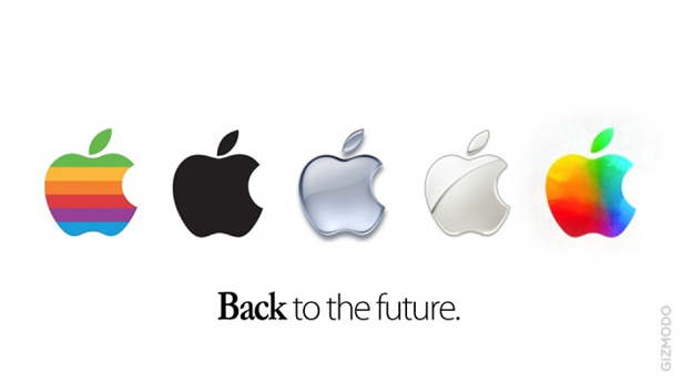
Apple rocks the rainbow. Again.
Not content with wowing us with Q2 financials, Apple today surprised with astonishing take on its corporate logo - complete with rainbow-coloured translucent squares
Sign up to Creative Bloq's daily newsletter, which brings you the latest news and inspiration from the worlds of art, design and technology.
You are now subscribed
Your newsletter sign-up was successful
Want to add more newsletters?
Created for this year's World Wide Developer Conference (WWDC 2012), the new logo design echoes other recent Apple experiments with its logo branding - and even harks back to its distant past when rainbow striping was in vogue.
The new logo design - which dominates the WWDC 2012 website splash page - is certainly a bold, colourful contrast to Apple's corporate colours, which are almost monolithic in their black, white and silver / grey uniformity.

It proves, if nothing else, that the company remains true to its roots - and still has a certain playfulness that belies the grown-up, sober image it normally likes to portray.
Article continues belowThe new logo design - and the announcement of WWDC 2012 - follows hot on the heels of Apple's best ever Q2 financial results, when it announced it $11.6bn in profits - up a staggering 94% for the same quarter last year.
Sign up to Creative Bloq's daily newsletter, which brings you the latest news and inspiration from the worlds of art, design and technology.

The Creative Bloq team is made up of a group of art and design enthusiasts, and has changed and evolved since Creative Bloq began back in 2012. The current website team consists of eight full-time members of staff: Editor Georgia Coggan, Deputy Editor Rosie Hilder, Ecommerce Editor Beren Neale, Senior News Editor Daniel Piper, Editor, Digital Art and 3D Ian Dean, Tech Reviews Editor Erlingur Einarsson, Ecommerce Writer Beth Nicholls and Staff Writer Natalie Fear, as well as a roster of freelancers from around the world. The ImagineFX magazine team also pitch in, ensuring that content from leading digital art publication ImagineFX is represented on Creative Bloq.
